Tuesday 31 January 2012

Colour - Exercise One

Controlling the strength of a colour.


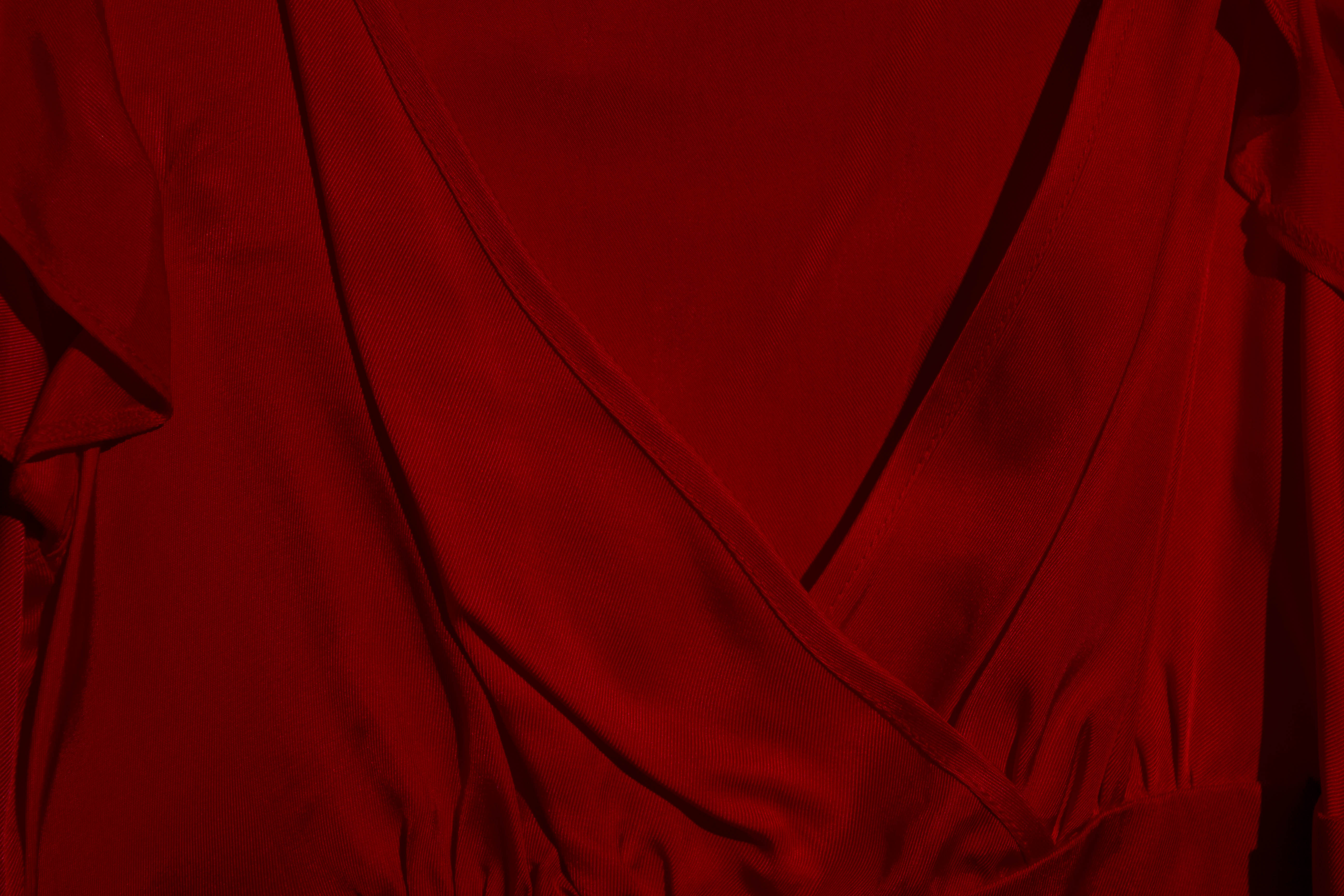
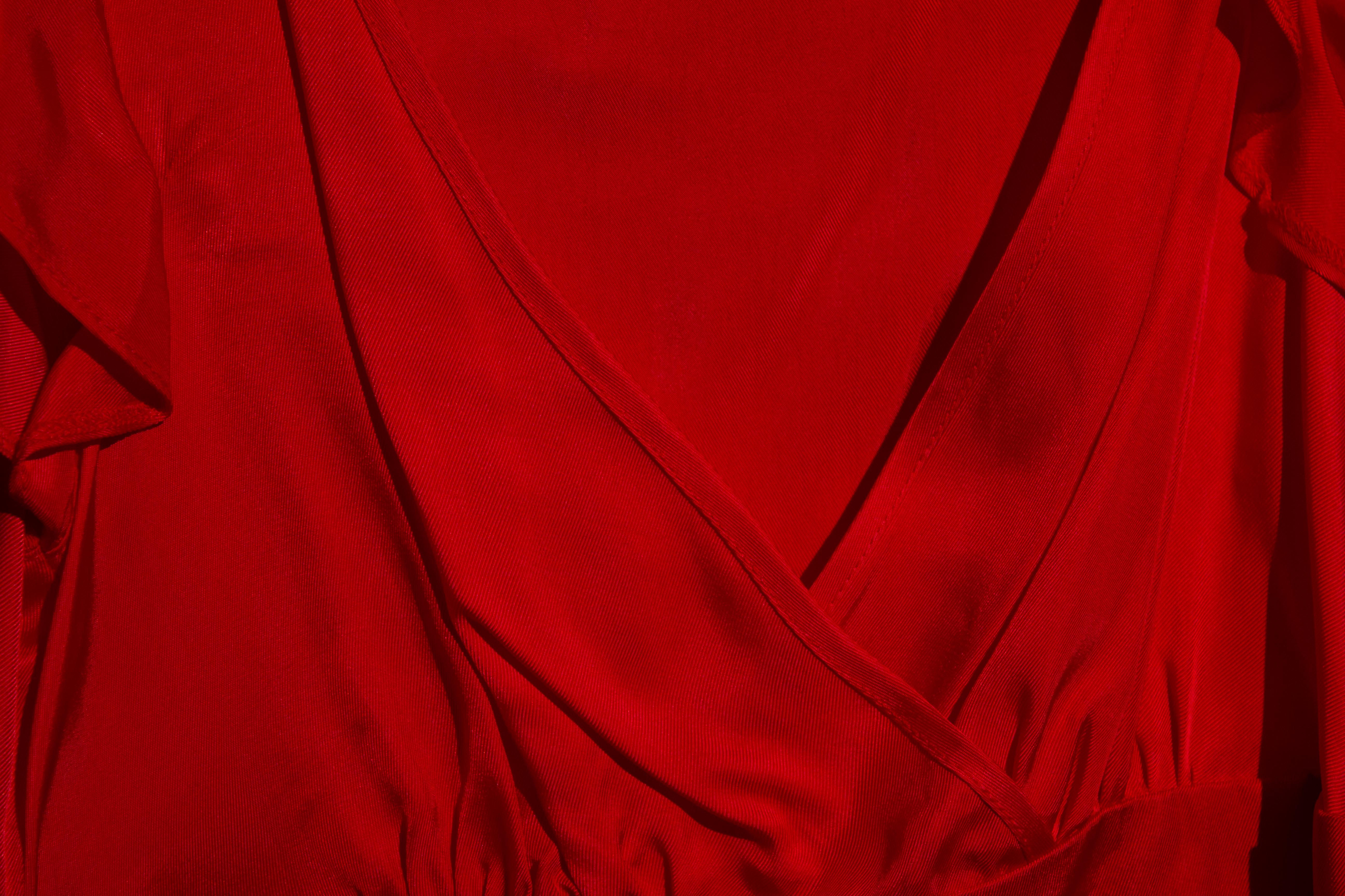
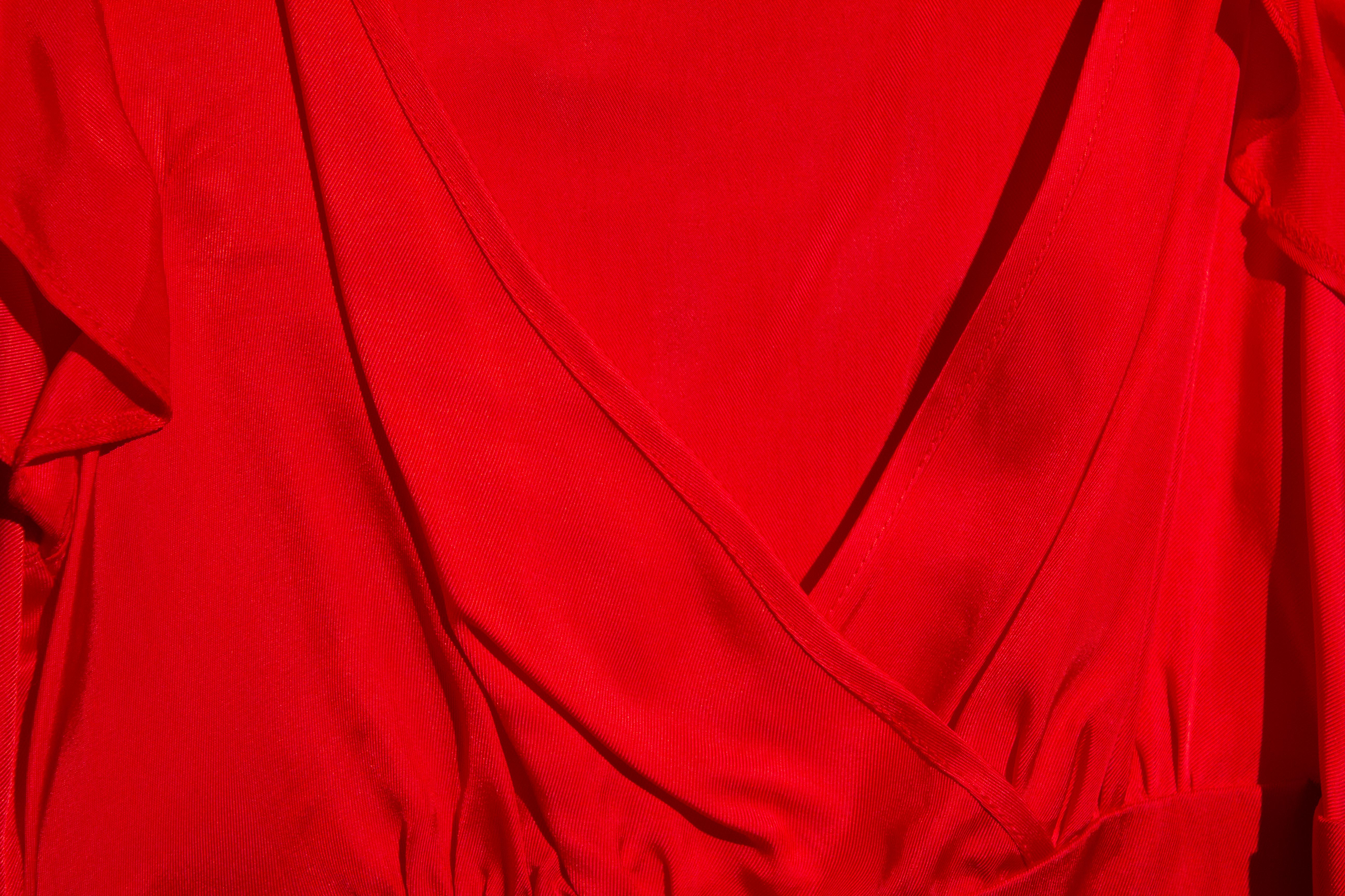
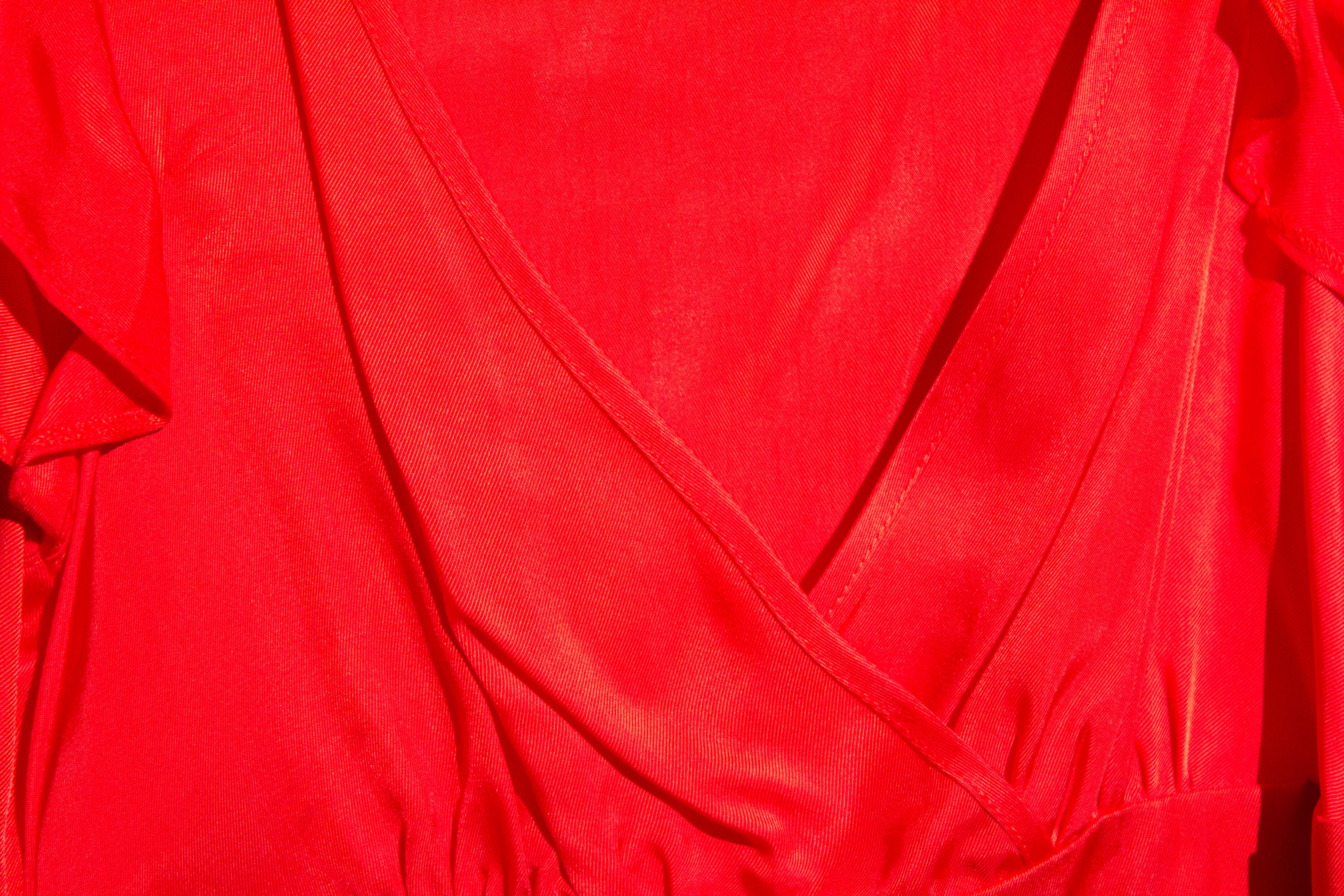
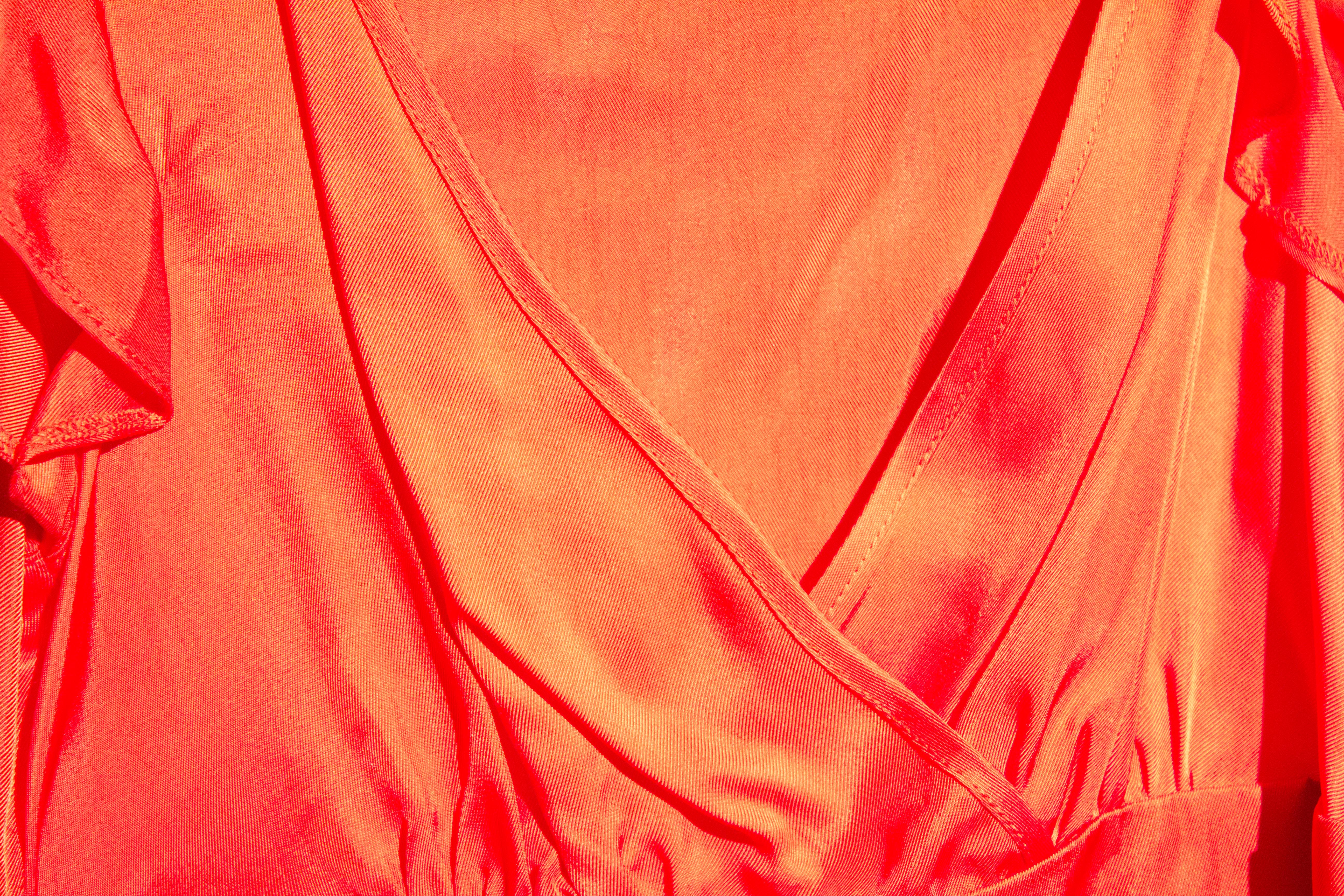
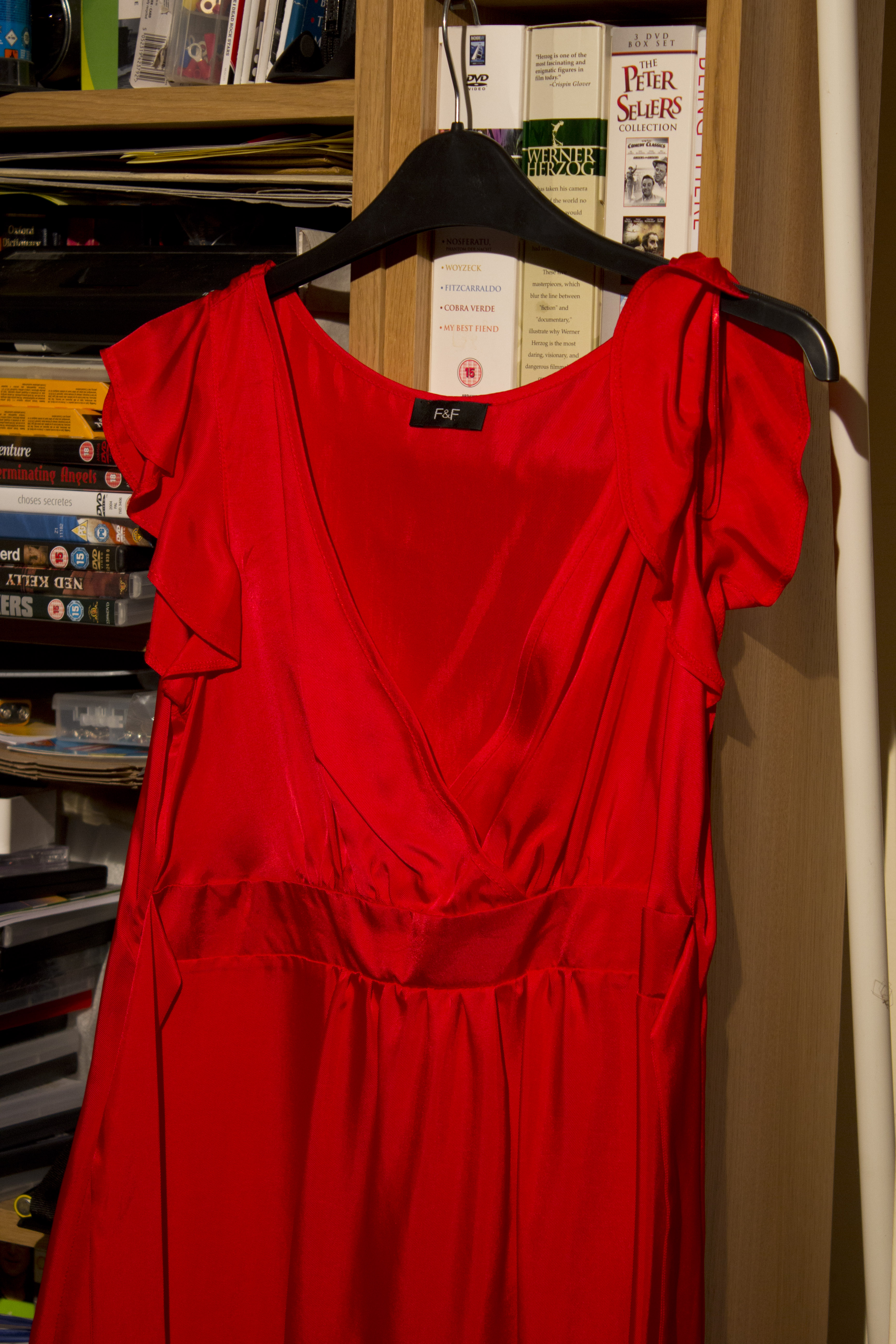
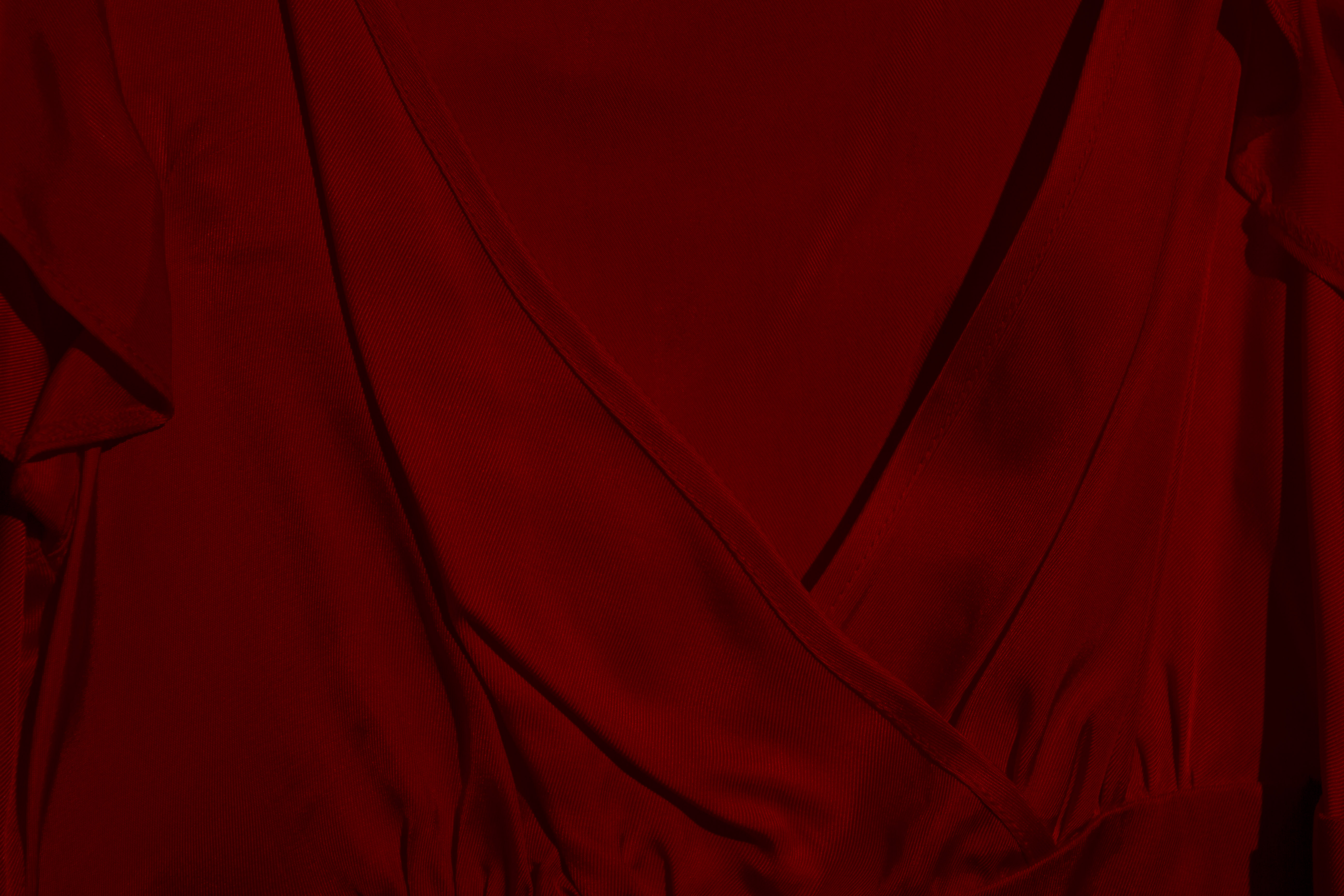
This exercise will explore the effect that varying camera exposures have upon the perceived "strength" of a colour. The subject chosen is a bright red dress, as seen below. It is lit by a single 500W tungsten fresnel lamp, as the images were recorded on a very dull January day. A Canon EOS 60D camera was used, with varying degrees of exposure compensation dialed in, as indicated below each image.

Subject of this exercise


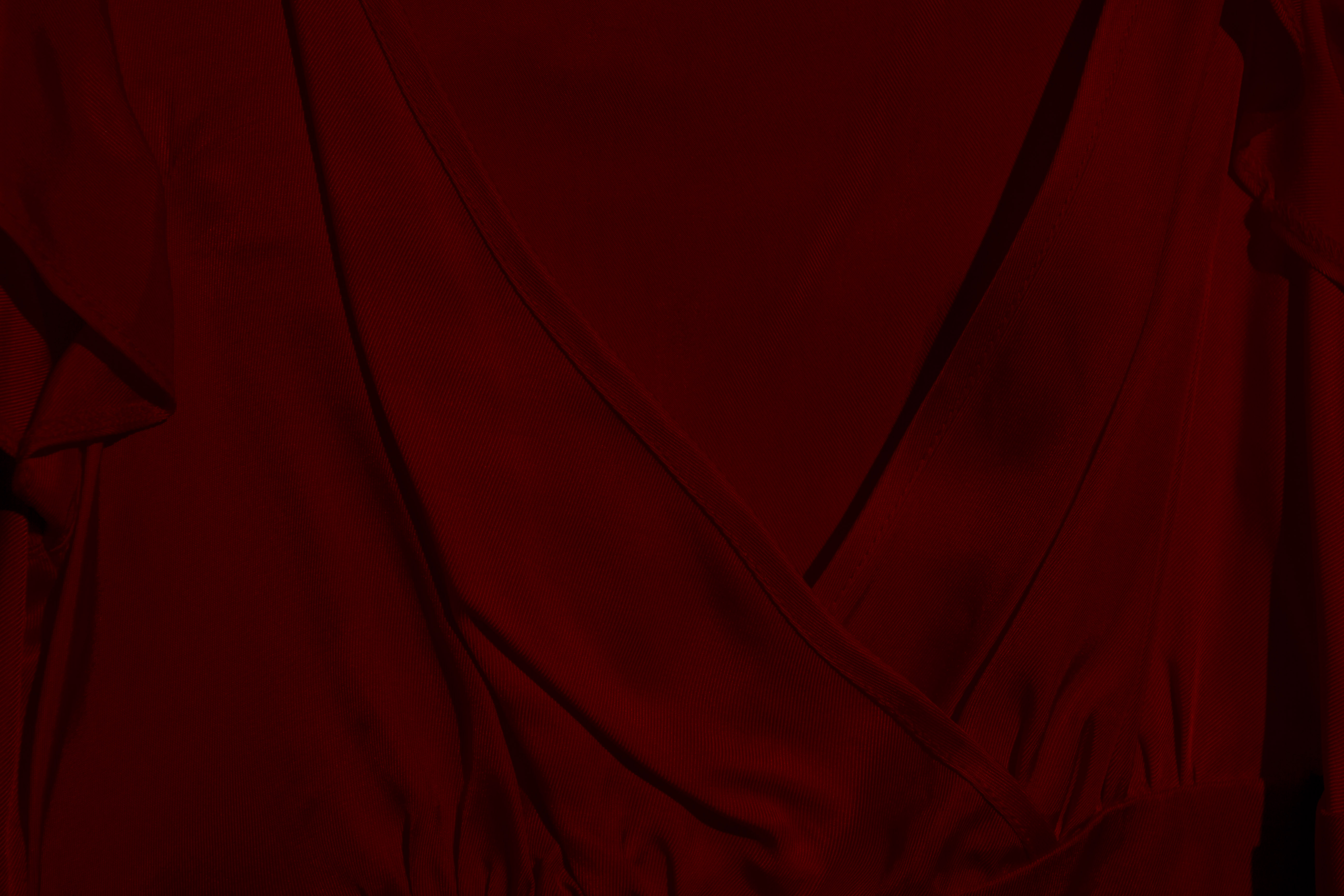
Minus 3


Minus 2


Minus 1


"Standard" exposure


Plus 1


plus 2


Plus 3


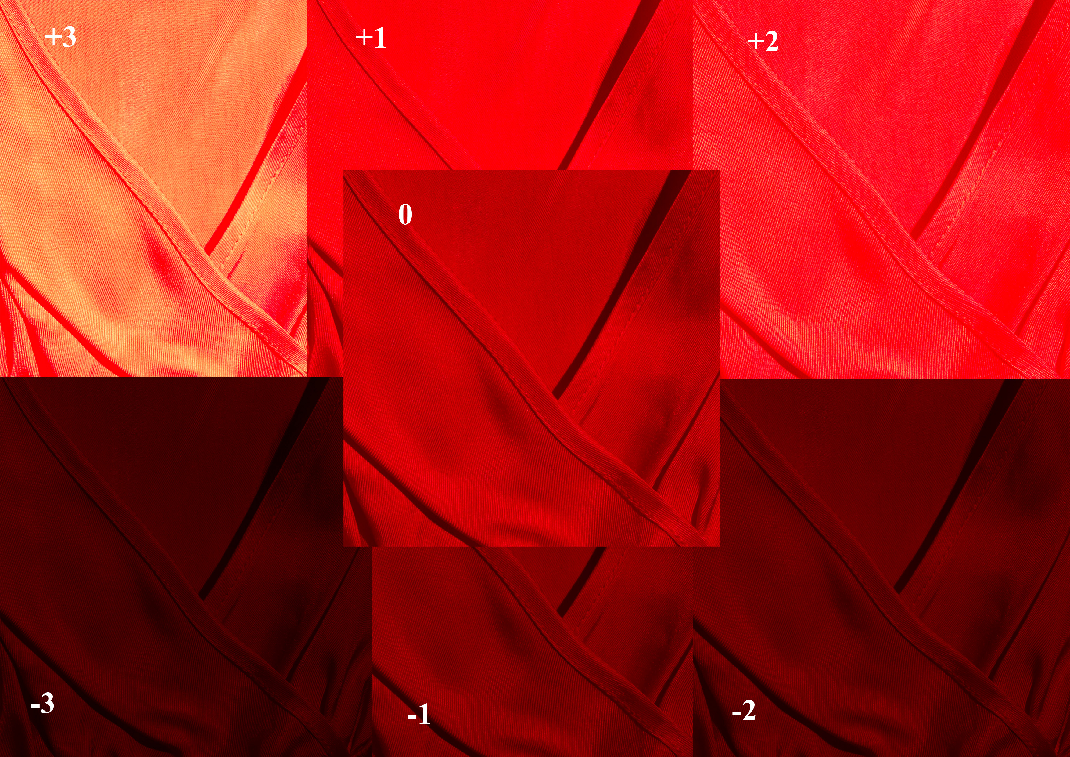
The final image in this series presents a composite of the above items. This makes it easier to compare how different exposures influence the rendering of a colour.


The "straight" image is seen in the centre. The images subject to relative over-exposure are seen in the upper half, and vary from a brighter red, through pink, to the final (+3) exposure, where the sheen of the fabric almost overpowers the true colour of the fabric.


Under exposure perhaps has a less dramatic effect, with a deeper saturation resulting in an ultimate rendering that, while dark, is still undoubtedly red.


Friday 20 January 2012

Colour wheel


Not directly related to the exercises set - but I felt like playing with colour a bit...


I looked through a fairly random selection of images I created over the years, and sought to link distinct colours within them to the tones rendered in a colour wheel  sourced from http://blulob.com/2009/03/15/the-hexadecimal-color-wheel/ Some colours were easier to find than others, which is why magenta tones are linked to a screen grab from "The Umbrellas of Cherbourg" - a film by Jaques Demy, which is notable for its vividly colourful rendering of a rainy town in northern France.


Colour wheel by Less than meets the eye
Colour wheel, a photo by Less than meets the eye on Flickr.


BLOGGER!!!! - and Flickr...

I am currently hating Blogger with some enthusiasm.

I am trying to link to my Flickr account. I have managed to do this before, but exactly the same procedure is now not working, and Blogger claims the URL is invalid.

It isn't.

I am attempting this because my free allowance for images on Picasa is becoming full, and as I have a perfectly good Flickr Pro account I can't see the point in paying more just to upload images for this blog.

I am very annoyed.


Addendum - 31st January...

It now seems that my difficulties in linking Blogger to Flickr are primarily a result in changes in the way Flickr offers to share stuff. I think I have developed a bit of a hack to the Flickr HTML which allows me to do what I want, but this has caused a lot of wasted time. Why do these things have to be so inconvenient? And how do people manage who have wasted fewer years of their lives tinkering with computers than I?
Tuesday 17 January 2012

A photo a day...

To drag my head away from the current obsession with colour, I have decided to join the ranks of those who take (and publish) a photograph every day for a year. In attempting this I am shamelessly following the example of my daughter Catherine.

I suspect that it will be a challenge to produce something of any value on many days. Work days at this time of year see me travelling in the dark at each end of the shift, and photography is not welcomed in the work environment, so there will inevitably be a sprinkling of "Another view of the bookshelves" slipping in.

Nothing ventured - nothing gained?

Here is today's offering...

Hawk of the Red Arrows landing at RAF Scampton


See the rest here...

http://www.flickr.com/photos/lessthanmeetstheeye/

Saturday 7 January 2012

Adjustment to assignment two.

It was suggested that the first image I presented, which was supposed to represent a single point dominating the composition, didn't actually work as the eye was distracted from the (I thought) dominant signpost by the presence of tree in the background. Certainly this could be the case in a monochrome rendering...


...although I feel there remains a clear distinction between the organic elements of the background and the hard industrial lines of the sign.


To explore this idea further I created an alternative image without distracting undergrowth. This was achieved with five minutes rough and ready clone stamping, so please don't look too closely.


Now the sign stands out!

First colour...

To start off the next section - which explores colour - I offer a screen grab From Derek Jarman's  stunning 1993 film, "Blue".


As AIDS progressed, Jarman's vision deteriorated, his sight dominated by blue tones.


The entire film consists of the blue screen above.

The text may be found at http://www.evanizer.com/articles/blue/index.html