|
| Blue Plus |
An over-exposed image gives a lighter, brighter blue.
 |
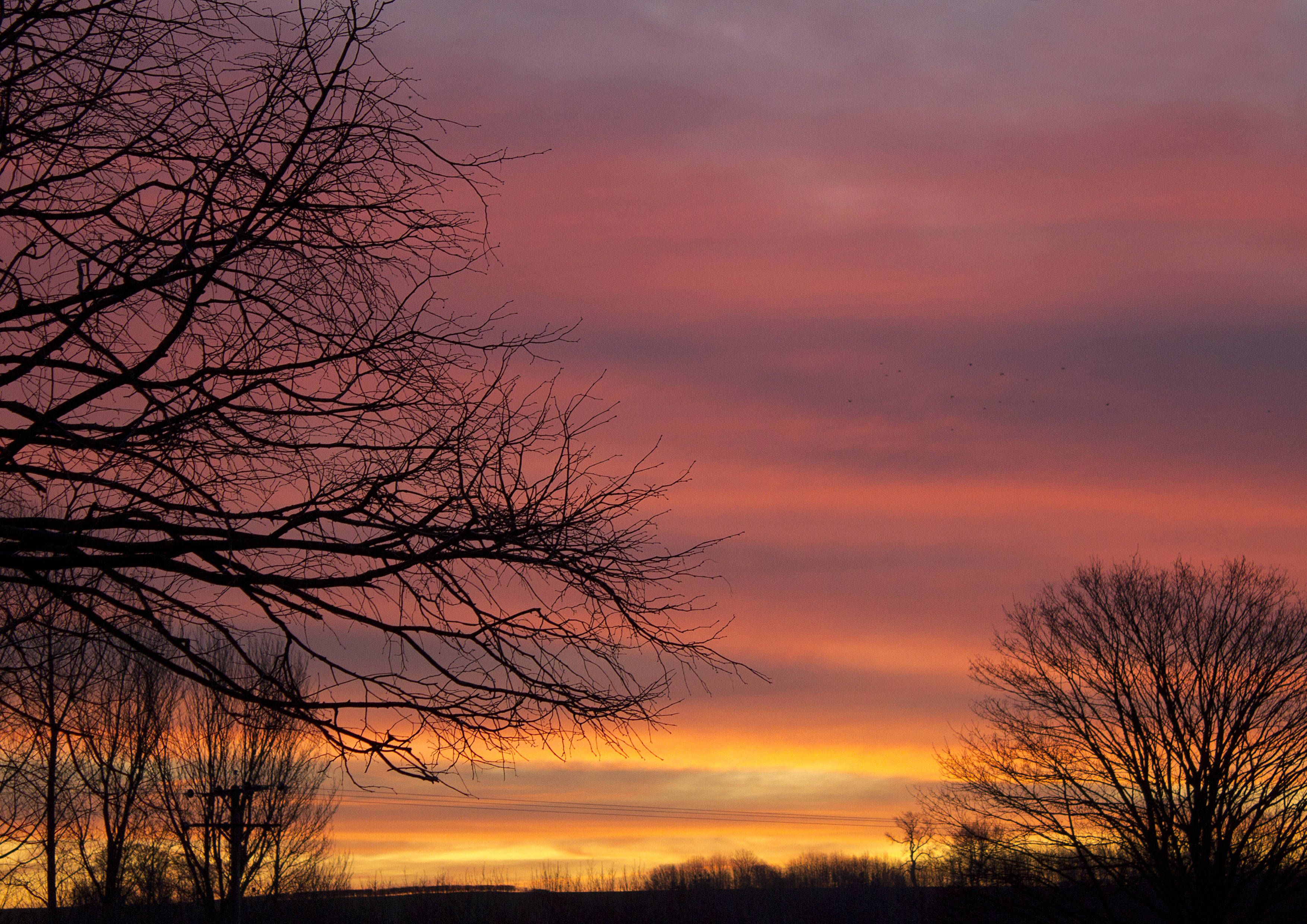
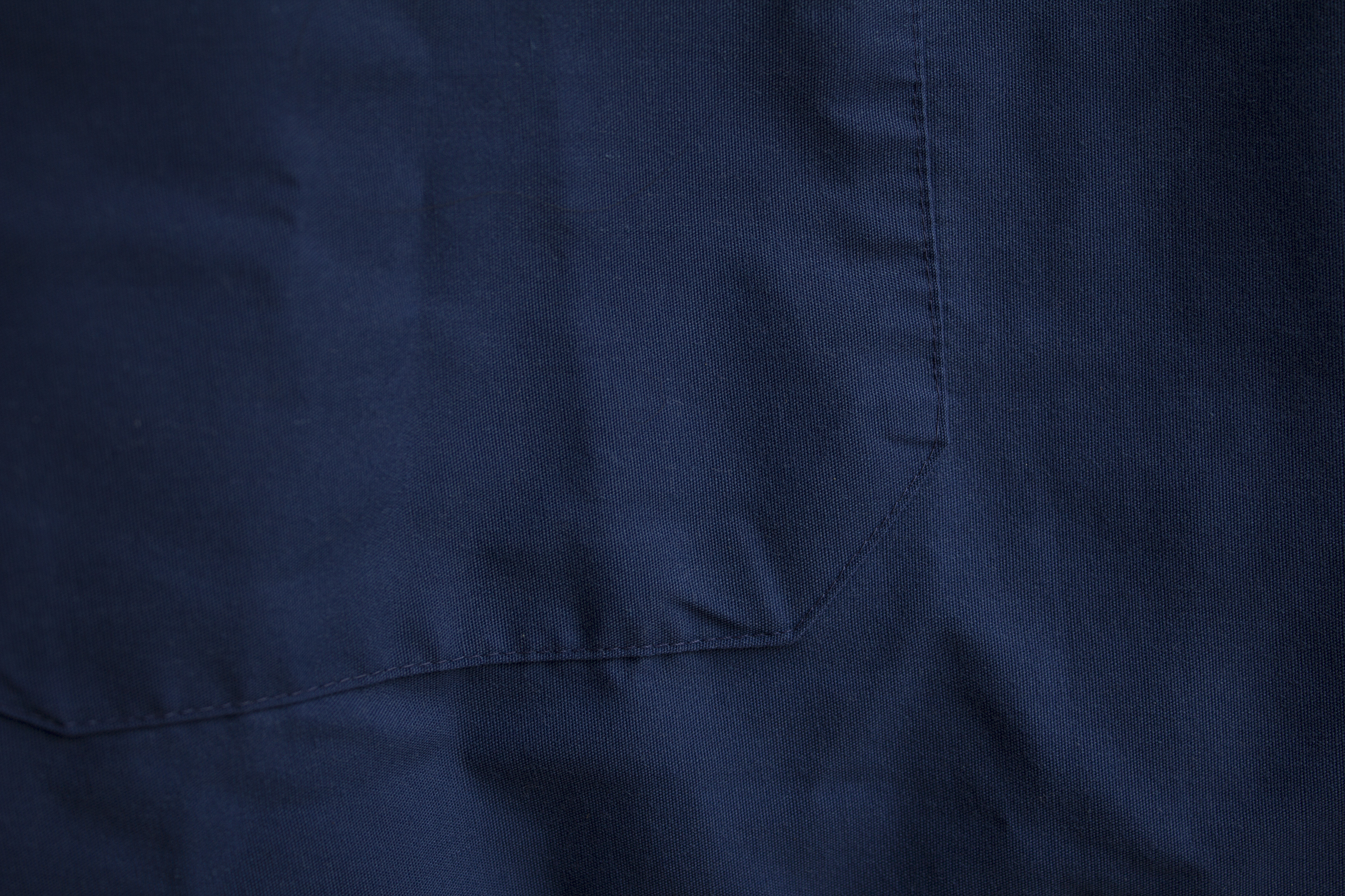
| Blue |
The straight rendering...
 |
| Blue Minus |
While under-exposure seems to offer a more purple tonality?

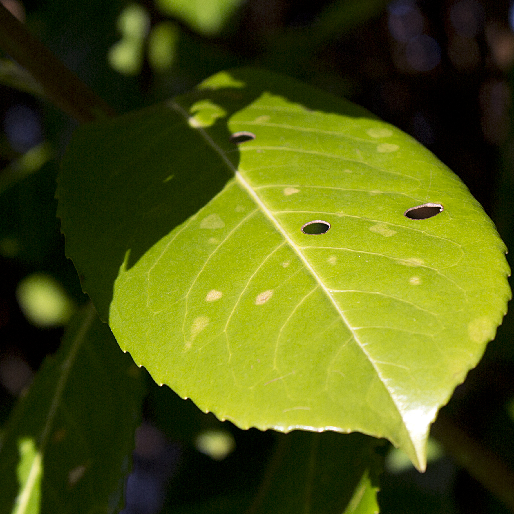 |
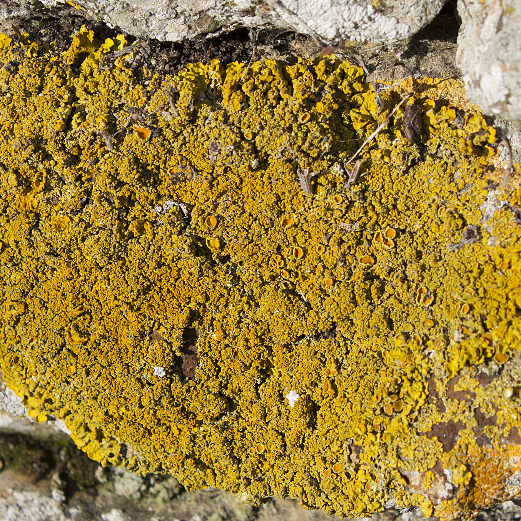
| Green Plus |
The lighter example seems to emphasise the yellow content of the leaf.
 |
| Green |
As metered...
 |
| Green Minus |
While the darker image tends towards the blue tones - green being made by combining yellow and blue in subtractive colour mixing.
I am starting to think that varying the exposure of a colour has the effect of shuffling it around the circumference of the colour wheel a bit. In reference to the wheel above it seems that the darker images tend to move the tone clockwise around the wheel...
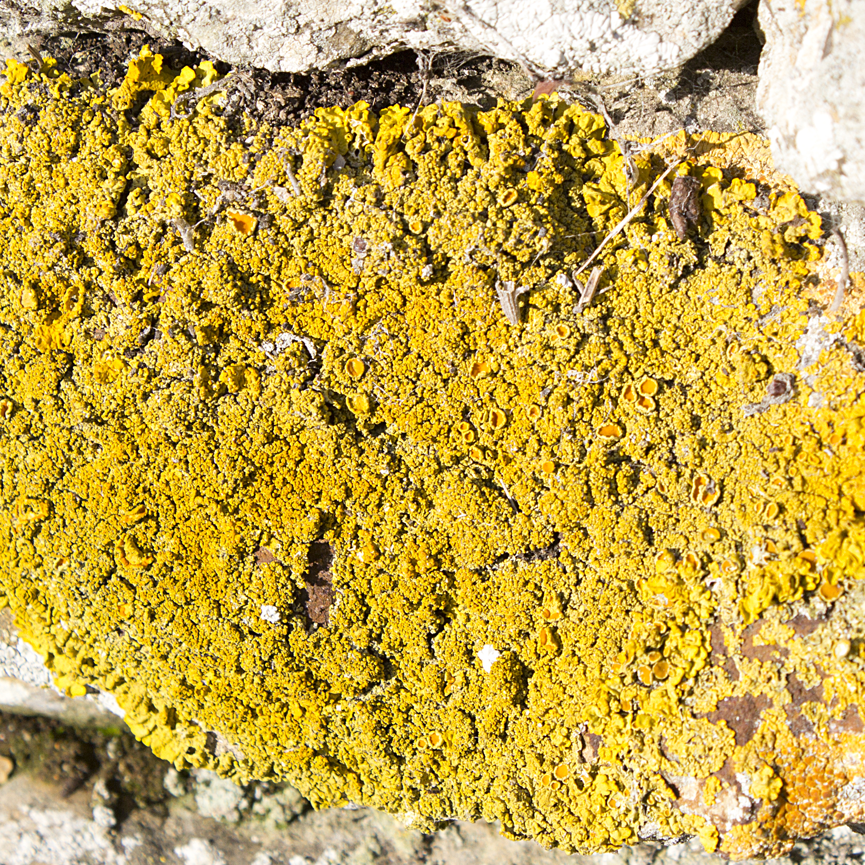 |
| Yellow Plus |
But the brighter yellow seen above would appear to lie between -
 |
| Yellow |
the slightly orange tones here-
 |
| Yellow Minus |
and the duller, almost greenish rendering here.
I wonder if part of the problem in understanding what is happening here is that the visible spectrum does not "chase its tail" into a circle to form a colour wheel, but in fact is just a small slice from the much wider, linear electromagnetic spectrum?

Image from http://premediablog.widen.com/blog/the-color-space/call-me-mr-biv-v1
 |
| Orange Plus |
A strong orange becomes more yellow in over-exposure.
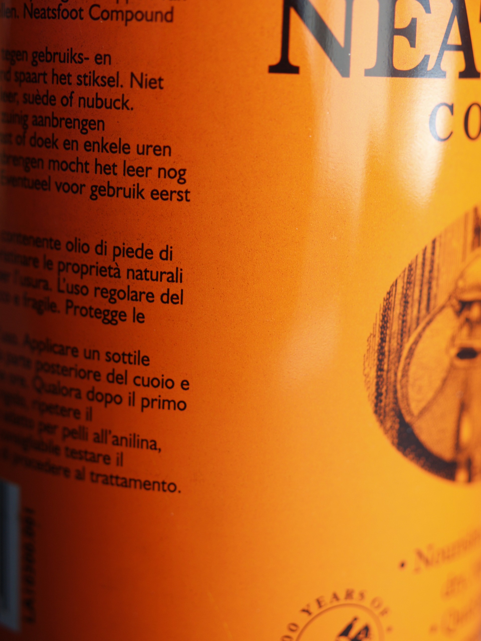 |
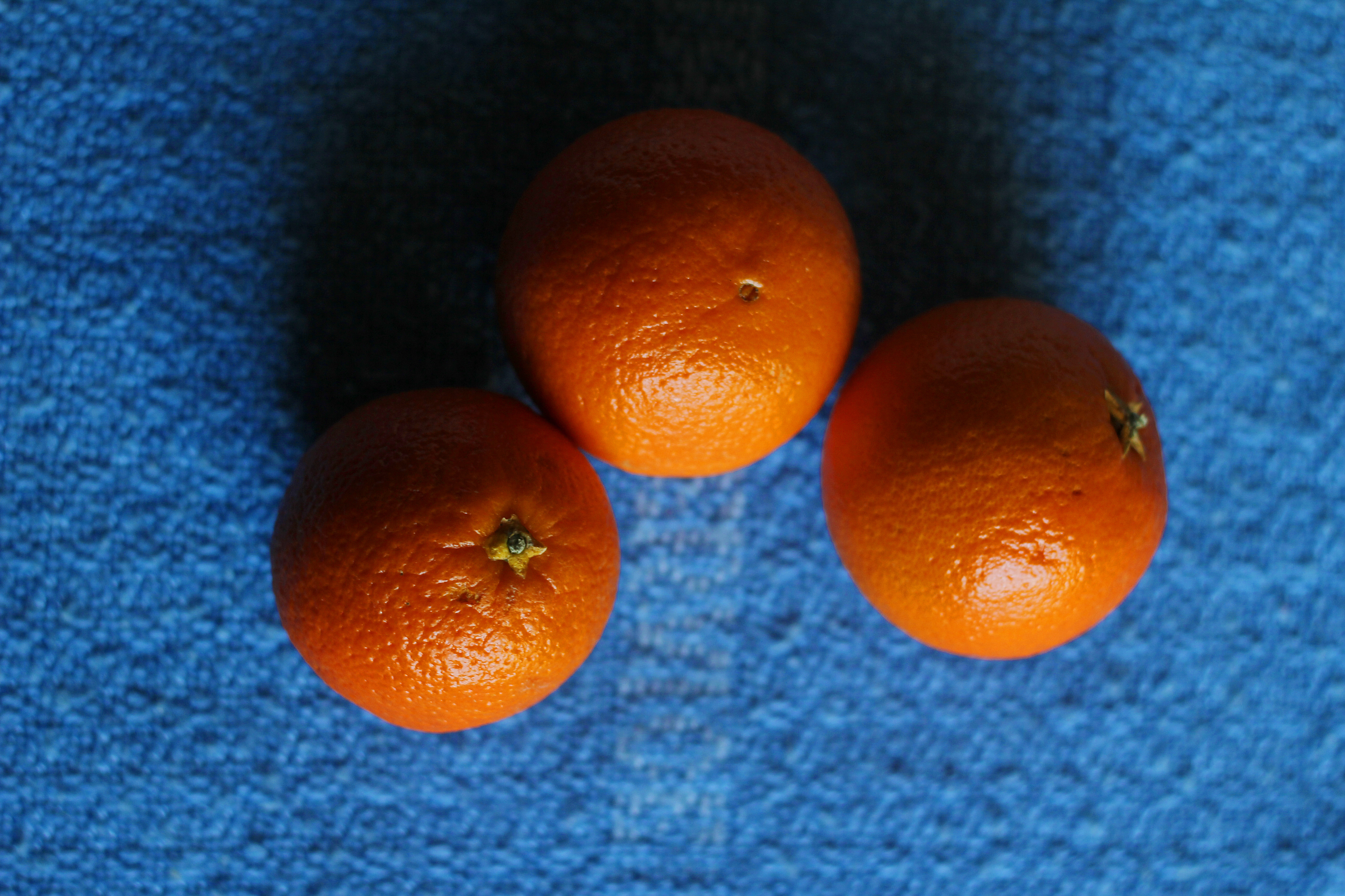
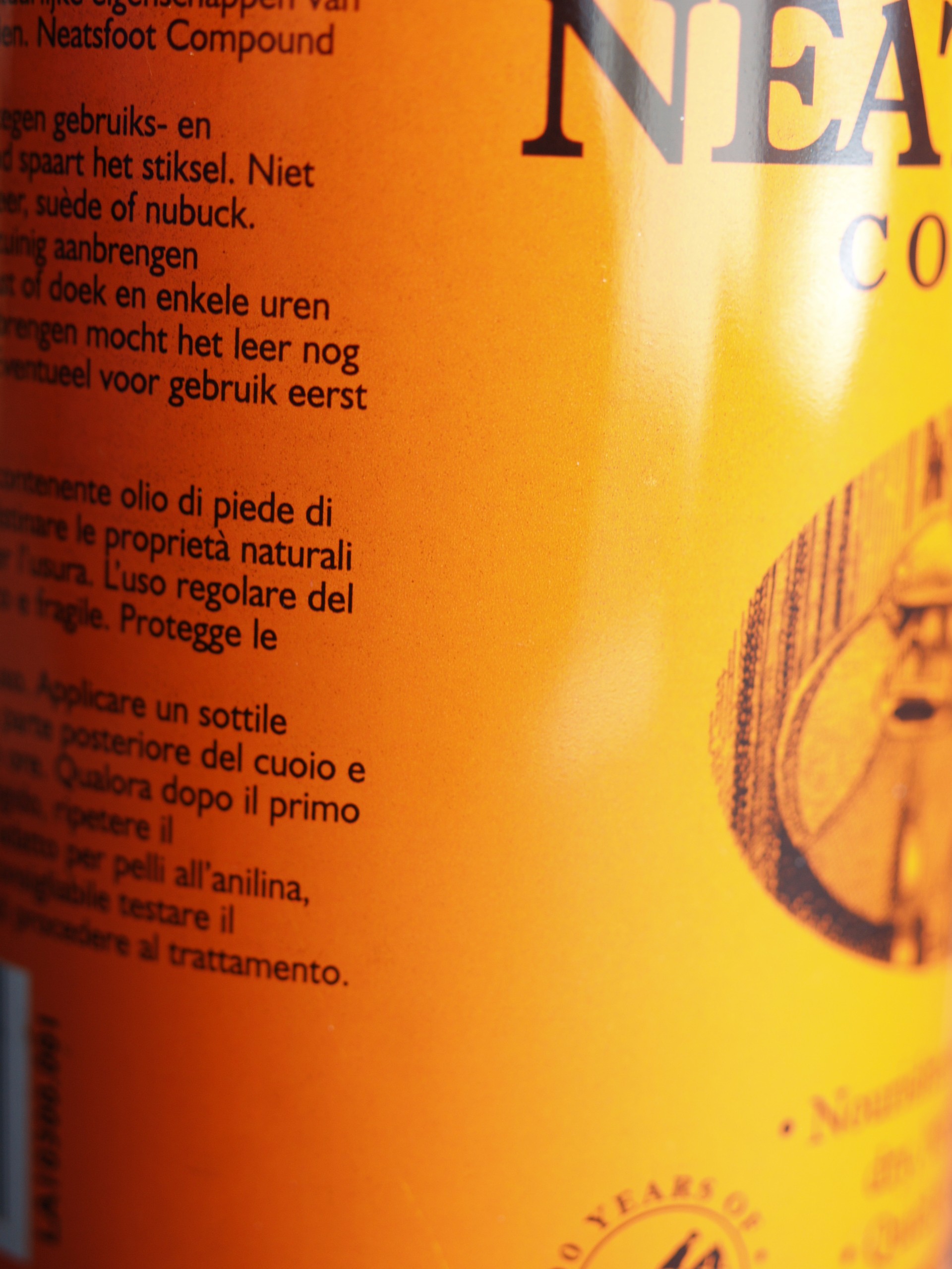
| Orange |
The can is lit from the right, so each image has an exposure which varies from left to right - one may consider the changes as effectively rotating the field of view around the axis of the cylinder.
 |
| Orange Minus |
 |
| Red Plus |
An over exposed red looks rather pink.
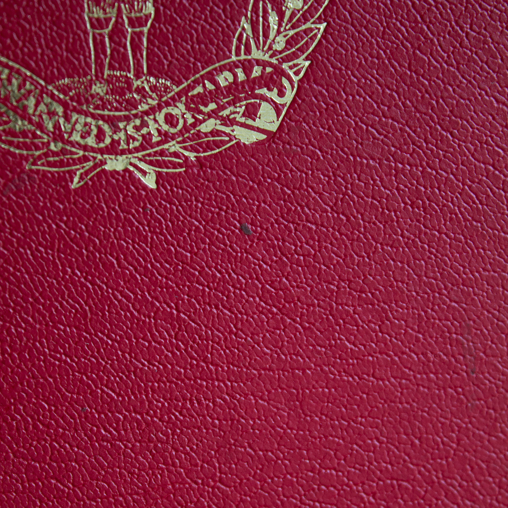 |
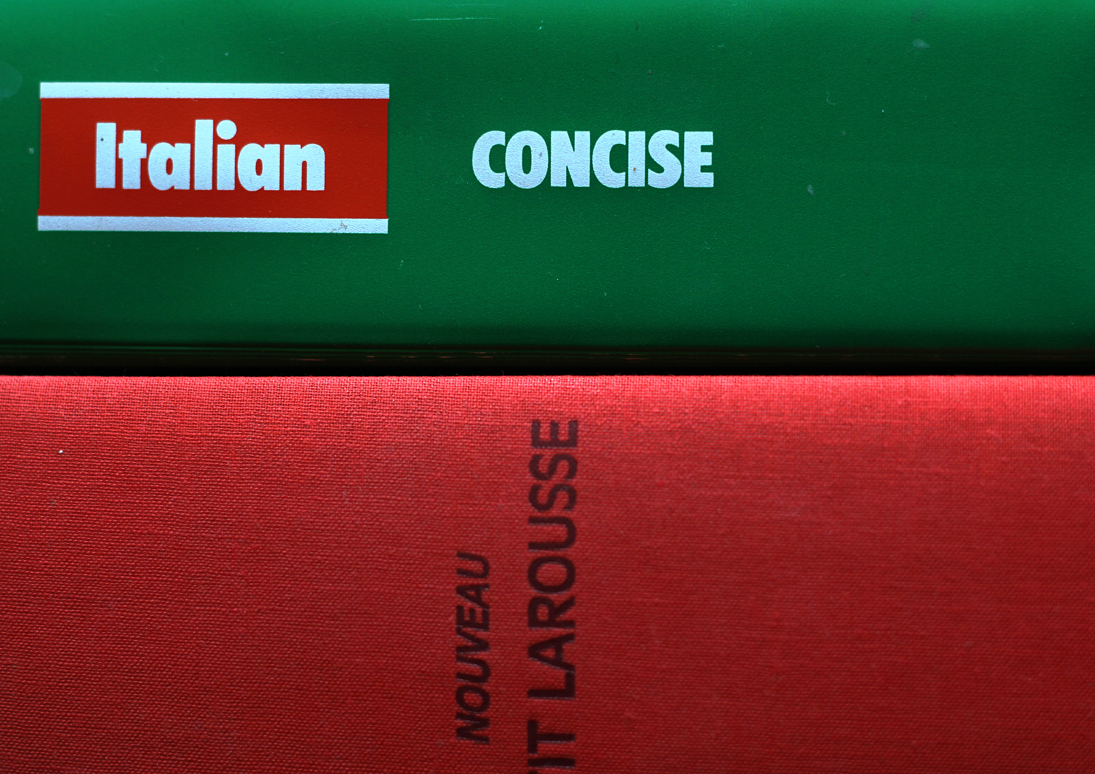
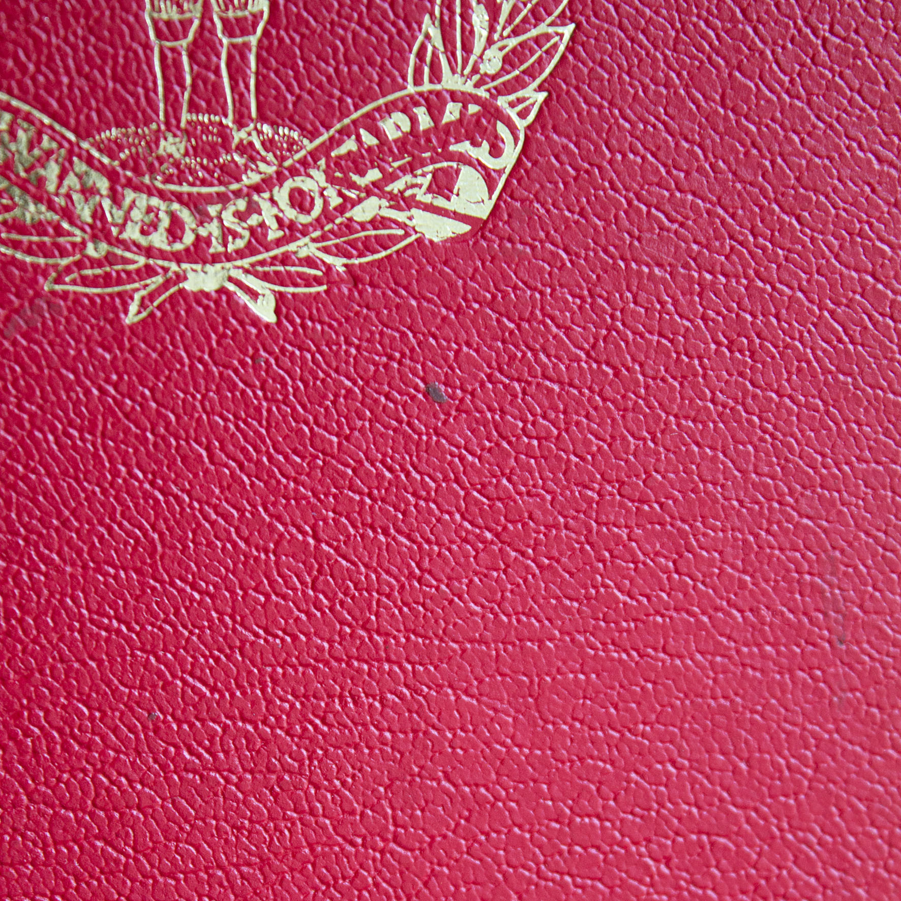
| Red |
A red book...
 |
| Red Minus |
The darker version looks a little purple, compared with the ones above.
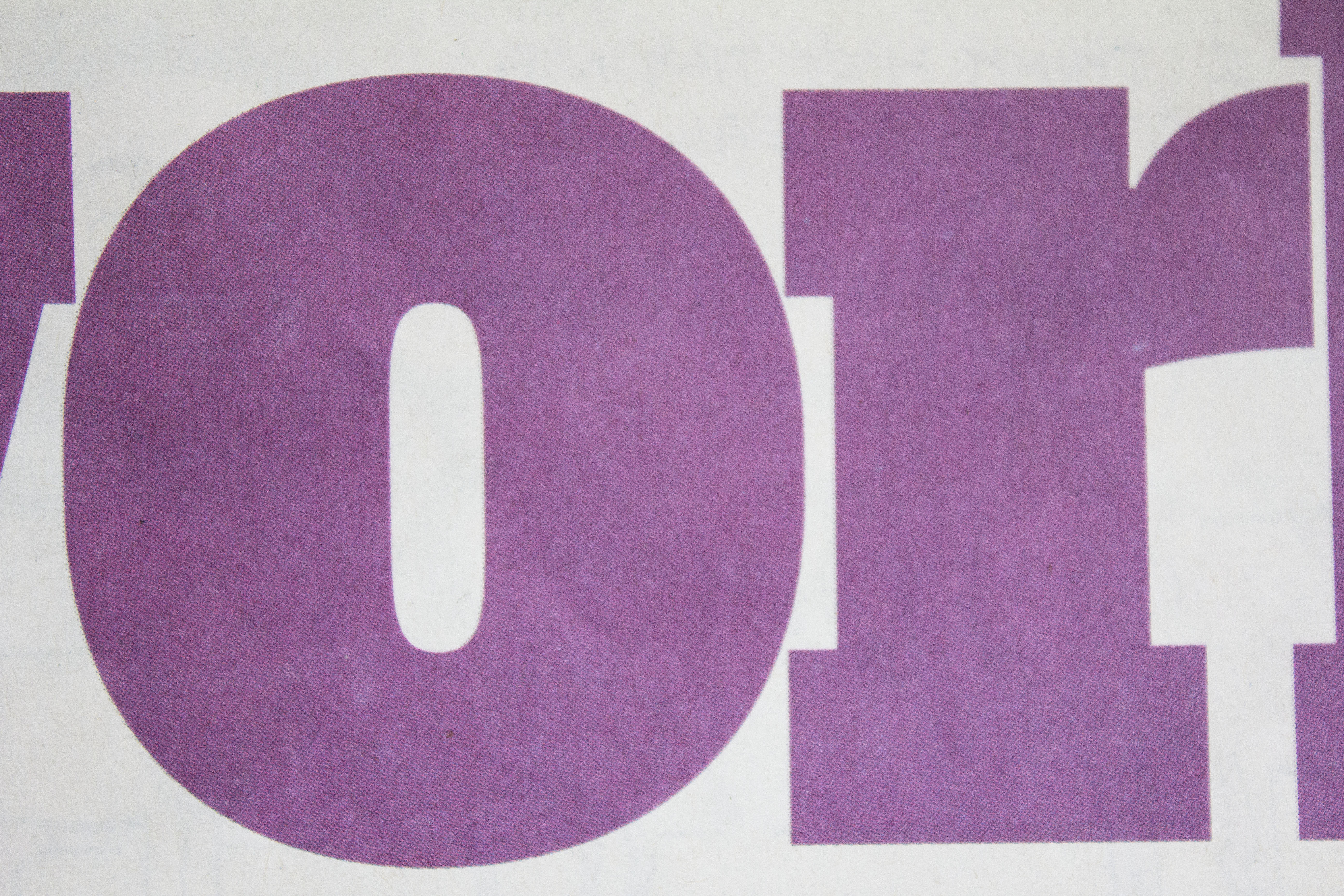 |
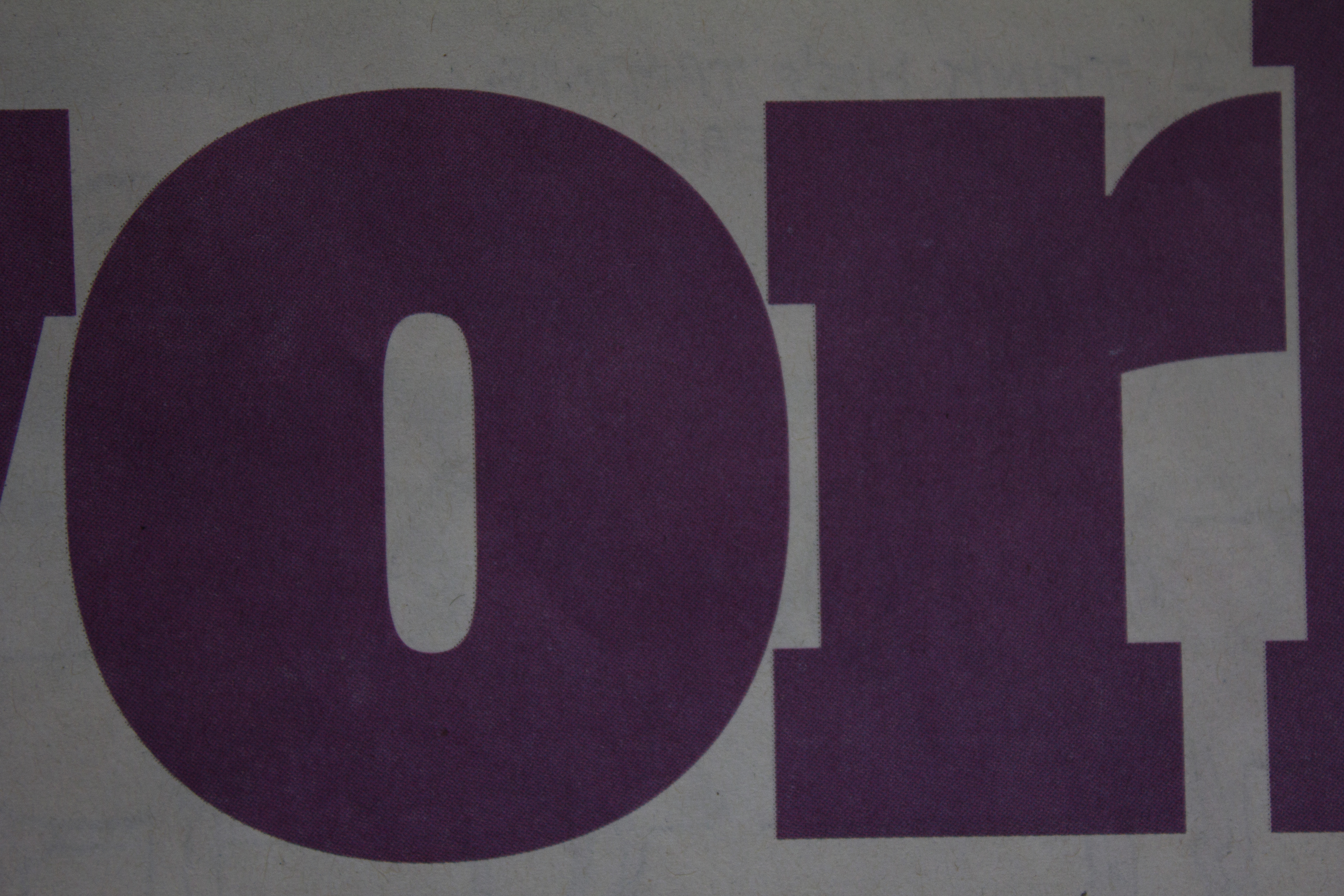
| Magenta Plus |
These three are of interest in demonstrating the influence of the surface we are looking at. The purple text is printed on relatively rough newsprint, from The Guardian newspaper, which is why all three appear rather dull and poorly saturated. The texture of the paper scatters reflected light giving the effect seen. This is why photographs reproduce better on glossy, coated (more expensive) papers.
 |
| Magenta |
The "straight" image, and the darker one below also show the effect of exposure variations on the background as well as the colour we are interested in. The "white" newsprint becomes positively grey as the exposure darkens.
 |
| Magenta Minus |