Please go to http://ratheskin.wordpress.com/ for the further adventures of this blog.
Thank-you.
Wednesday 30 May 2012

Friday 9 March 2012
Primary and secondary colours
This exercise will present a series of images representing each of the primary and secondary colours. Each example has been recorded at the default "correct" meter reading of the camera, but also with relative under and over exposure to explore how the colour rendering varies.
An over-exposed image gives a lighter, brighter blue.
The straight rendering...
While under-exposure seems to offer a more purple tonality?

The lighter example seems to emphasise the yellow content of the leaf.
As metered...
While the darker image tends towards the blue tones - green being made by combining yellow and blue in subtractive colour mixing.

I am starting to think that varying the exposure of a colour has the effect of shuffling it around the circumference of the colour wheel a bit. In reference to the wheel above it seems that the darker images tend to move the tone clockwise around the wheel...
But the brighter yellow seen above would appear to lie between -
the slightly orange tones here-
and the duller, almost greenish rendering here.
I wonder if part of the problem in understanding what is happening here is that the visible spectrum does not "chase its tail" into a circle to form a colour wheel, but in fact is just a small slice from the much wider, linear electromagnetic spectrum?

Image from http://premediablog.widen.com/blog/the-color-space/call-me-mr-biv-v1
A strong orange becomes more yellow in over-exposure.
The can is lit from the right, so each image has an exposure which varies from left to right - one may consider the changes as effectively rotating the field of view around the axis of the cylinder.
An over exposed red looks rather pink.
A red book...
The darker version looks a little purple, compared with the ones above.
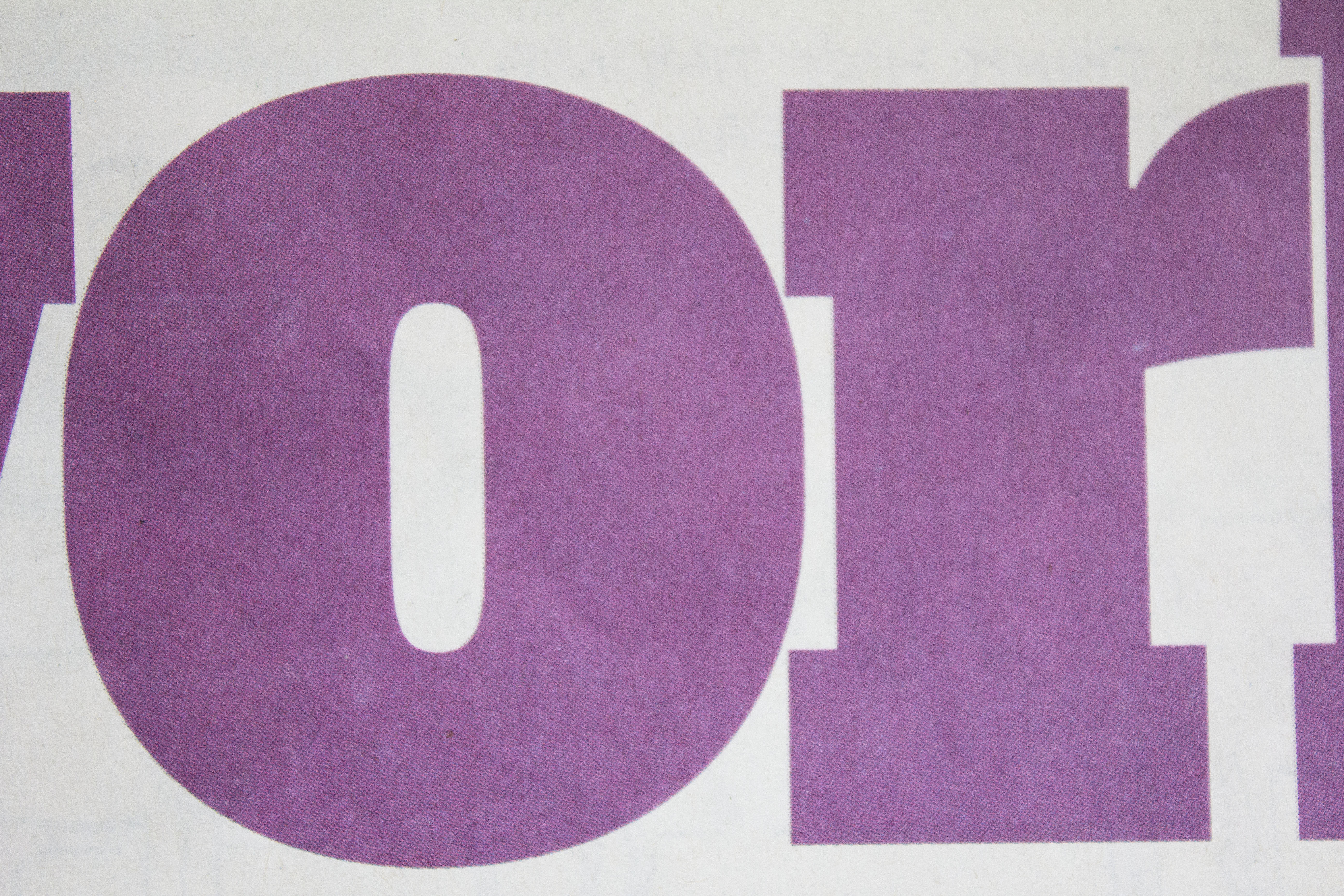
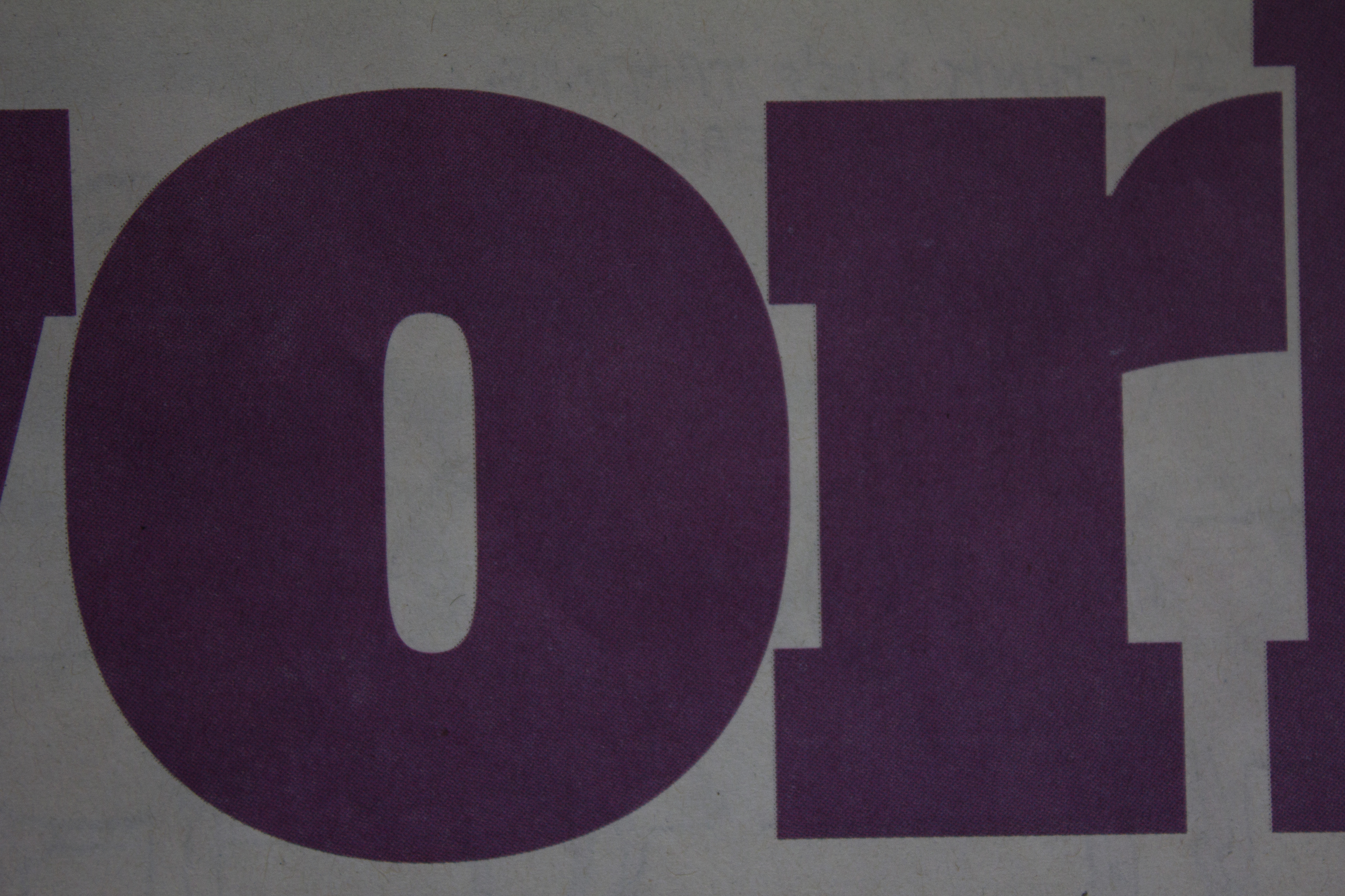
These three are of interest in demonstrating the influence of the surface we are looking at. The purple text is printed on relatively rough newsprint, from The Guardian newspaper, which is why all three appear rather dull and poorly saturated. The texture of the paper scatters reflected light giving the effect seen. This is why photographs reproduce better on glossy, coated (more expensive) papers.
The "straight" image, and the darker one below also show the effect of exposure variations on the background as well as the colour we are interested in. The "white" newsprint becomes positively grey as the exposure darkens.
 |
| Blue Plus |
An over-exposed image gives a lighter, brighter blue.
 |
| Blue |
The straight rendering...
 |
| Blue Minus |
While under-exposure seems to offer a more purple tonality?
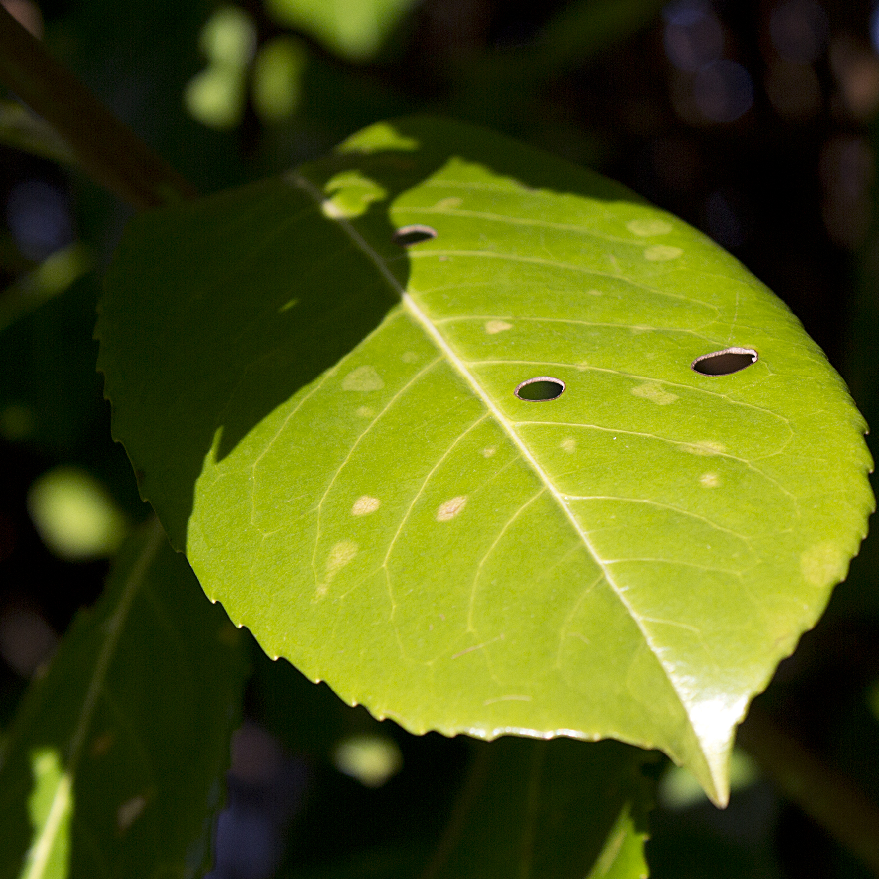 |
| Green Plus |
The lighter example seems to emphasise the yellow content of the leaf.
 |
| Green |
As metered...
 |
| Green Minus |
While the darker image tends towards the blue tones - green being made by combining yellow and blue in subtractive colour mixing.
I am starting to think that varying the exposure of a colour has the effect of shuffling it around the circumference of the colour wheel a bit. In reference to the wheel above it seems that the darker images tend to move the tone clockwise around the wheel...
 |
| Yellow Plus |
But the brighter yellow seen above would appear to lie between -
 |
| Yellow |
the slightly orange tones here-
 |
| Yellow Minus |
and the duller, almost greenish rendering here.
I wonder if part of the problem in understanding what is happening here is that the visible spectrum does not "chase its tail" into a circle to form a colour wheel, but in fact is just a small slice from the much wider, linear electromagnetic spectrum?

Image from http://premediablog.widen.com/blog/the-color-space/call-me-mr-biv-v1
 |
| Orange Plus |
A strong orange becomes more yellow in over-exposure.
 |
| Orange |
The can is lit from the right, so each image has an exposure which varies from left to right - one may consider the changes as effectively rotating the field of view around the axis of the cylinder.
 |
| Orange Minus |
 |
| Red Plus |
An over exposed red looks rather pink.
 |
| Red |
A red book...
 |
| Red Minus |
The darker version looks a little purple, compared with the ones above.
 |
| Magenta Plus |
These three are of interest in demonstrating the influence of the surface we are looking at. The purple text is printed on relatively rough newsprint, from The Guardian newspaper, which is why all three appear rather dull and poorly saturated. The texture of the paper scatters reflected light giving the effect seen. This is why photographs reproduce better on glossy, coated (more expensive) papers.
 |
| Magenta |
The "straight" image, and the darker one below also show the effect of exposure variations on the background as well as the colour we are interested in. The "white" newsprint becomes positively grey as the exposure darkens.
 |
| Magenta Minus |
Colour Relationships
The first images in the section demonstrate combinations of primary and secondary colours, seeking to present them in the proportions proposed by Von Goethe in his Theory of Colours (1810), thus making allowance for the relative brightness of each hue.
The one to one ratio is readily achieved here, a touch more of the red book being balanced by the title panel of the green one.
Orange is supposed to have a relative value of 8, compared with the 4 of blue. This example therefore has a larger area of blue background to balance the brighter oranges.
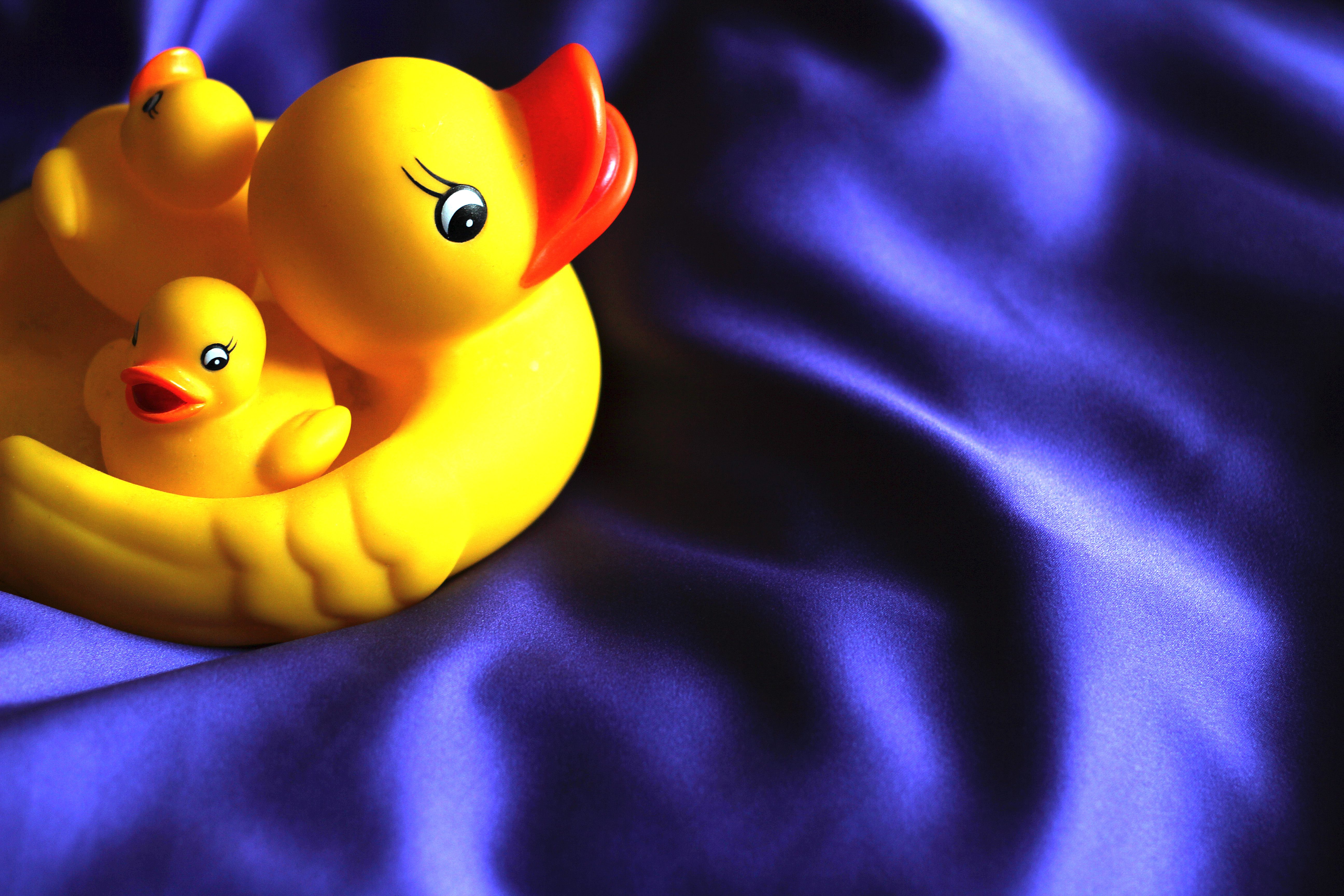
Yellow is clearly the brighter here. Von Goethe ascribes it a value of 9, while violet is 3. The duck occupies about a quarter of the image, which gives proportions of around 1 to 3. This does seem to give a pleasing balance to the different elements of this composition.
 |
| Red - Green |
The one to one ratio is readily achieved here, a touch more of the red book being balanced by the title panel of the green one.
 |
| Orange - Blue |
Orange is supposed to have a relative value of 8, compared with the 4 of blue. This example therefore has a larger area of blue background to balance the brighter oranges.
 |
| Yellow - Violet |
Yellow is clearly the brighter here. Von Goethe ascribes it a value of 9, while violet is 3. The duck occupies about a quarter of the image, which gives proportions of around 1 to 3. This does seem to give a pleasing balance to the different elements of this composition.
And now the really hard bit - choosing colour combinations that "appeal" to me!
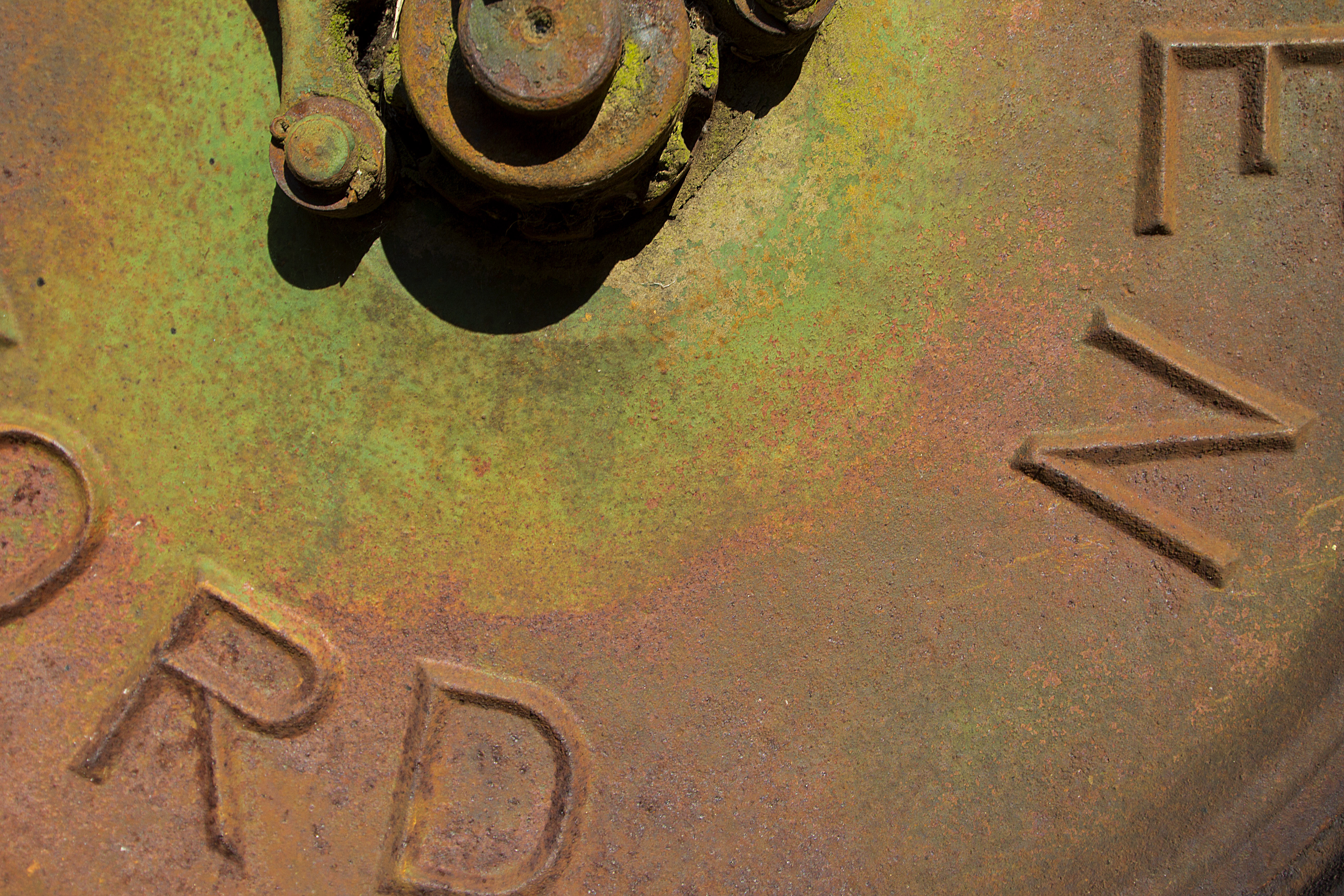
I find the colour in this image pleasing because of the relatively understated and muted tones. It is essentially composed with greens contrasted with rust tones derived from the orange end of the spectrum. I terms of balance there is perhaps a preponderance of the warmer rusts, but I think this is compensated by the clearer and more vivid nature of the greens.
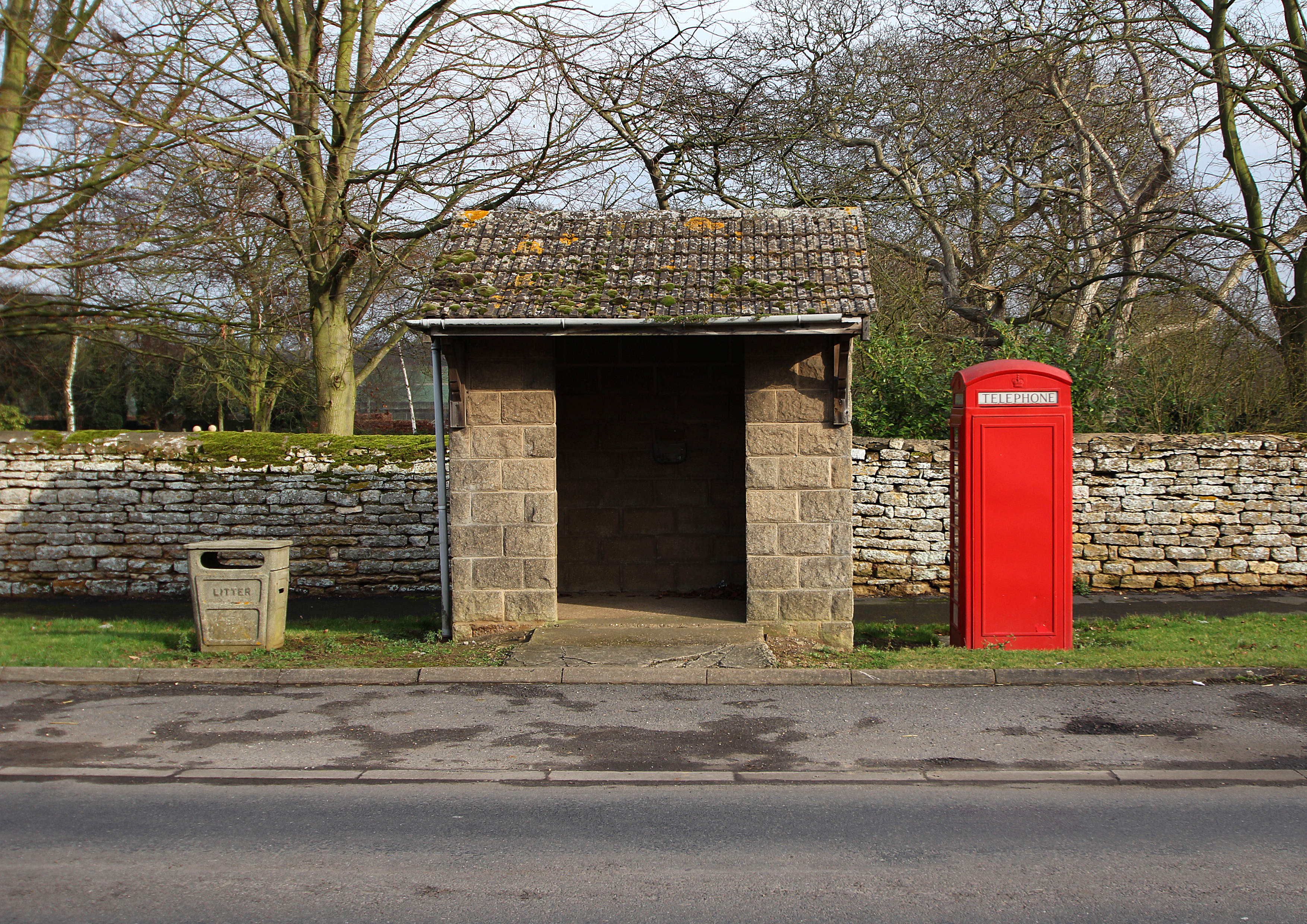
Ignore the box. The rest of this scene contains quite a lot of green, with some warmer tones to the stone and tile, with a delicate blue sky behind; the road surface is largely blueish. And then we have the box - an extremely positive statement in a red bright enough to dominate everything else. I think this could demonstrate that Goethe's theories of relative colour values apply best when the colours are of similar purity and saturation?
A similar, but less dramatic example. The colours here are again largely greens and browns, with snow providing areas of neutrality. An accent is provided by the surprisingly bright orange buds. The large bud in the centre immediately catches the eye, but then we see others dotted around the rest of the image.
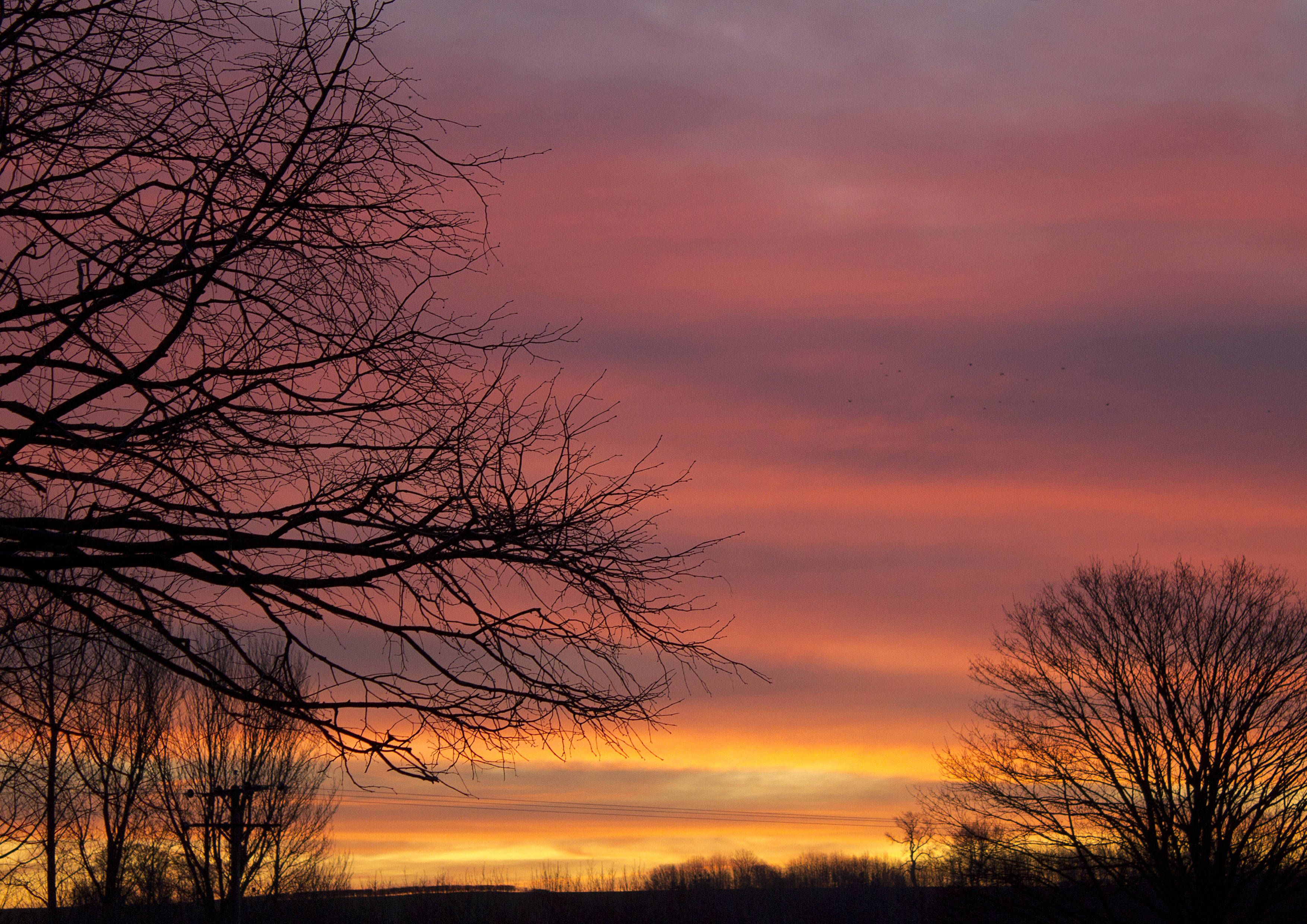
The colour in this example has not been enhanced in Photoshop. It was one of those truly vivid, if fleeting moments when the sky was afire... However, the camera (photographer) is selective in what is revealed - the image below was taken with an 18mm focal length, the one above at 55mm. The broader picture is a little less Turneresque...
 |
| Wheel of Allen Scythe |
I find the colour in this image pleasing because of the relatively understated and muted tones. It is essentially composed with greens contrasted with rust tones derived from the orange end of the spectrum. I terms of balance there is perhaps a preponderance of the warmer rusts, but I think this is compensated by the clearer and more vivid nature of the greens.
 |
| Facilities in Cammeringham |
Ignore the box. The rest of this scene contains quite a lot of green, with some warmer tones to the stone and tile, with a delicate blue sky behind; the road surface is largely blueish. And then we have the box - an extremely positive statement in a red bright enough to dominate everything else. I think this could demonstrate that Goethe's theories of relative colour values apply best when the colours are of similar purity and saturation?
 |
| Pine buds |
A similar, but less dramatic example. The colours here are again largely greens and browns, with snow providing areas of neutrality. An accent is provided by the surprisingly bright orange buds. The large bud in the centre immediately catches the eye, but then we see others dotted around the rest of the image.
 |
| Sunrise, 7:53 AM, 17th January |
The colour in this example has not been enhanced in Photoshop. It was one of those truly vivid, if fleeting moments when the sky was afire... However, the camera (photographer) is selective in what is revealed - the image below was taken with an 18mm focal length, the one above at 55mm. The broader picture is a little less Turneresque...
 |
| Sunrise, 7:54 AM, 17th January |
Tuesday 28 February 2012
Black and white conversion
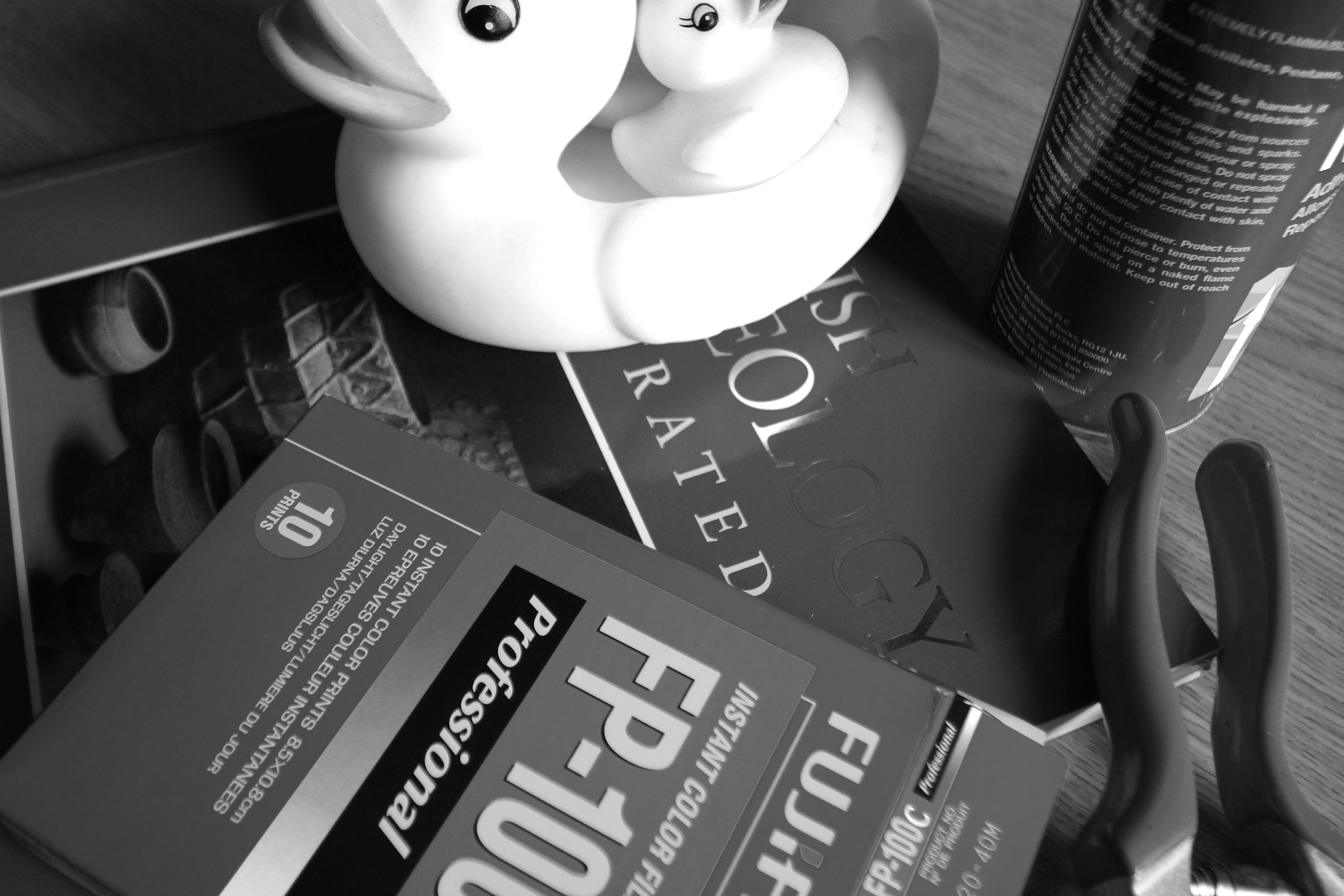
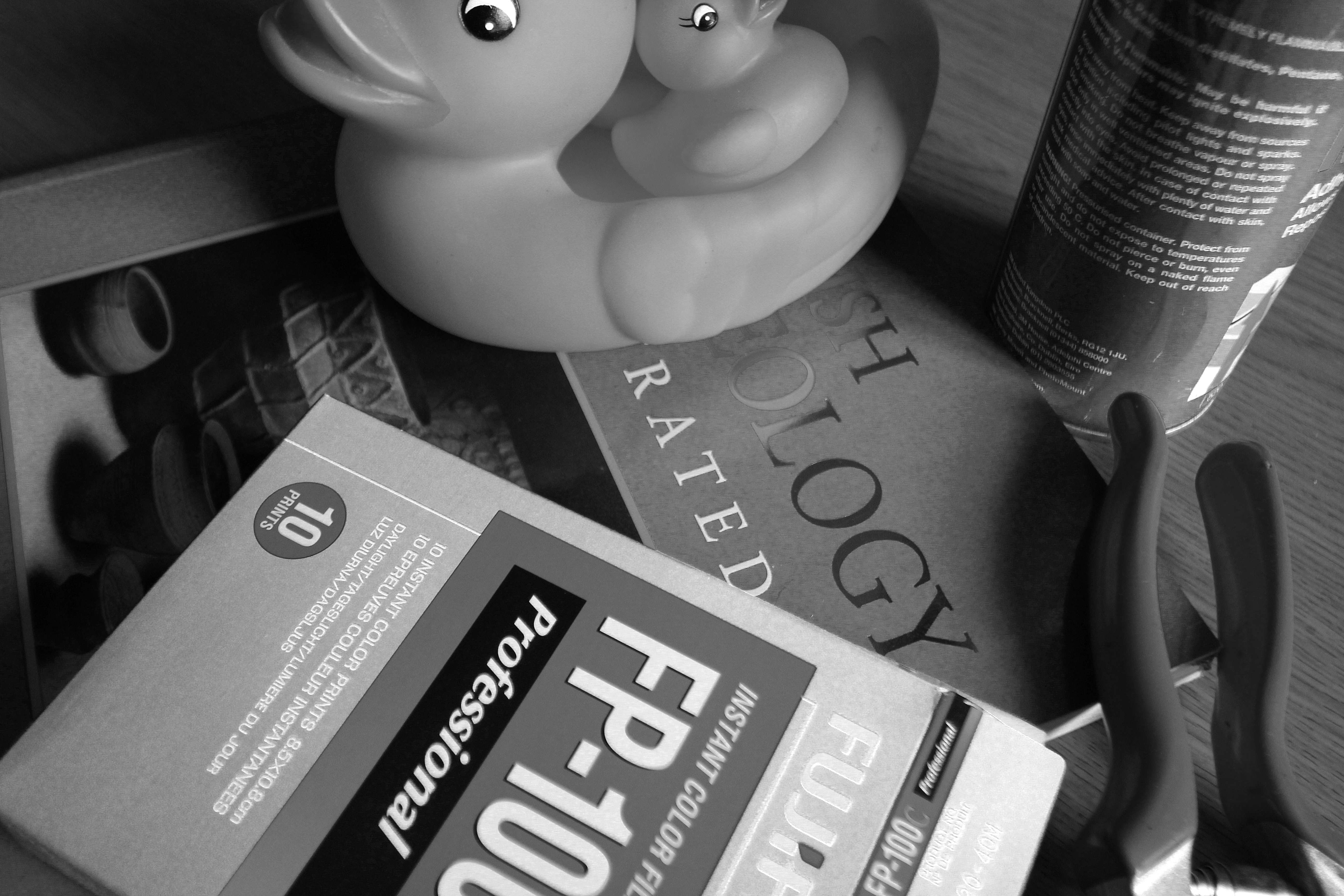
This series of exercises will explore the contribution of different colours to a monochrome composition, and demonstrate how the end result can be manipulated. The starting point is the image below, a thoroughly artificial arrangement which was assembled to present clear bold areas of strong colour. The original will be manipulated into black and white in Photoshop CS5, then further adjusted with respect to the individual colour elements.
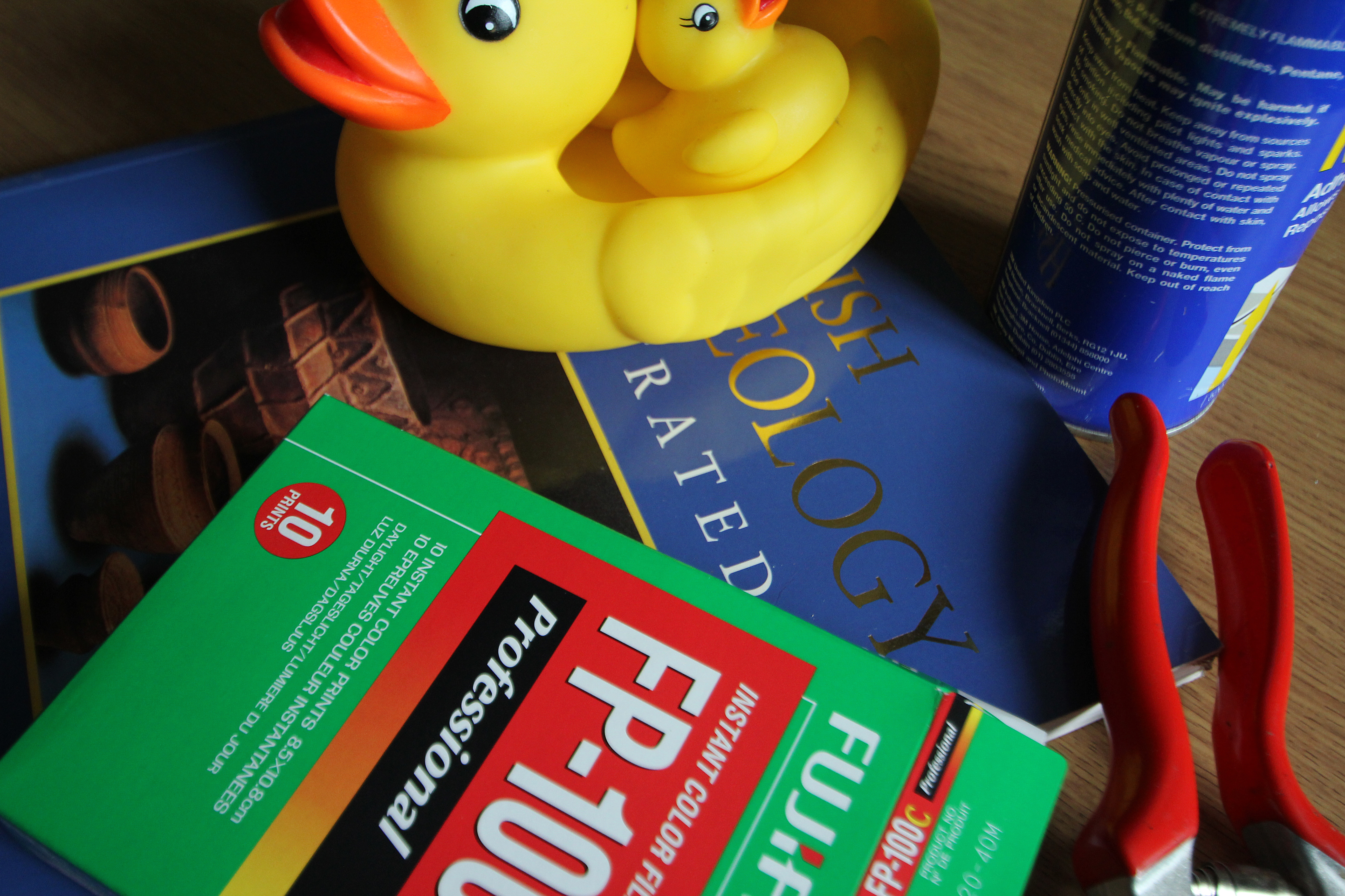
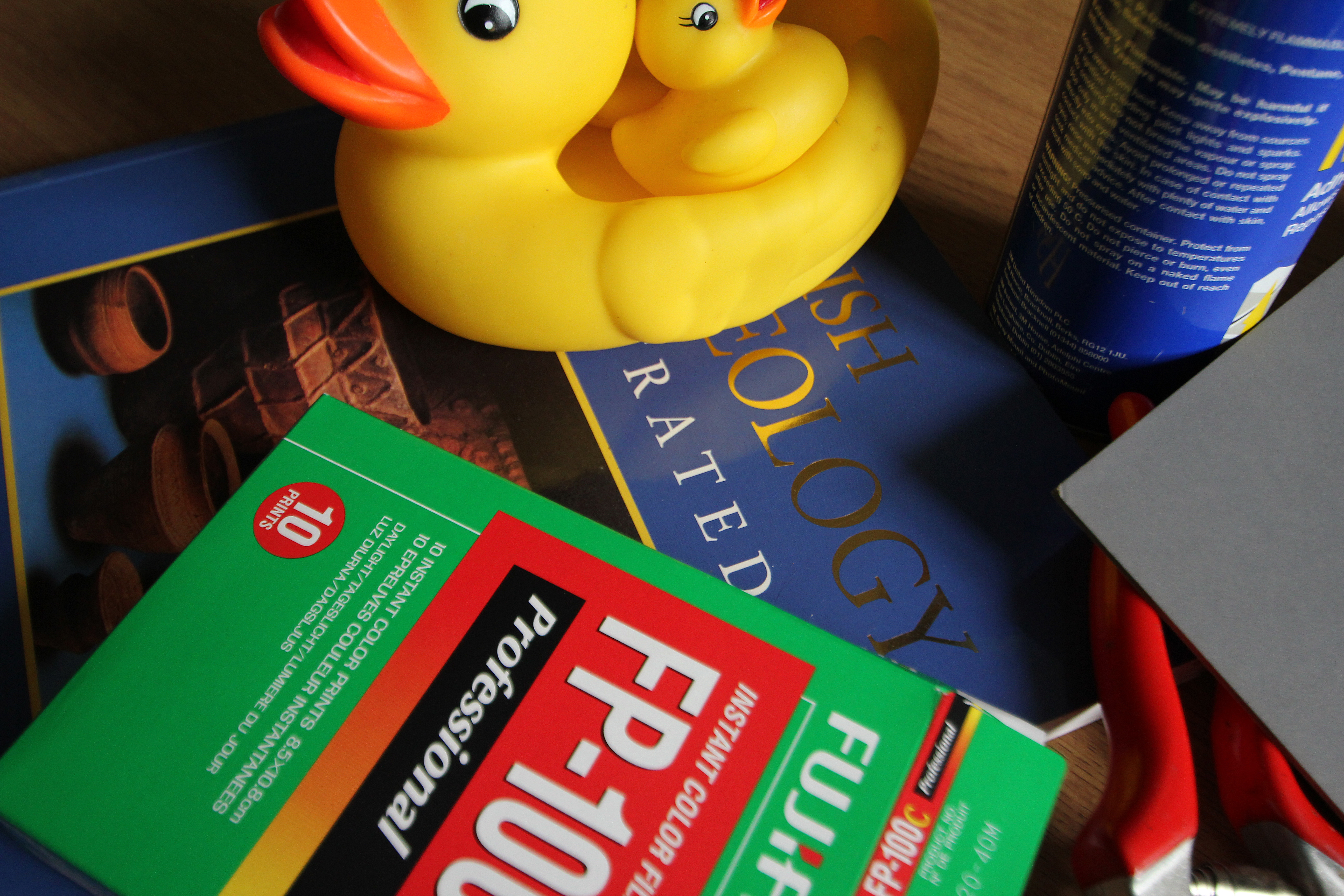
This version includes a corner of a Kodak 18% grey card, and was used to assess how the automatic white-balance function of the camera rendered the scene. It was found that the difference between the image as shot and a "corrected" version produced in Photoshop with the grey card as a reference point was imperceptible.
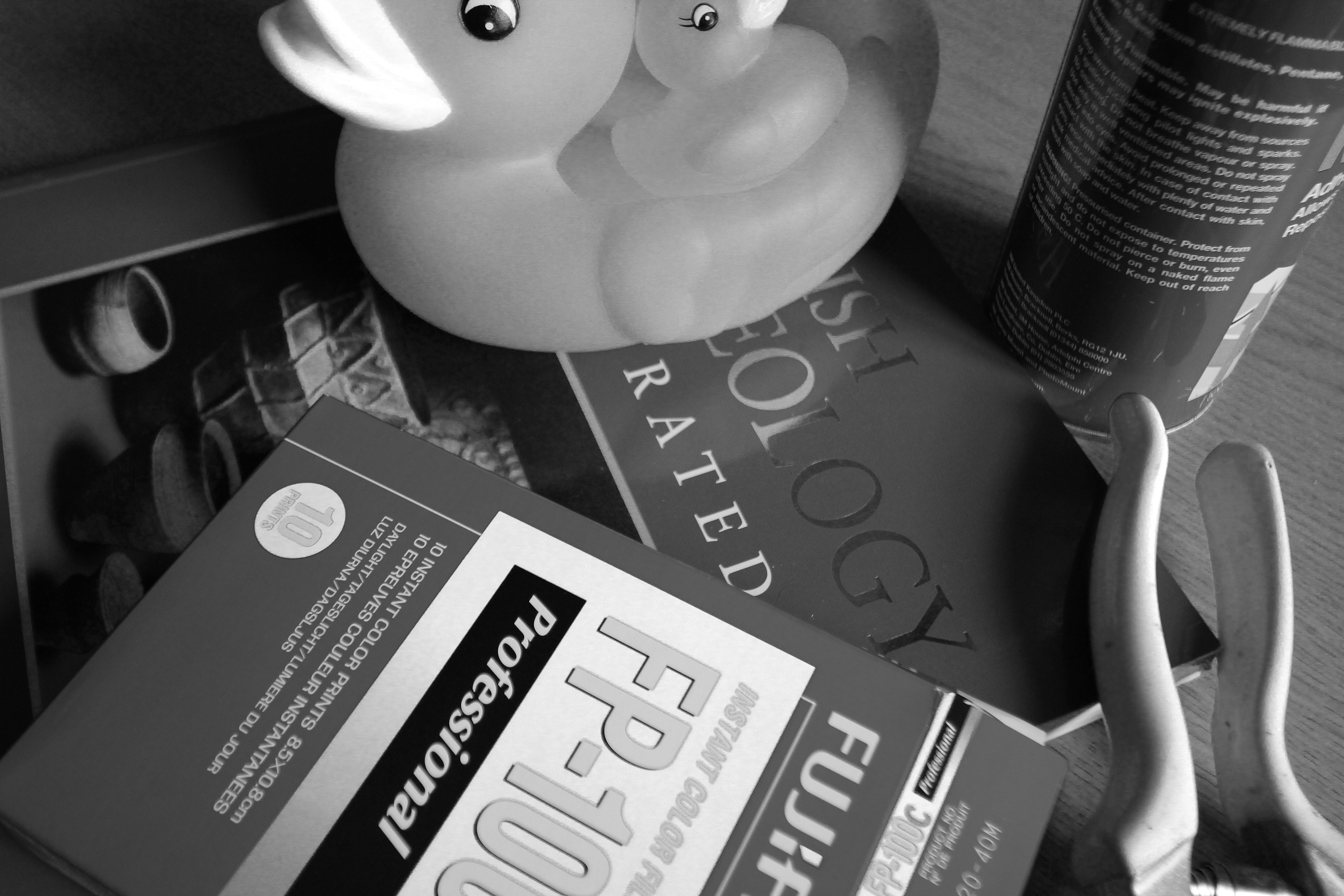
As a first step, having opened the image in Photoshop, I created a black and white adjustment layer which gave the following result -

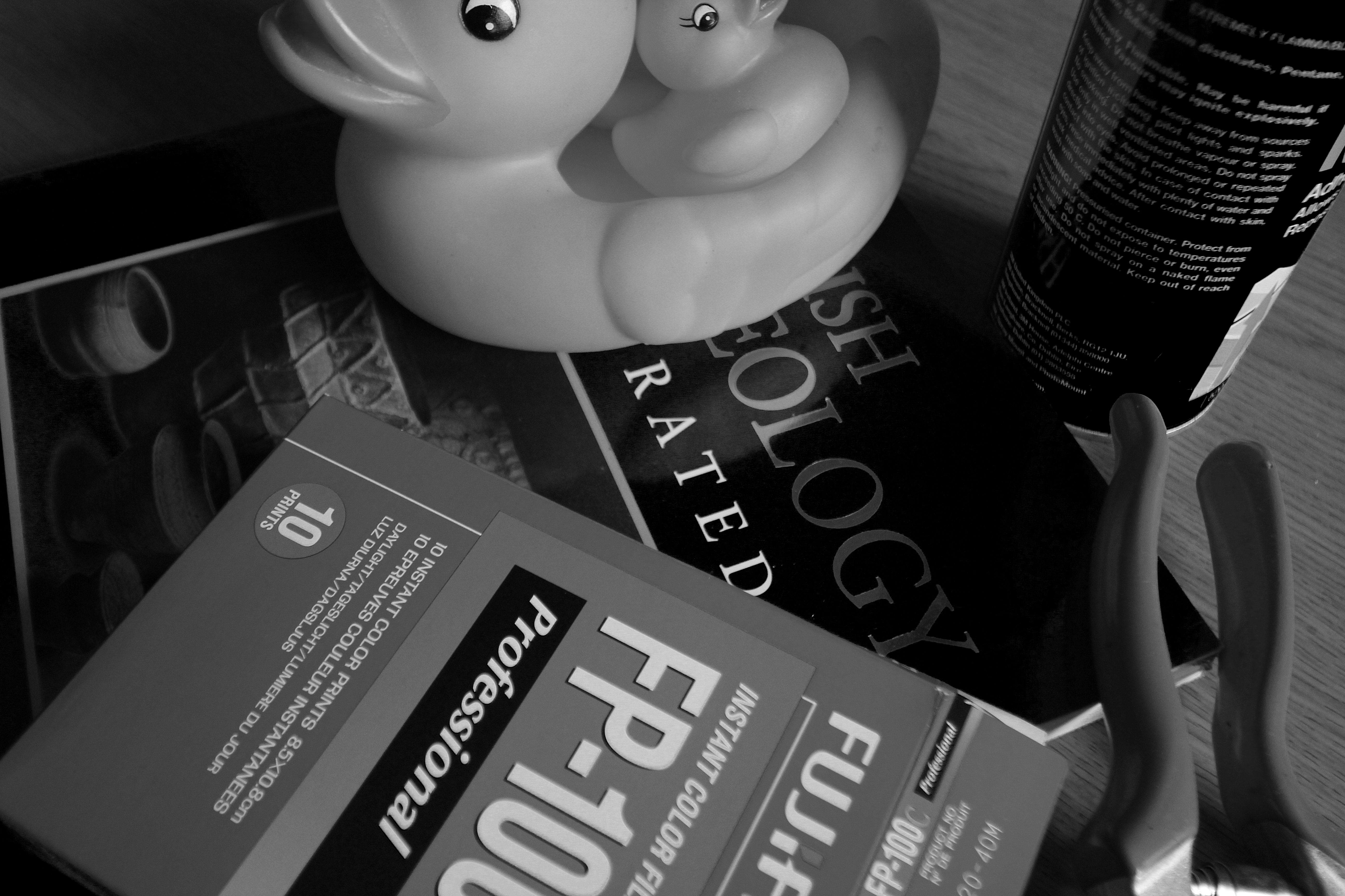
This seems a reasonable starting point, although it will be noticed that there is little differentiation between the orange beak and yellow body of the duck. Most other details are adequately rendered.
The default conversion in Photoshop used these settings -
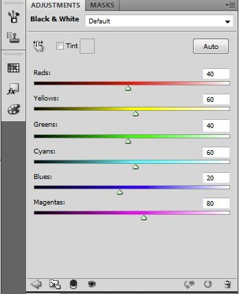
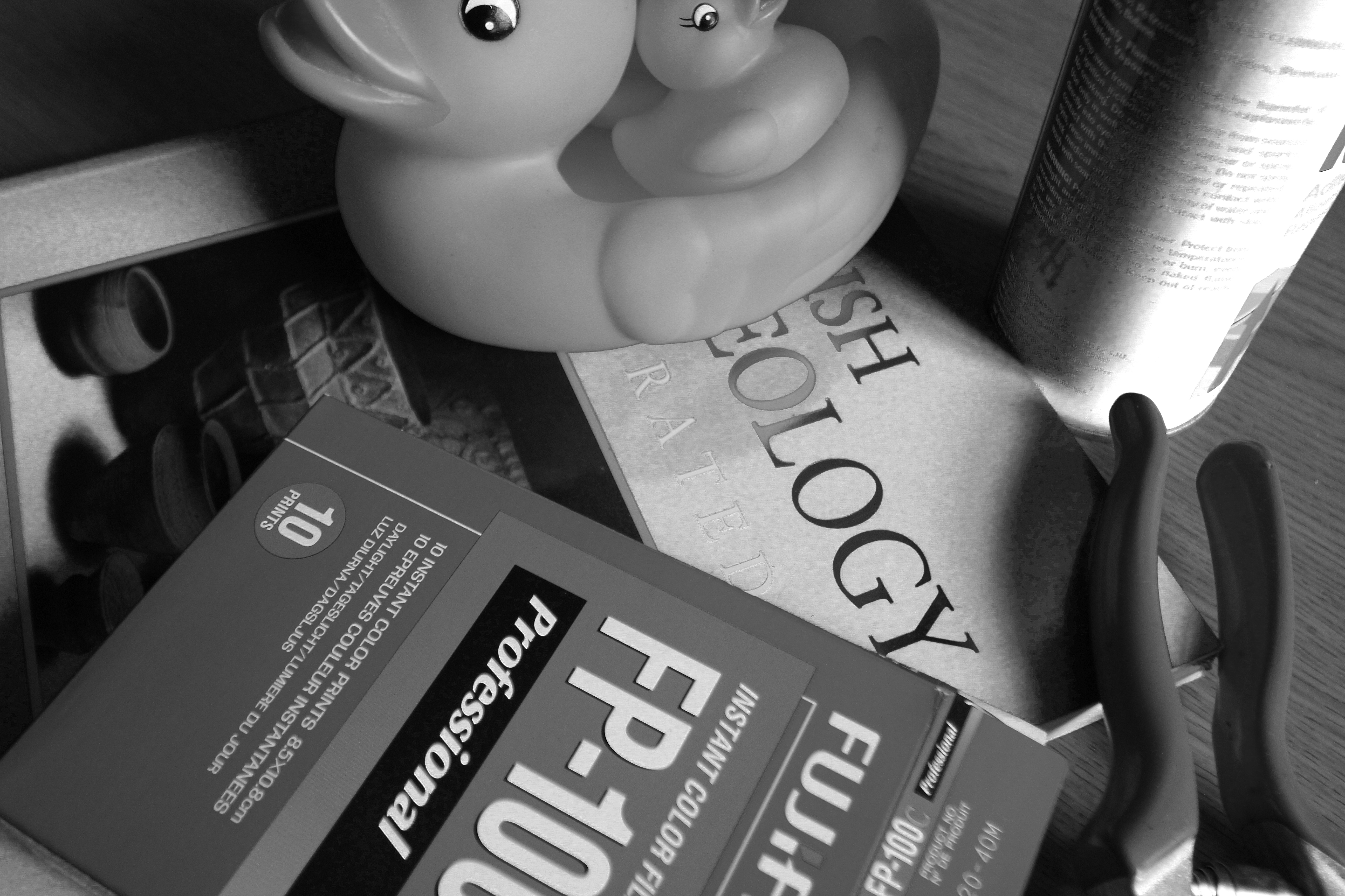
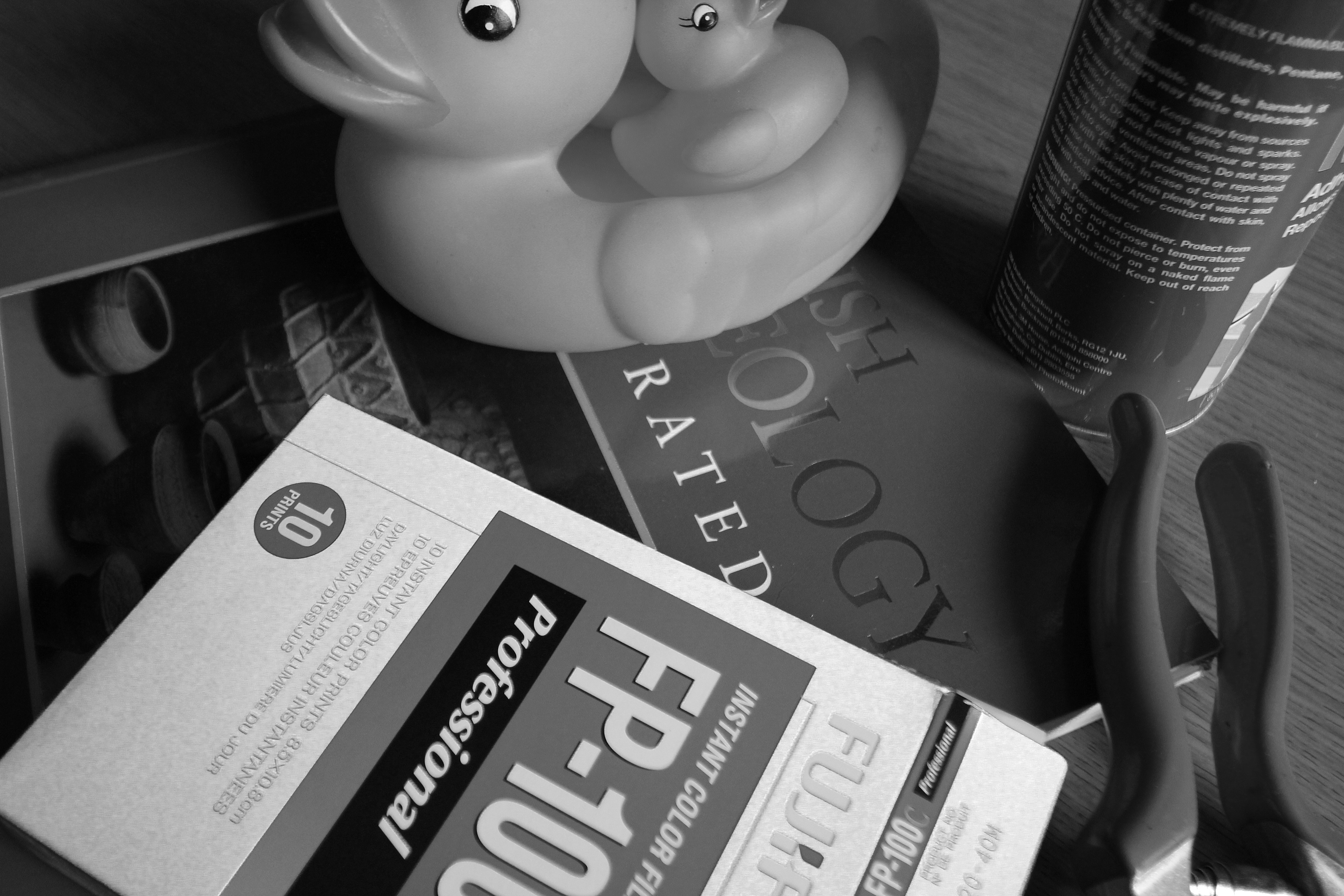
I then performed a series of manipulations using the sliders above, to explore what happens as the influences of colours are modified in the monochrome image. For the first set of experiments I lightened the grey value of each colour by moving the slider to the right.
A lightening of the reds gives the poor duck a bit of the zinc-oxide sun screen look. The handles of the clippers are now white, and the text on the package now stands out less from the background.
We now have an albino duck. We also see subtler changes in the graduated band of colour beneath "Professional" on the package.
Significant changes to the overall look of the image here. We have again lost the differentiation between the duck and her beak, while the larger areas of blue in the book and can are much paler, although we can still see some of the yellow reflection of the duck on the cover of the book.
As we may expect, the green package shows the biggest change here.
The changes here are less apparent; there is a little modification to the panel in the centre of the package which reflects a magenta component in the red pigments of the printing, and a bright rim around the end of the handle suggests an interaction between the reds and blues of the can and clippers.
This example reveals the cyan component in the green body of the film package.
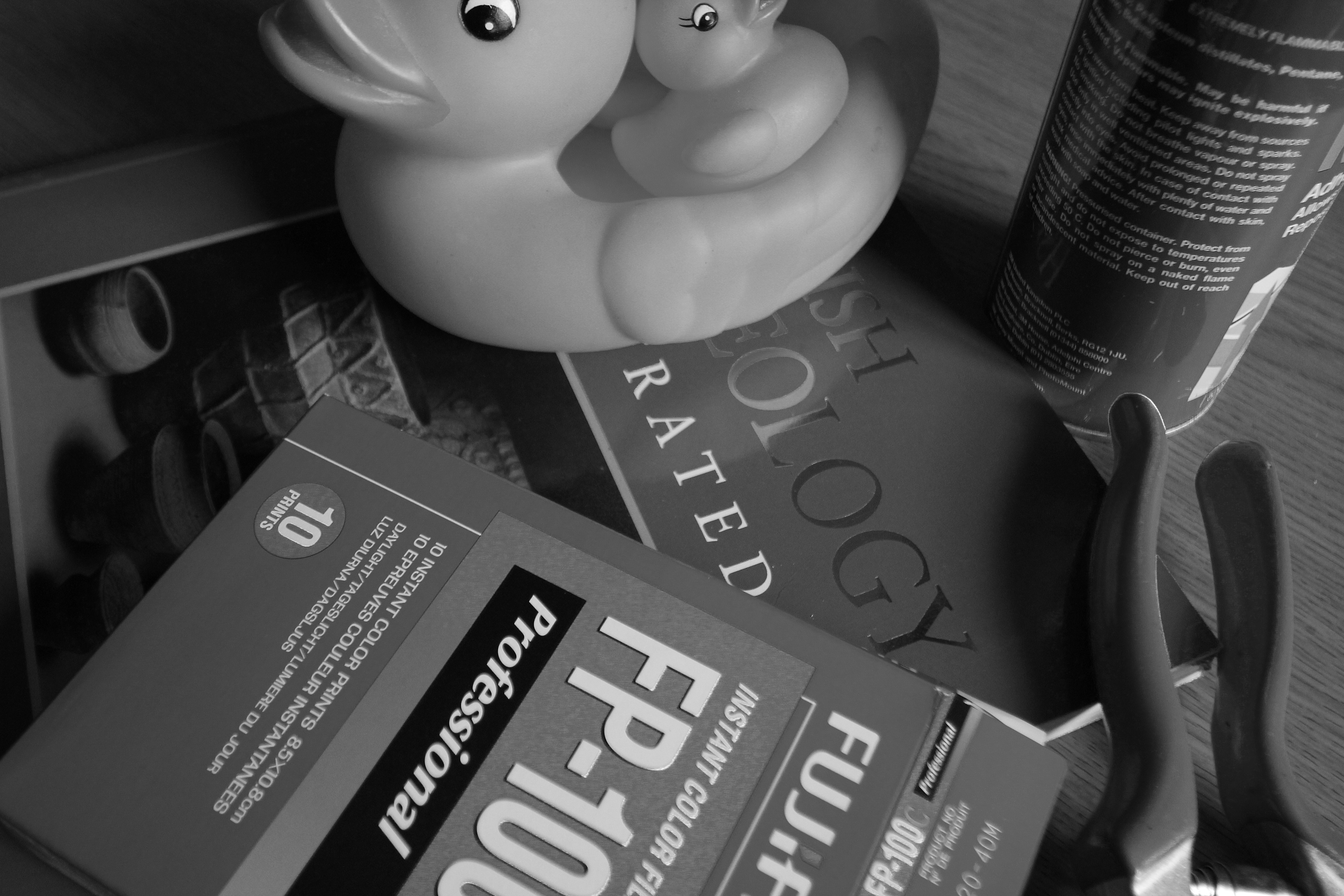
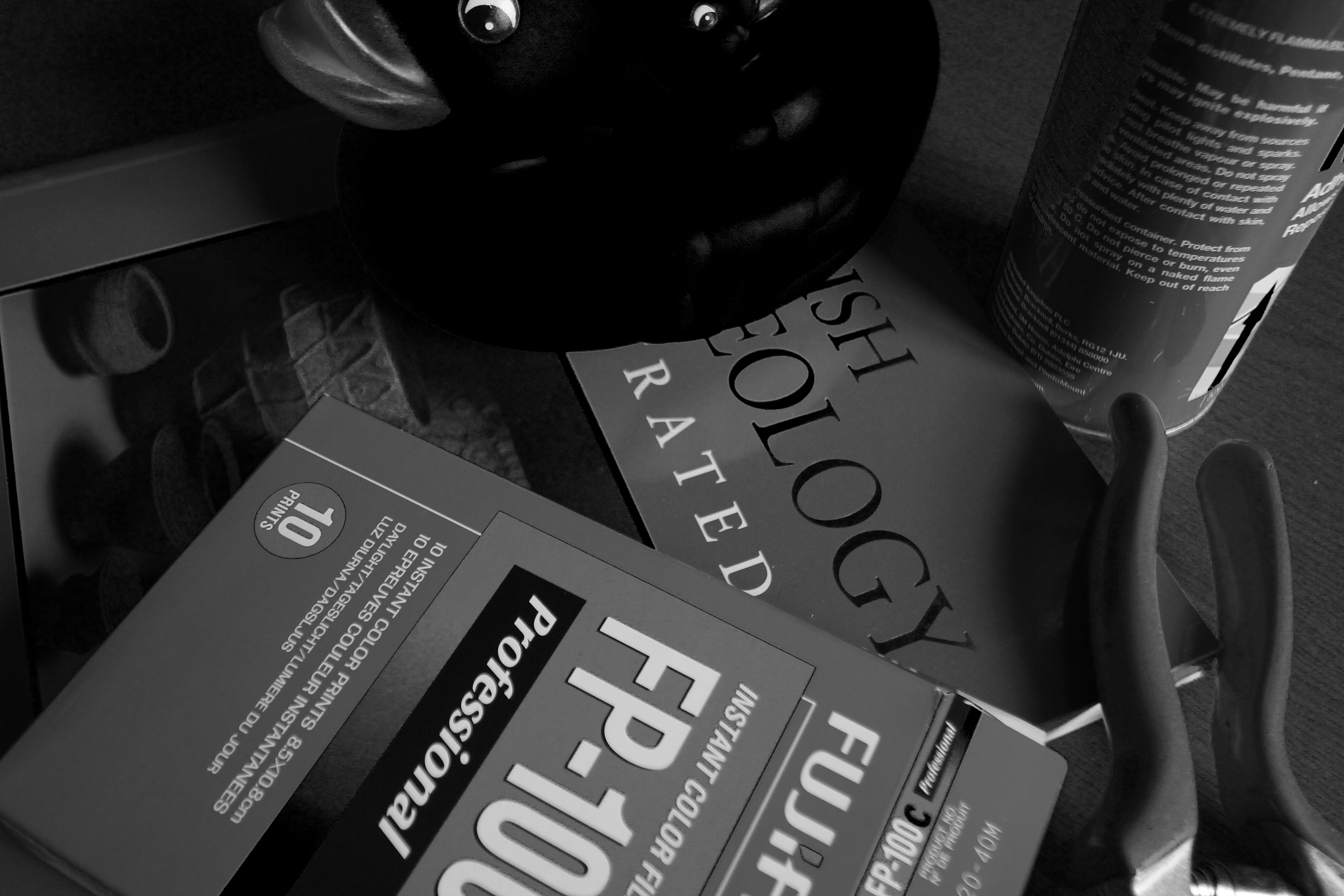
As a true obsessive, I then repeated all these experiments by darkening each colour in turn, moving the adjustment sliders to the left. I offer here just a few of the resulting images.
Darkening the reds here affects not just the clipper handles and the red panel on the package, but also the duck's beak and also the photograph on the front of the book.
The blue book and can here become black.
This is perhaps the least "life-like" rendering to result from these manipulations, as the duck has become a coot. The horizontal band within the text on the package also has its variations emphasised.
I making these adjustments I found with most that I was making judgements in moving the sliders, rarely using the extremities of the scales as the results became very tonally distorted, which I felt distracted from the object of the exercises.
This version includes a corner of a Kodak 18% grey card, and was used to assess how the automatic white-balance function of the camera rendered the scene. It was found that the difference between the image as shot and a "corrected" version produced in Photoshop with the grey card as a reference point was imperceptible.
As a first step, having opened the image in Photoshop, I created a black and white adjustment layer which gave the following result -
This seems a reasonable starting point, although it will be noticed that there is little differentiation between the orange beak and yellow body of the duck. Most other details are adequately rendered.
The default conversion in Photoshop used these settings -
I then performed a series of manipulations using the sliders above, to explore what happens as the influences of colours are modified in the monochrome image. For the first set of experiments I lightened the grey value of each colour by moving the slider to the right.
 |
| Red lightened. |
A lightening of the reds gives the poor duck a bit of the zinc-oxide sun screen look. The handles of the clippers are now white, and the text on the package now stands out less from the background.
 |
| Yellow lightened. |
We now have an albino duck. We also see subtler changes in the graduated band of colour beneath "Professional" on the package.
 |
| Blue lightened. |
 |
| Green lightened. |
As we may expect, the green package shows the biggest change here.
 |
| Magenta lightened. |
 |
| Cyan lightened. |
This example reveals the cyan component in the green body of the film package.
As a true obsessive, I then repeated all these experiments by darkening each colour in turn, moving the adjustment sliders to the left. I offer here just a few of the resulting images.
 |
| Red darkened. |
Darkening the reds here affects not just the clipper handles and the red panel on the package, but also the duck's beak and also the photograph on the front of the book.
 |
| Blue darkened. |
The blue book and can here become black.
 |
| Yellow darkened. |
This is perhaps the least "life-like" rendering to result from these manipulations, as the duck has become a coot. The horizontal band within the text on the package also has its variations emphasised.
I making these adjustments I found with most that I was making judgements in moving the sliders, rarely using the extremities of the scales as the results became very tonally distorted, which I felt distracted from the object of the exercises.
Colour vision.
While considering how colour contributes to an image it may be useful to consider what we see as individuals.
Colour vision deficiency or "colour blindness" affects one in twelve males and one in one hundred females (NHS statistics). I was reasonably confident that my colour vision is reasonable, having been tested in the past for occupational screening and airfield driving licence assessments, but I thought it would be fun to check anyway.
An introduction to the subject may be found here :
http://www.nhs.uk/conditions/Colour-vision-deficiency/Pages/Introduction.aspx
I dusted off my 1944 copy of Tests for Colour-Blindness, originally designed by Dr. Shinobu Ishihara. This work has been a standard assessment tool since it was devised in 1917, and is still employed today.

The tests consist of a series of plates composed of coloured dots which contain numerals the visibility of which varies according to an individuals colour perception.
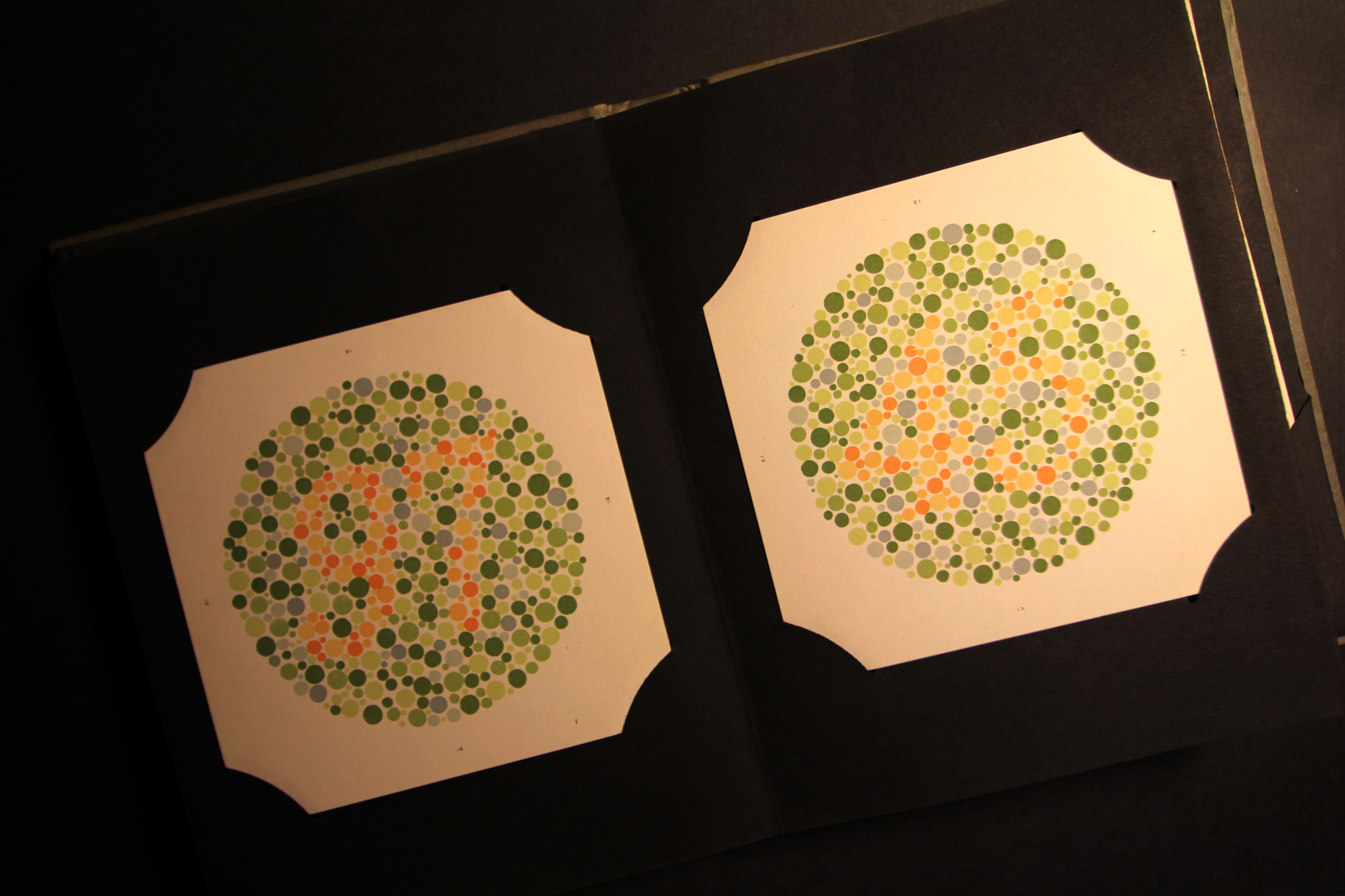
In the example here the number 97 may be seen in the left plate; number 45 in the right.
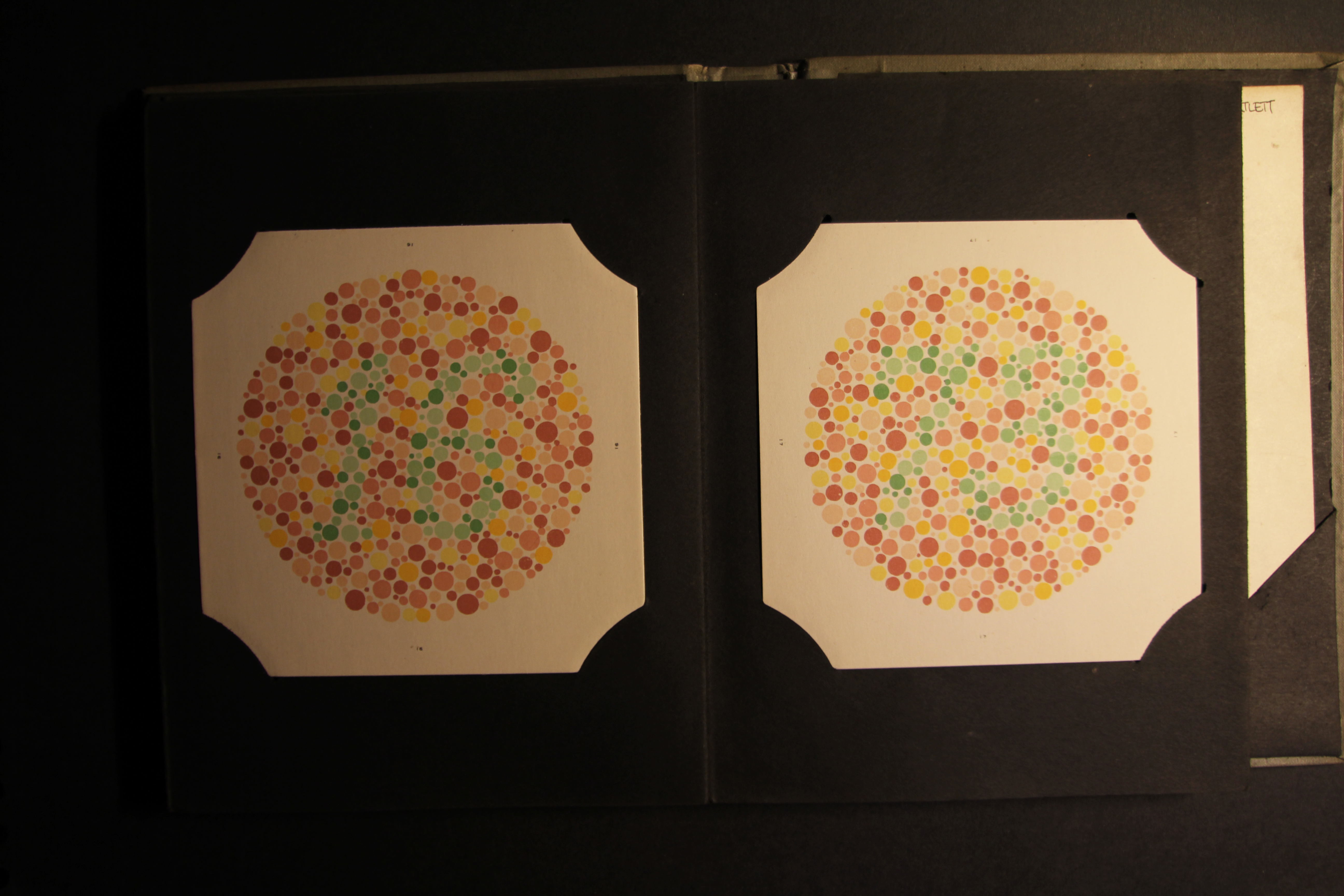
Above we see 16 to the left, with 73 to the right.
Being now satisfied that my colour vision is adequate, I shall proceed with what I'm supposed to be doing.
All the plates of the Ishihara tests may be found here (text is in French, but it is very easy to interpret the results) :
http://daltonien.free.fr/daltonien/article.php3?id_article=6
Colour vision deficiency or "colour blindness" affects one in twelve males and one in one hundred females (NHS statistics). I was reasonably confident that my colour vision is reasonable, having been tested in the past for occupational screening and airfield driving licence assessments, but I thought it would be fun to check anyway.
An introduction to the subject may be found here :
http://www.nhs.uk/conditions/Colour-vision-deficiency/Pages/Introduction.aspx
I dusted off my 1944 copy of Tests for Colour-Blindness, originally designed by Dr. Shinobu Ishihara. This work has been a standard assessment tool since it was devised in 1917, and is still employed today.
The tests consist of a series of plates composed of coloured dots which contain numerals the visibility of which varies according to an individuals colour perception.
In the example here the number 97 may be seen in the left plate; number 45 in the right.
Above we see 16 to the left, with 73 to the right.
Being now satisfied that my colour vision is adequate, I shall proceed with what I'm supposed to be doing.
All the plates of the Ishihara tests may be found here (text is in French, but it is very easy to interpret the results) :
http://daltonien.free.fr/daltonien/article.php3?id_article=6
Tuesday 31 January 2012
Colour - Exercise One
Controlling the strength of a colour.
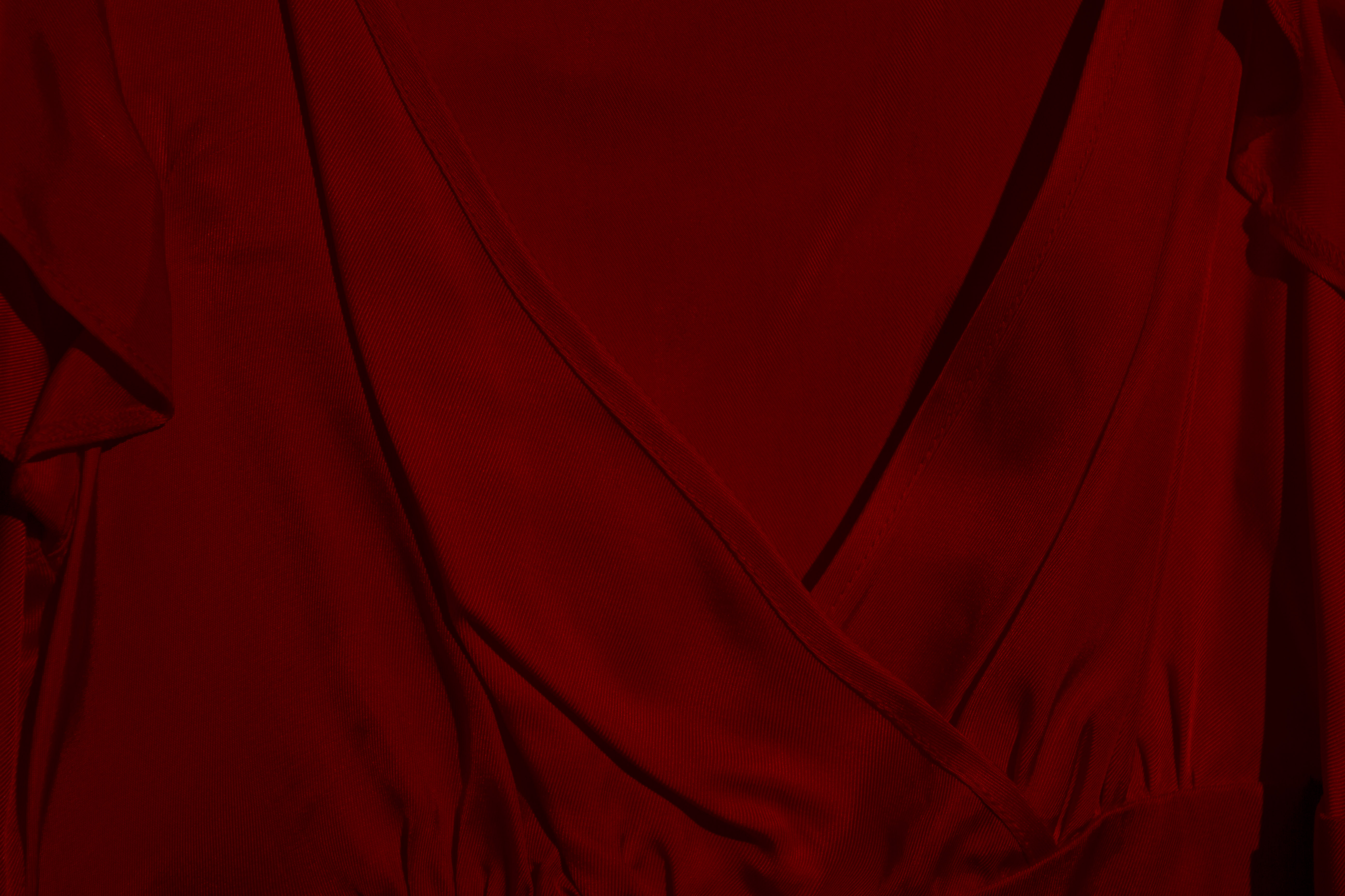
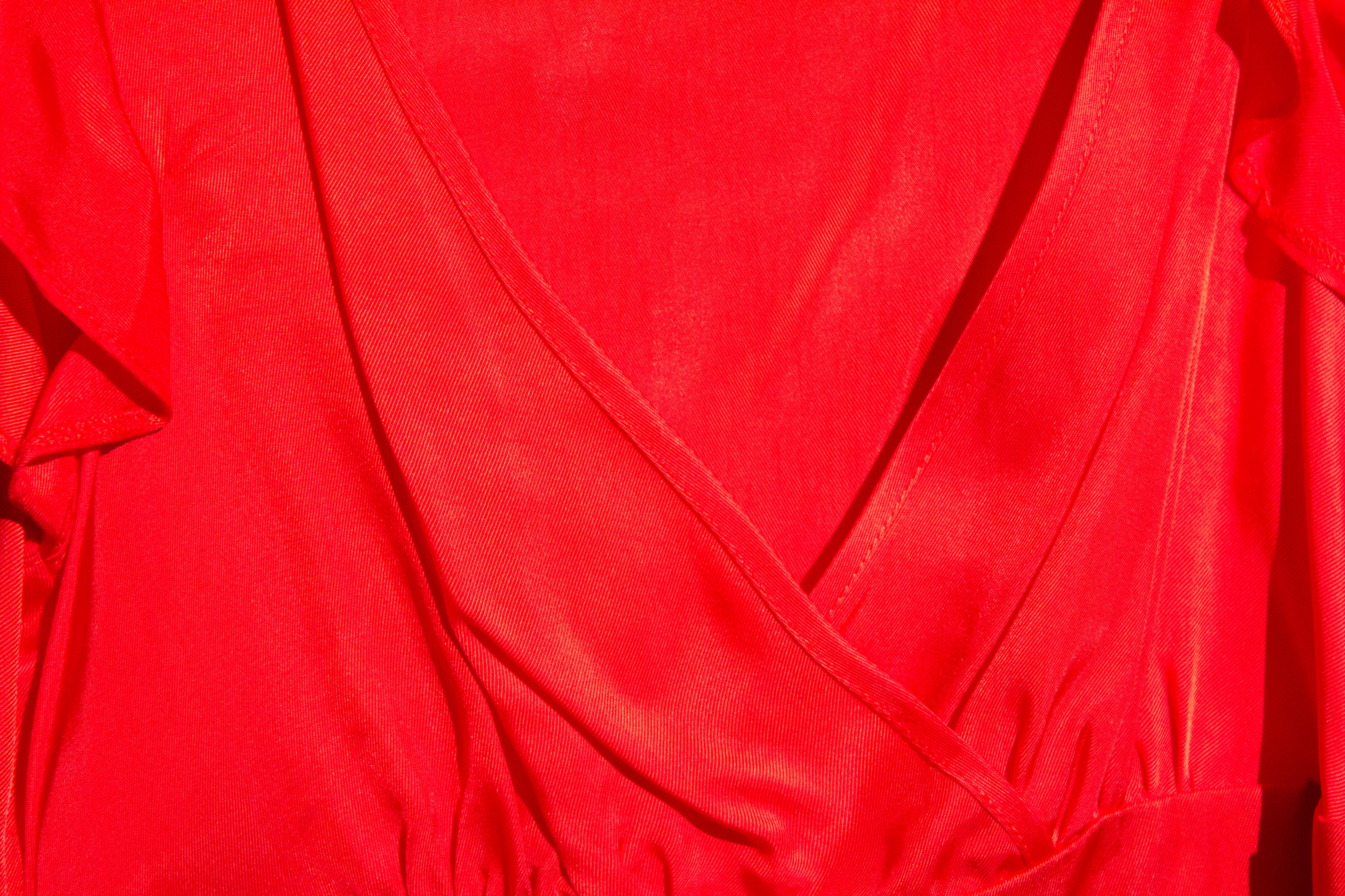
This exercise will explore the effect that varying camera exposures have upon the perceived "strength" of a colour. The subject chosen is a bright red dress, as seen below. It is lit by a single 500W tungsten fresnel lamp, as the images were recorded on a very dull January day. A Canon EOS 60D camera was used, with varying degrees of exposure compensation dialed in, as indicated below each image.
The final image in this series presents a composite of the above items. This makes it easier to compare how different exposures influence the rendering of a colour.
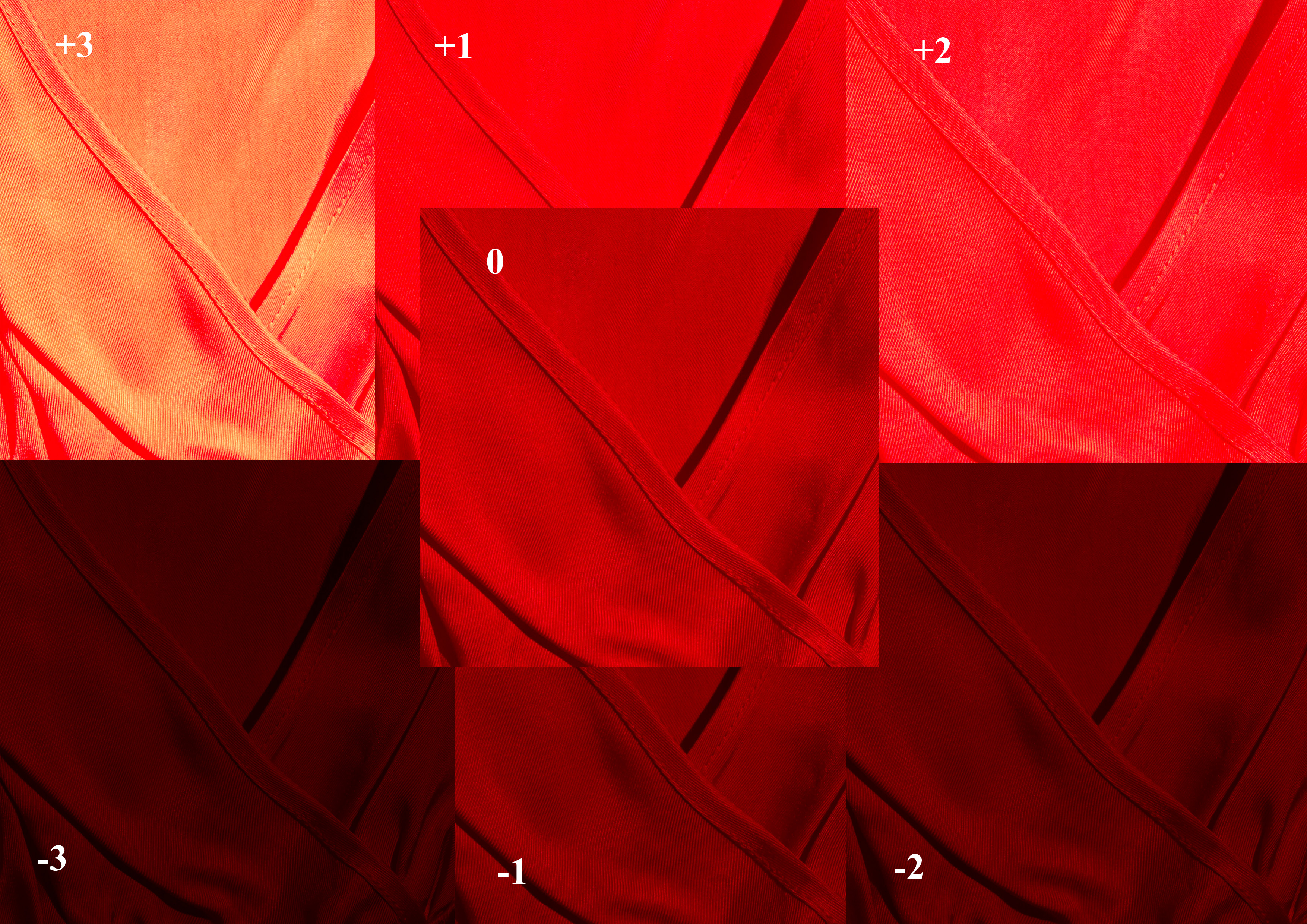
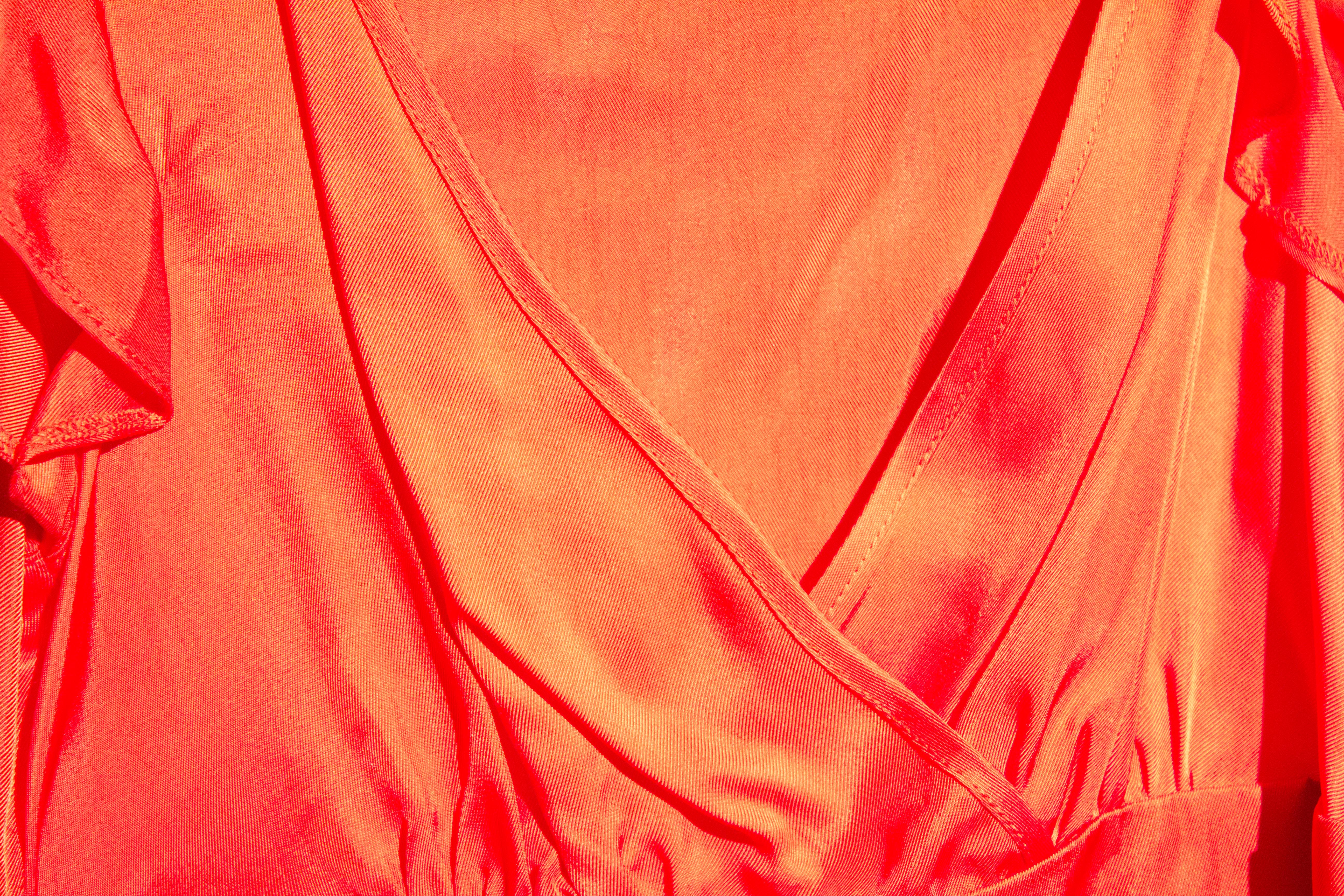
The "straight" image is seen in the centre. The images subject to relative over-exposure are seen in the upper half, and vary from a brighter red, through pink, to the final (+3) exposure, where the sheen of the fabric almost overpowers the true colour of the fabric.
Under exposure perhaps has a less dramatic effect, with a deeper saturation resulting in an ultimate rendering that, while dark, is still undoubtedly red.
This exercise will explore the effect that varying camera exposures have upon the perceived "strength" of a colour. The subject chosen is a bright red dress, as seen below. It is lit by a single 500W tungsten fresnel lamp, as the images were recorded on a very dull January day. A Canon EOS 60D camera was used, with varying degrees of exposure compensation dialed in, as indicated below each image.
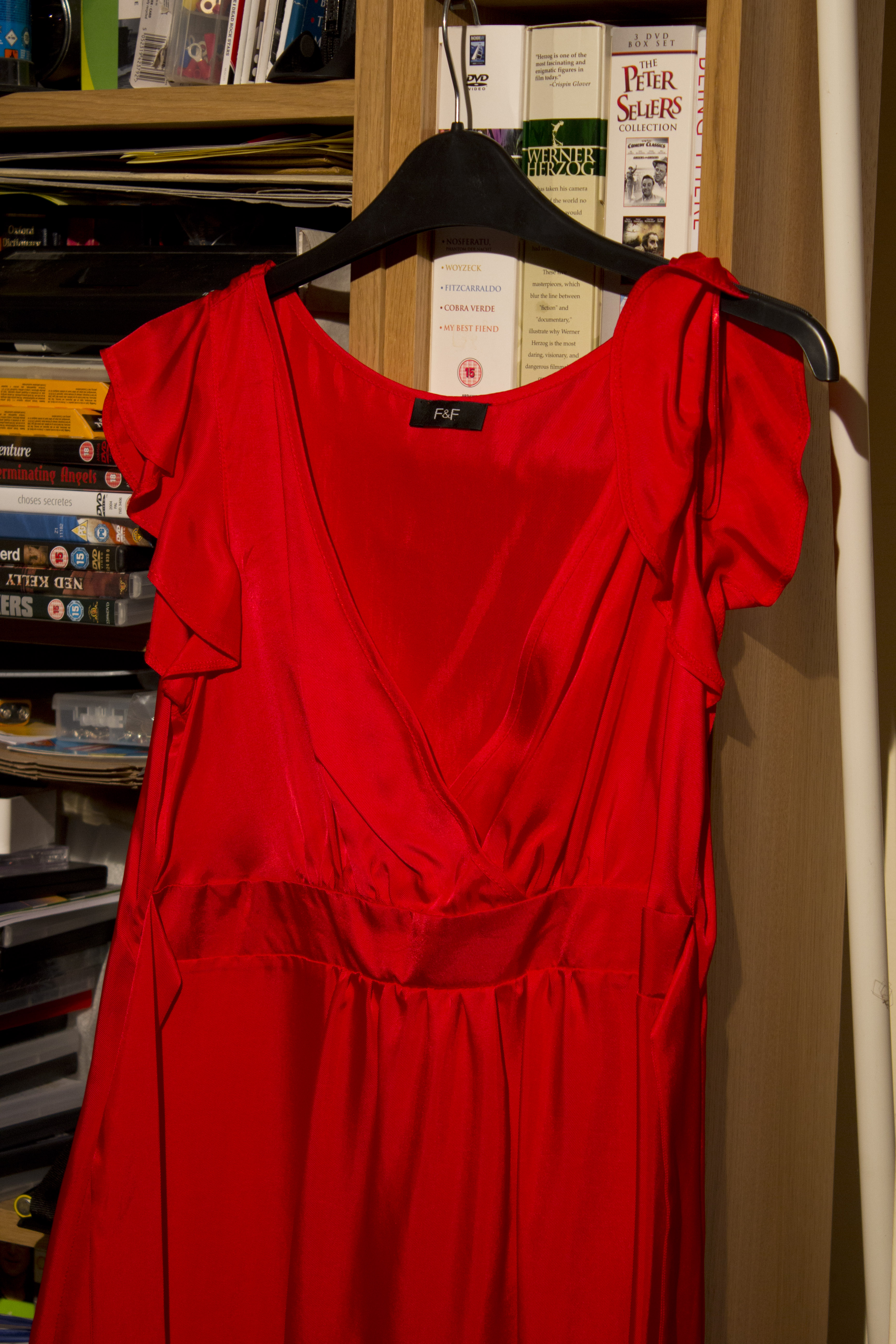 |
| Subject of this exercise |
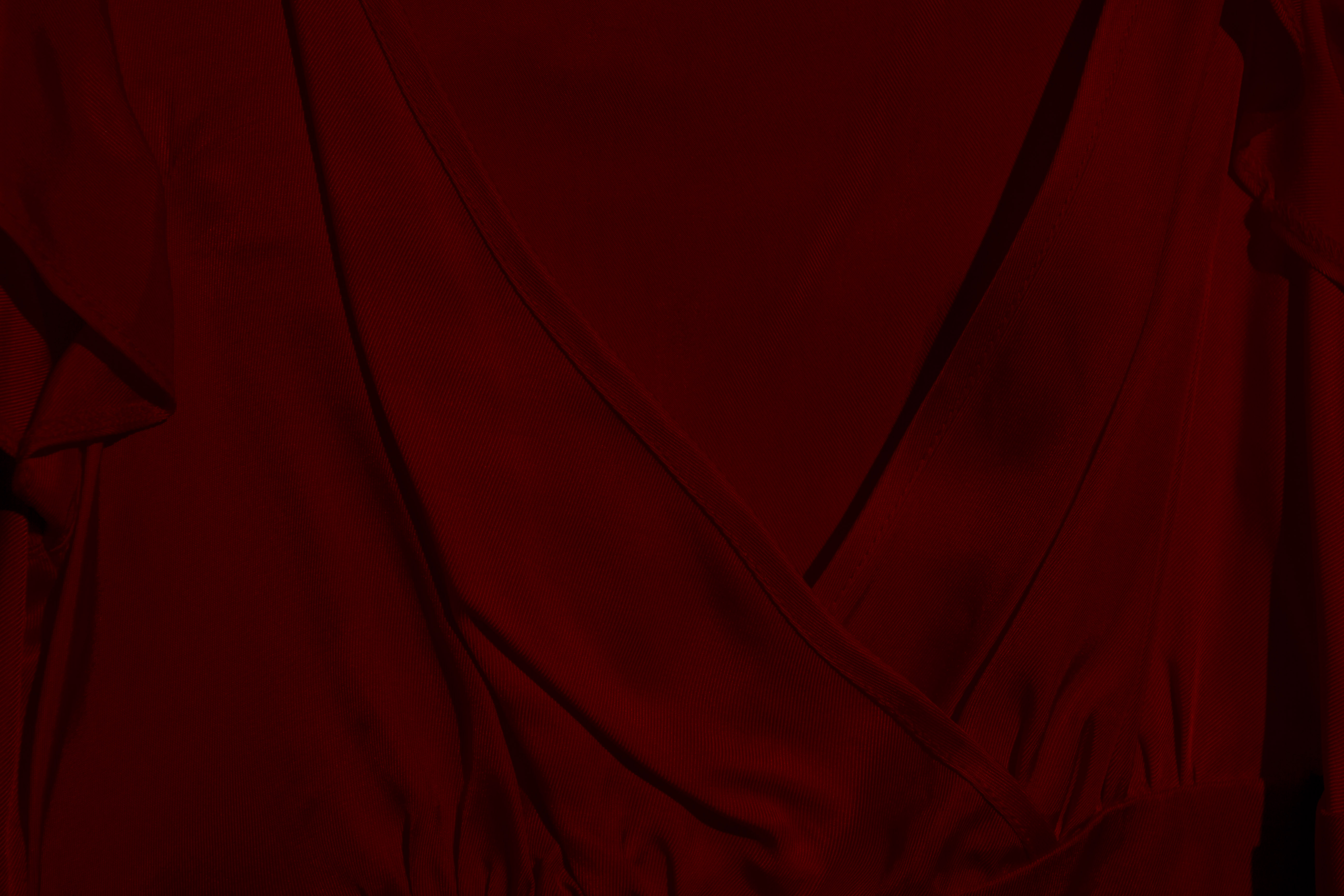 |
| Minus 3 |
 |
| Minus 2 |
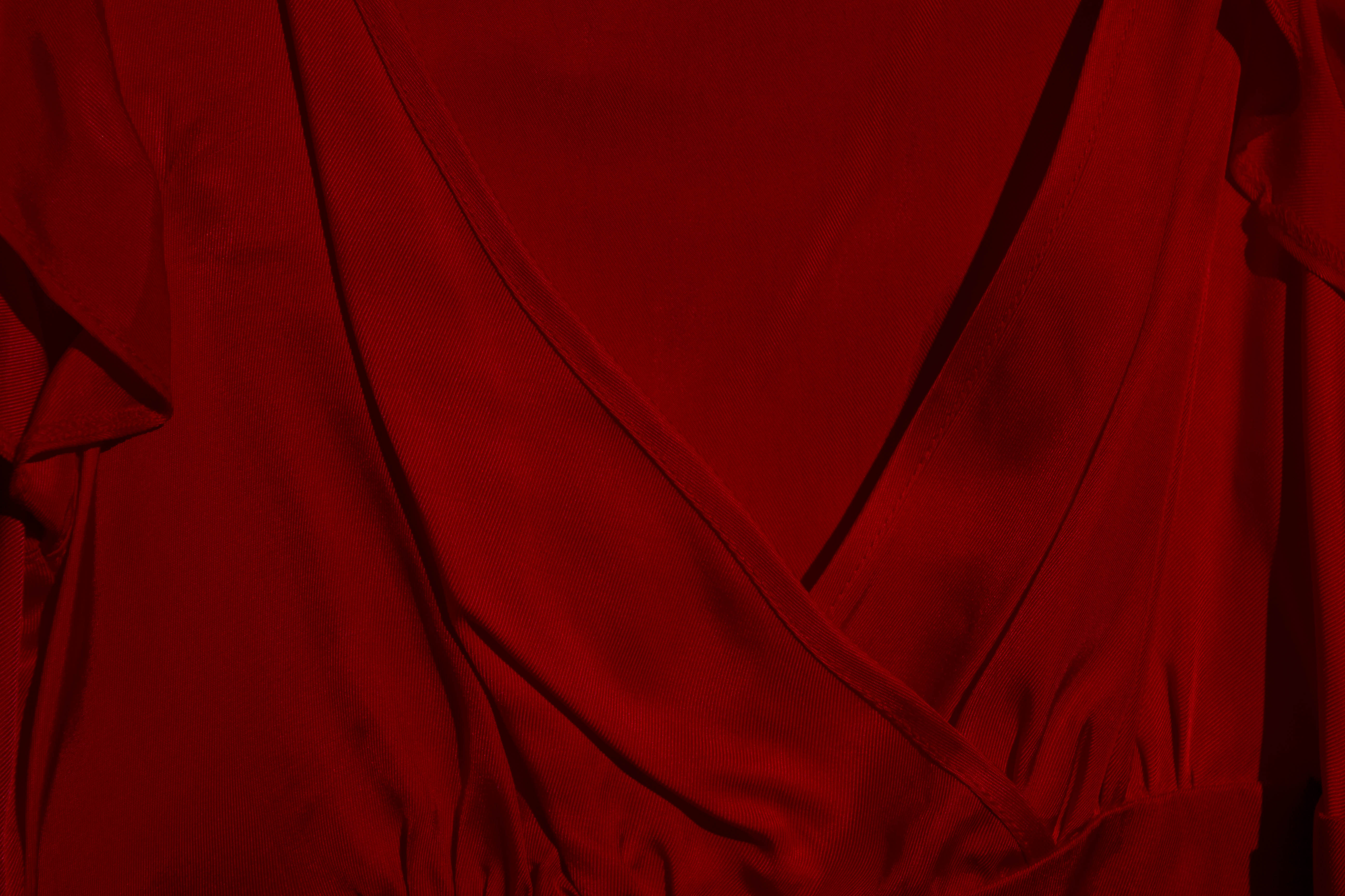 |
| Minus 1 |
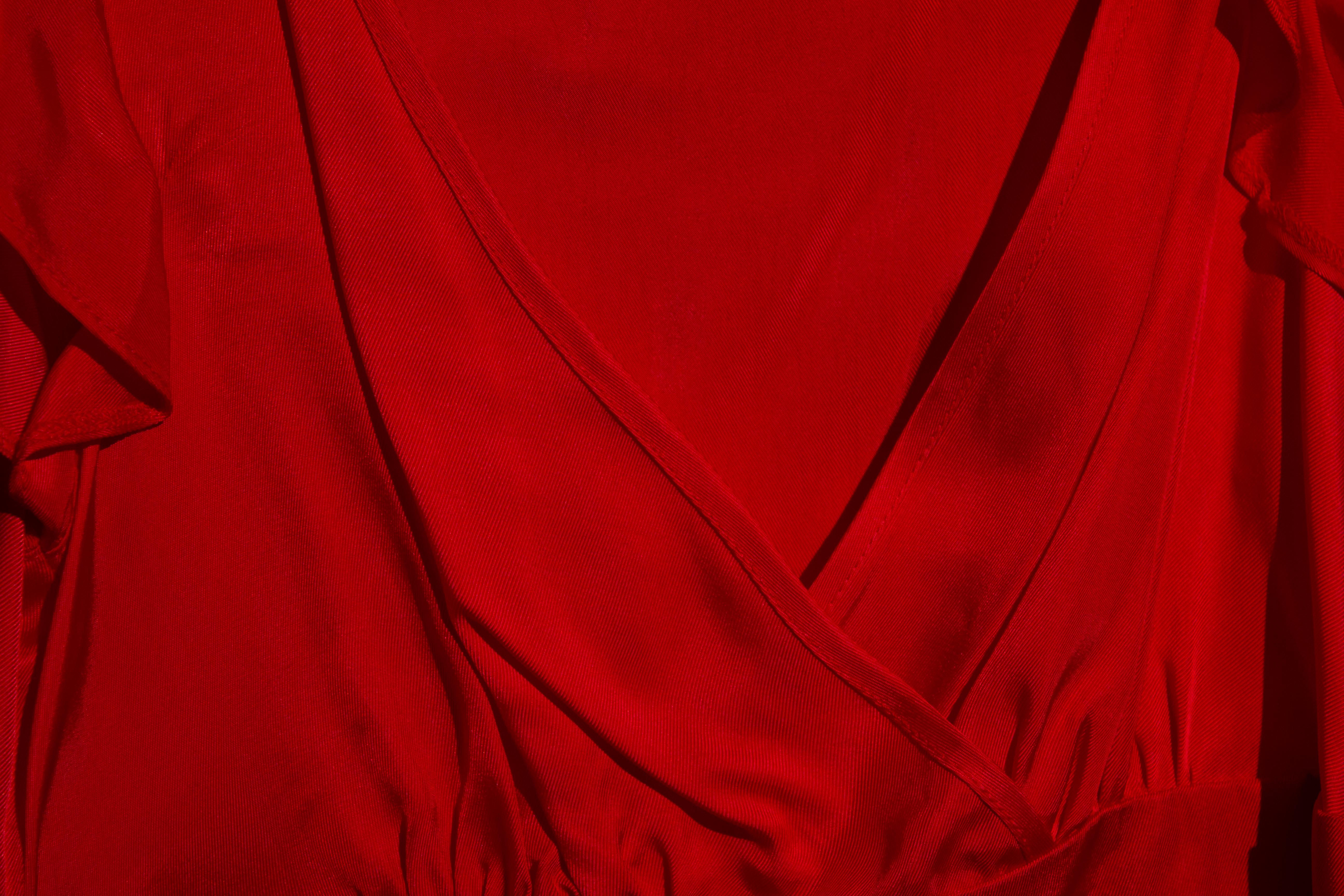 |
| "Standard" exposure |
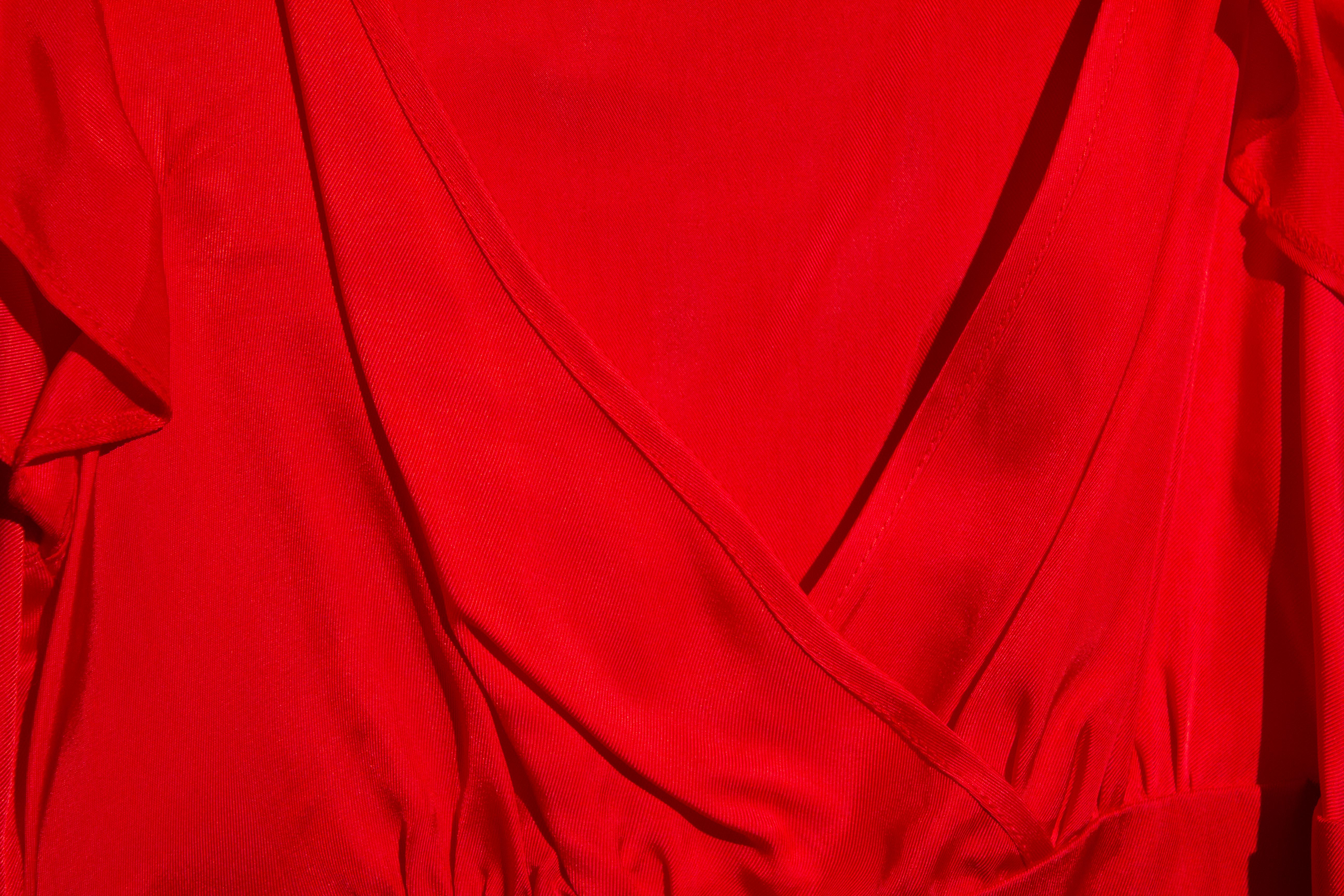 |
| Plus 1 |
 |
| plus 2 |
 |
| Plus 3 |
Under exposure perhaps has a less dramatic effect, with a deeper saturation resulting in an ultimate rendering that, while dark, is still undoubtedly red.
Subscribe to:
Posts (Atom)