Colour - Exercise One
Controlling the strength of a colour.
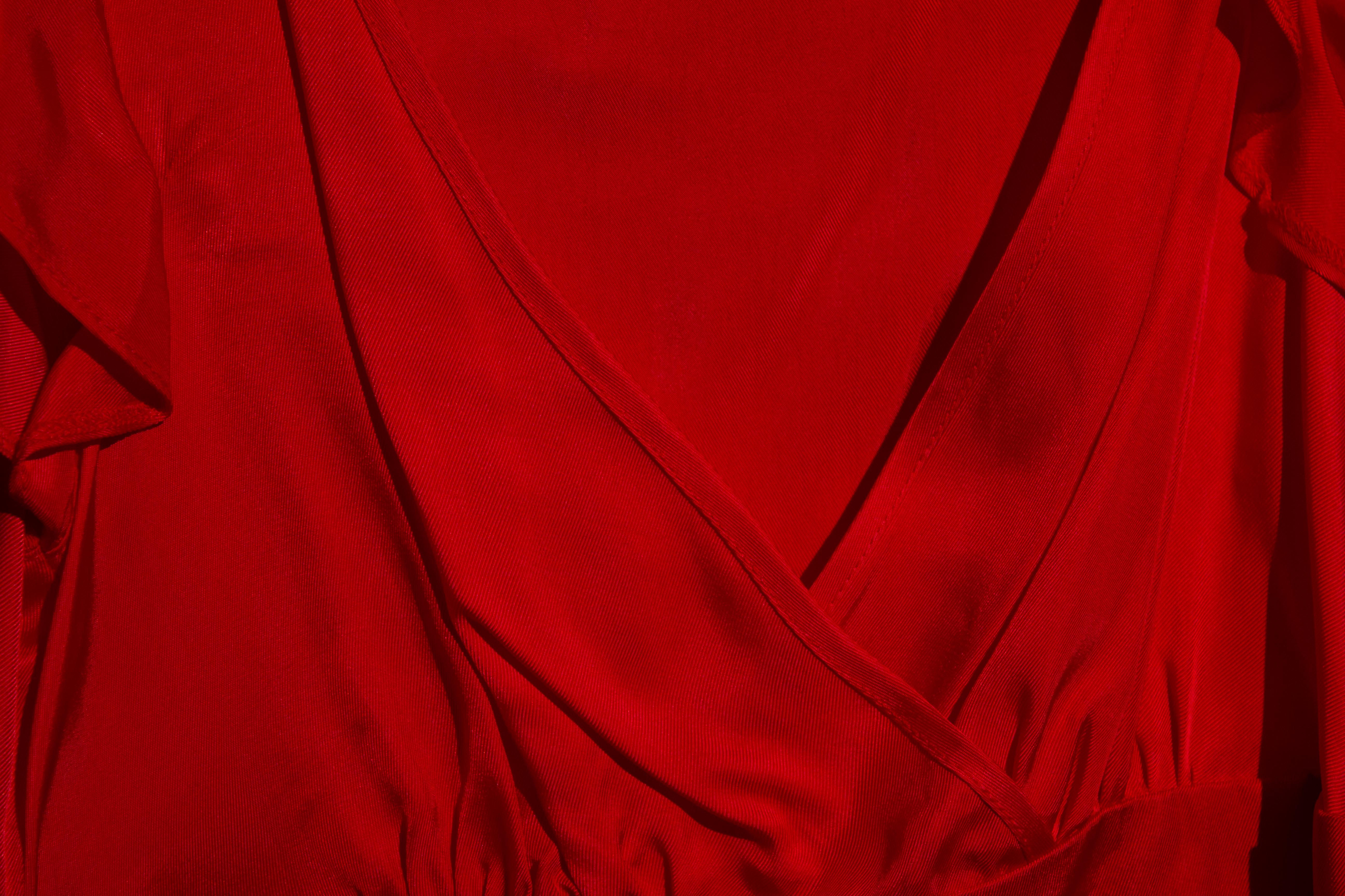
This exercise will explore the effect that varying camera exposures have upon the perceived "strength" of a colour. The subject chosen is a bright red dress, as seen below. It is lit by a single 500W tungsten fresnel lamp, as the images were recorded on a very dull January day. A Canon EOS 60D camera was used, with varying degrees of exposure compensation dialed in, as indicated below each image.
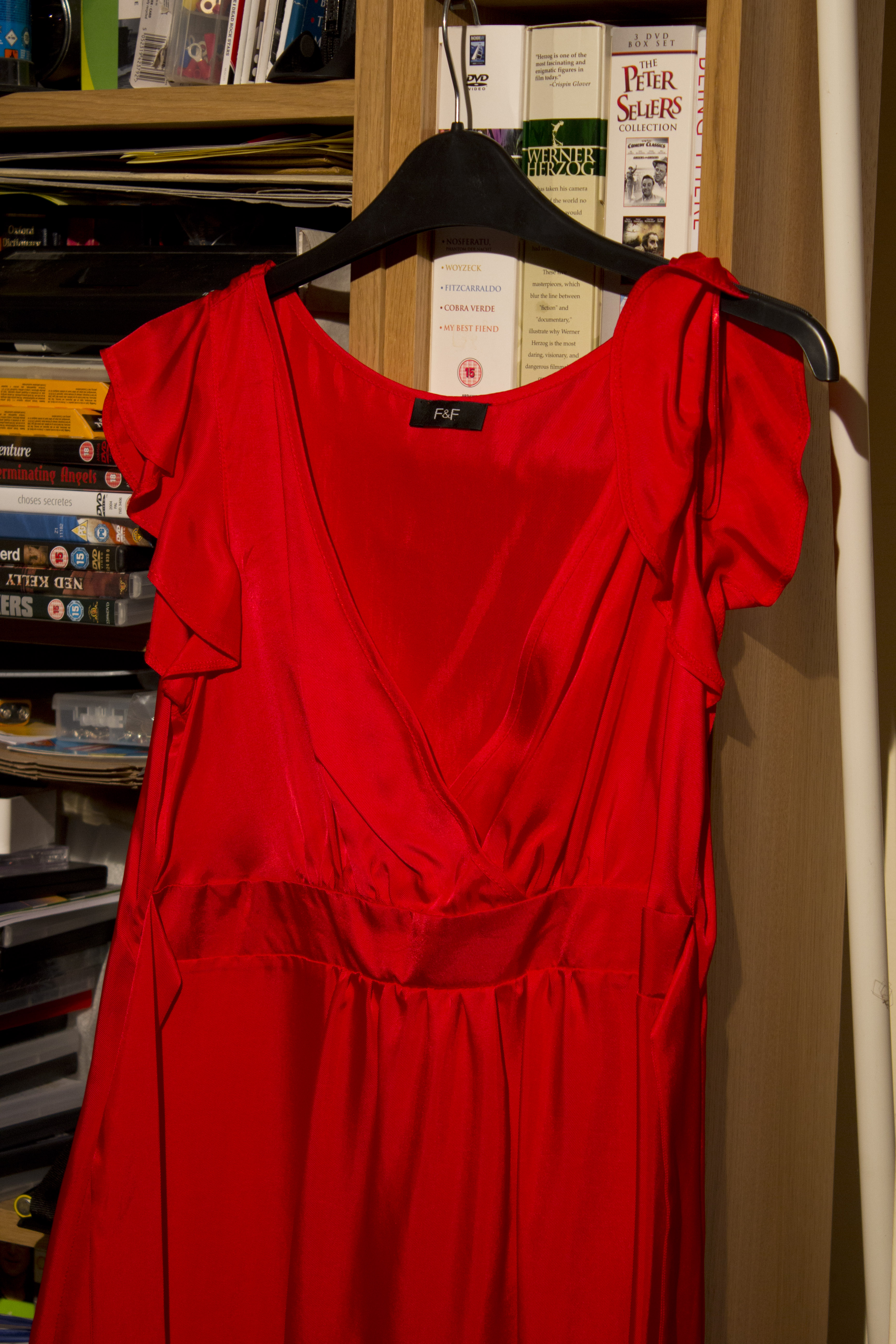 |
| Subject of this exercise |
 |
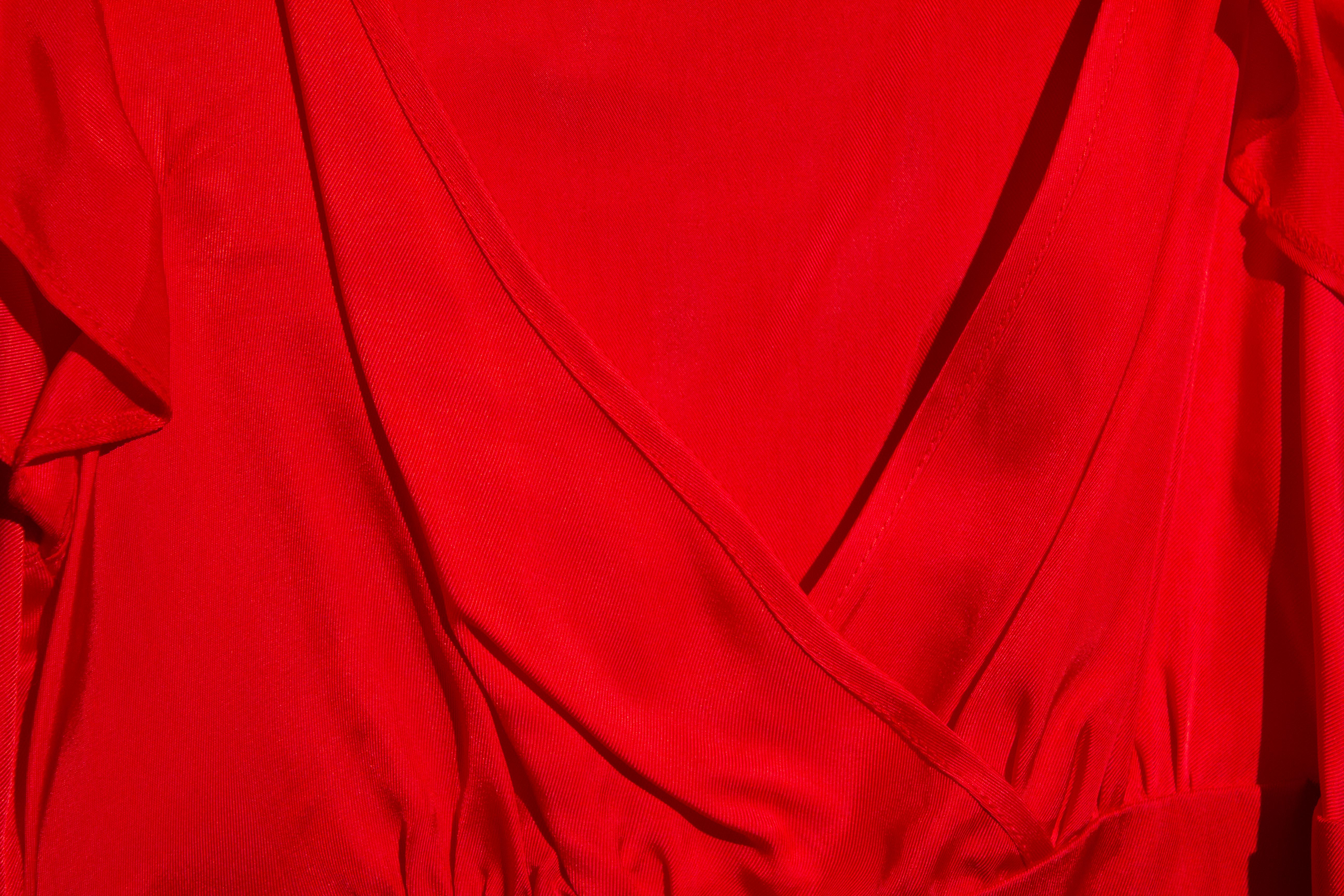
| Minus 3 |
 |
| Minus 2 |
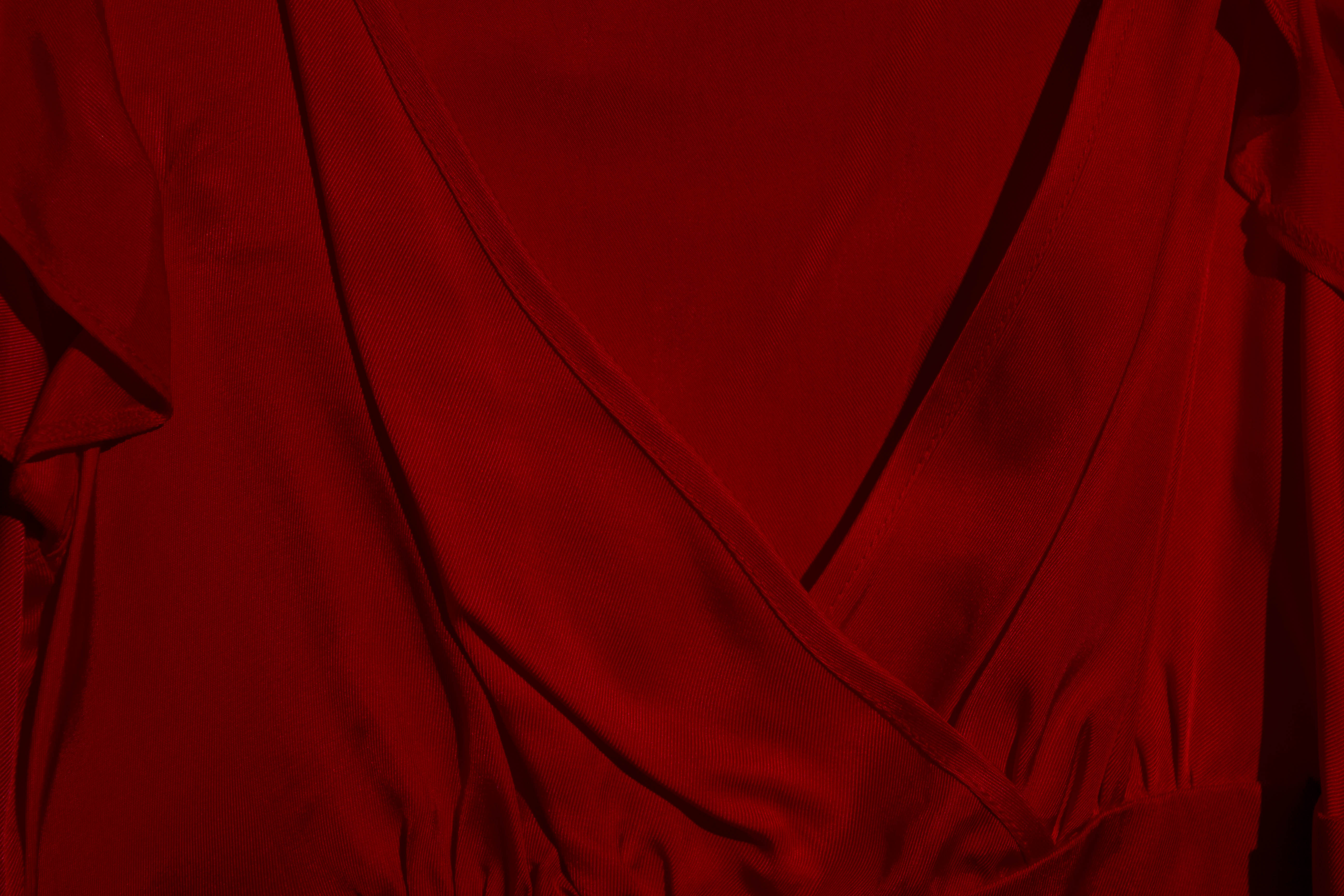 |
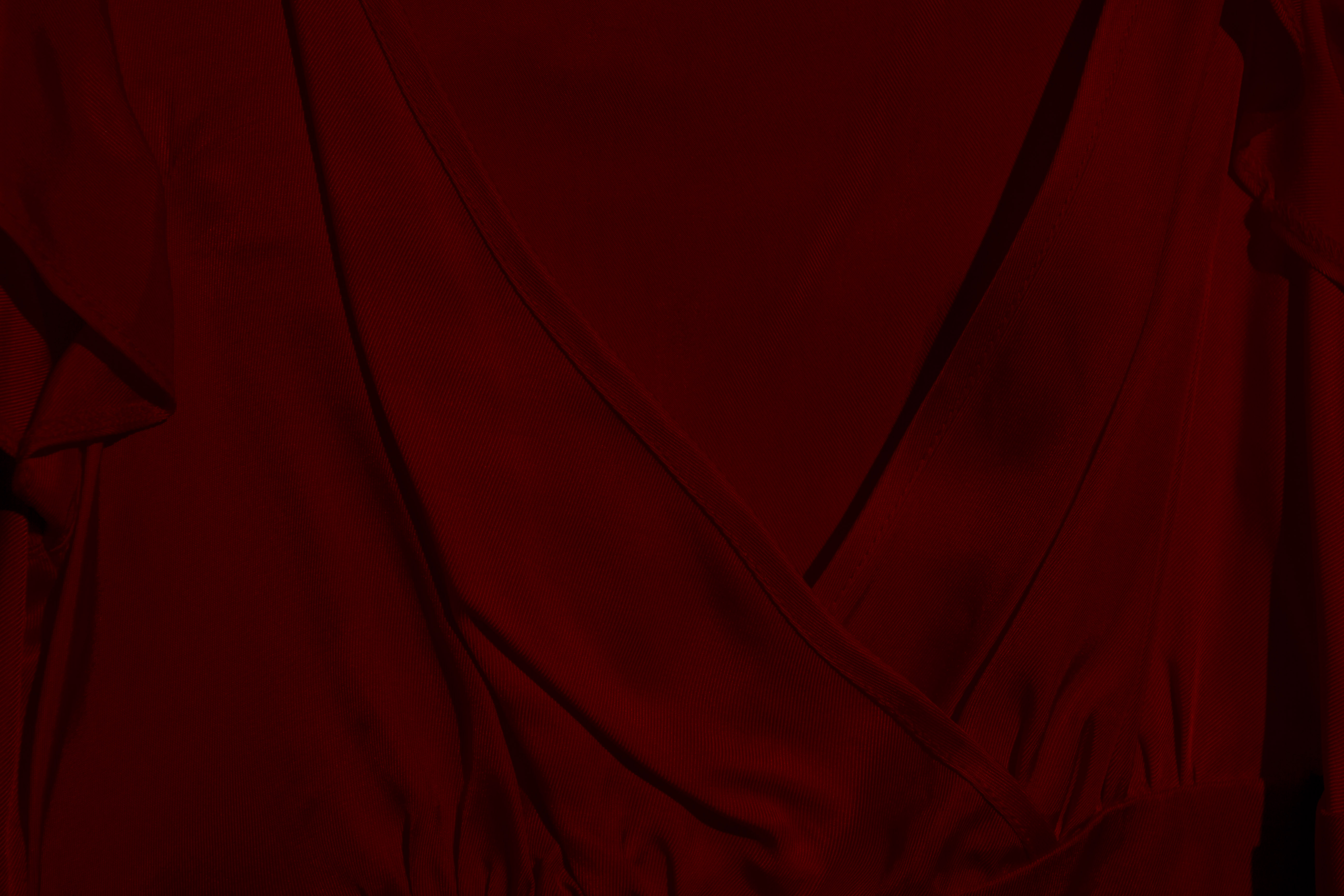
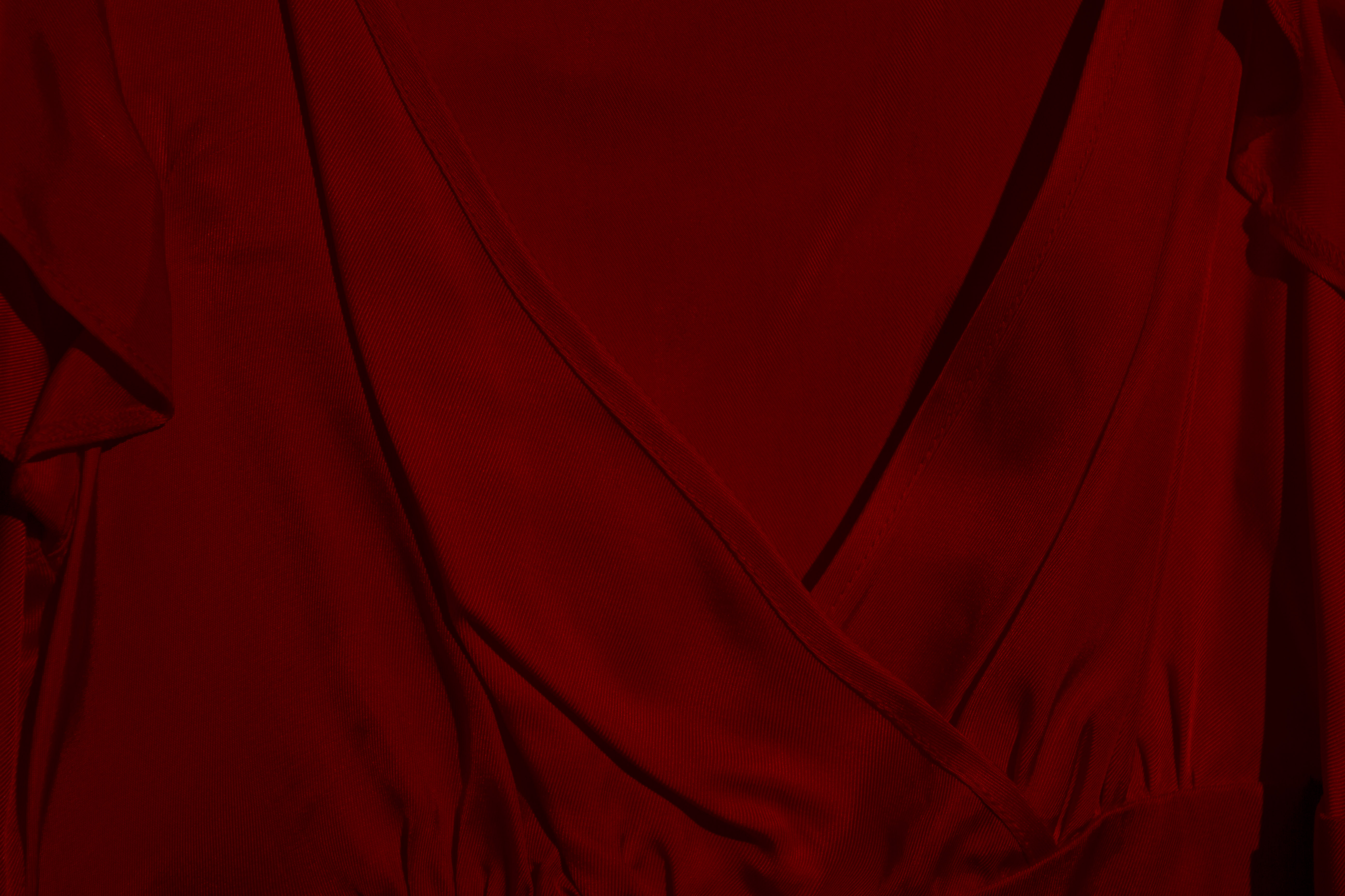
| Minus 1 |
 |
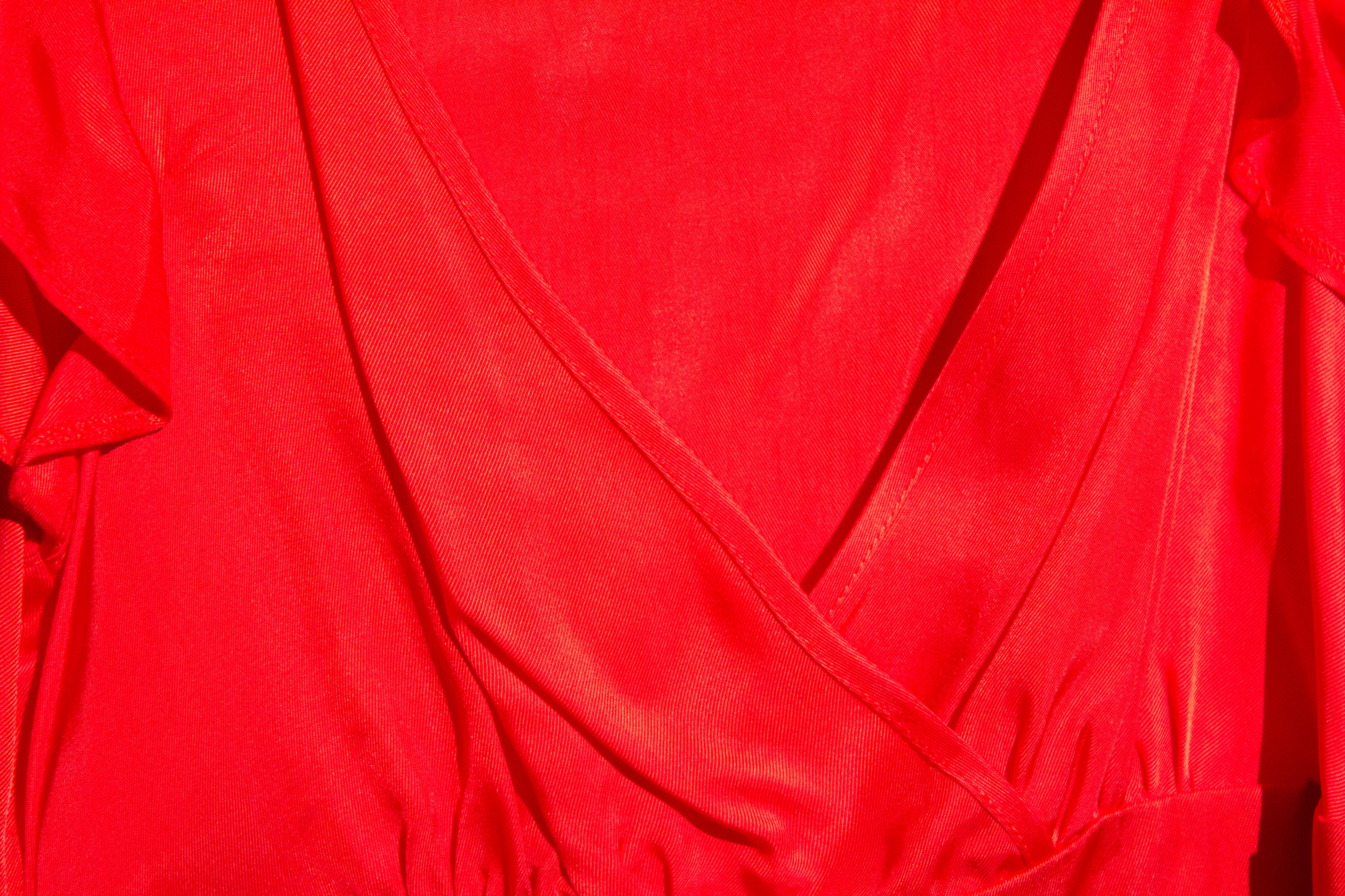
| "Standard" exposure |
 |
| Plus 1 |
 |
| plus 2 |
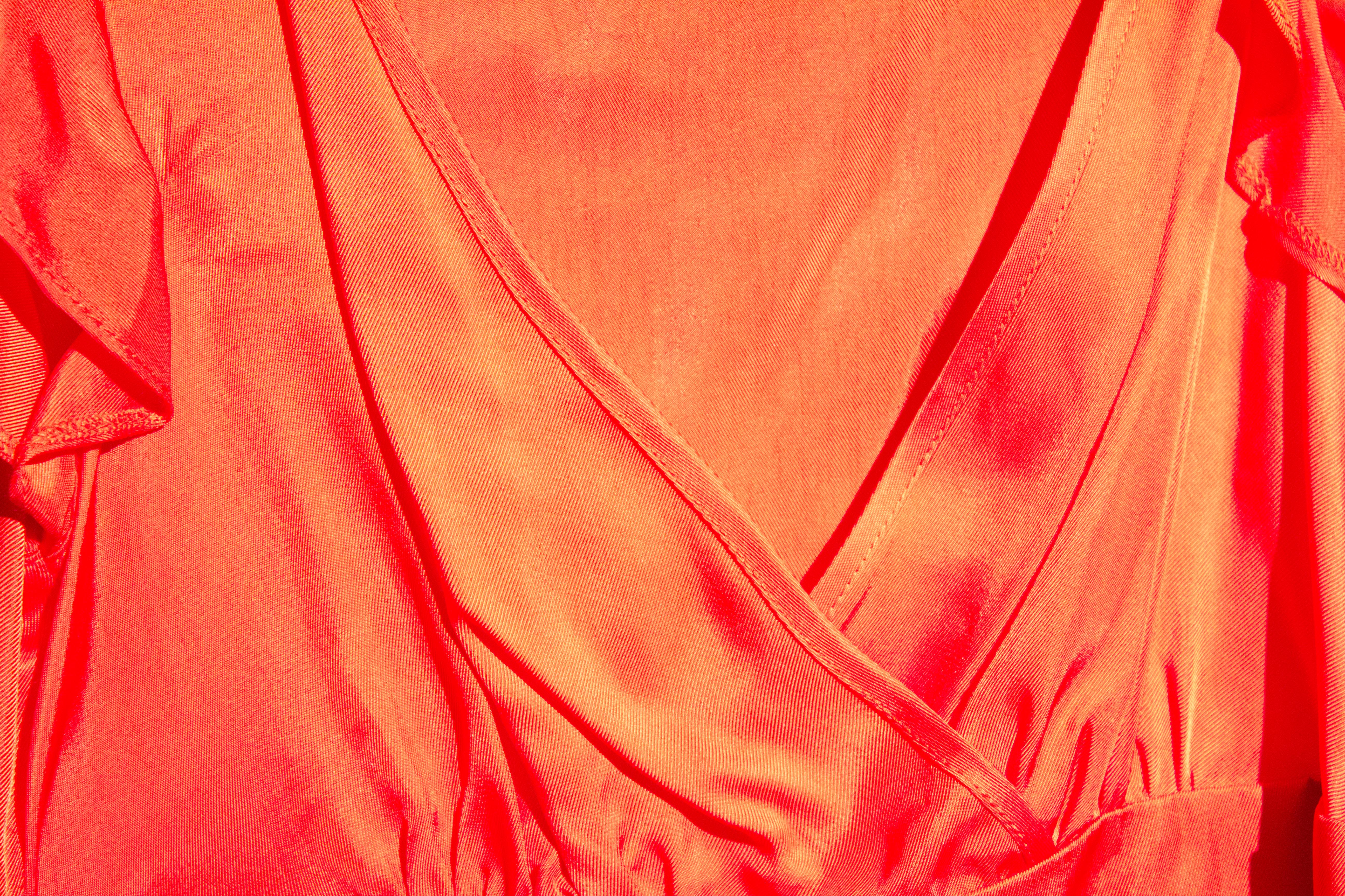 |
| Plus 3 |
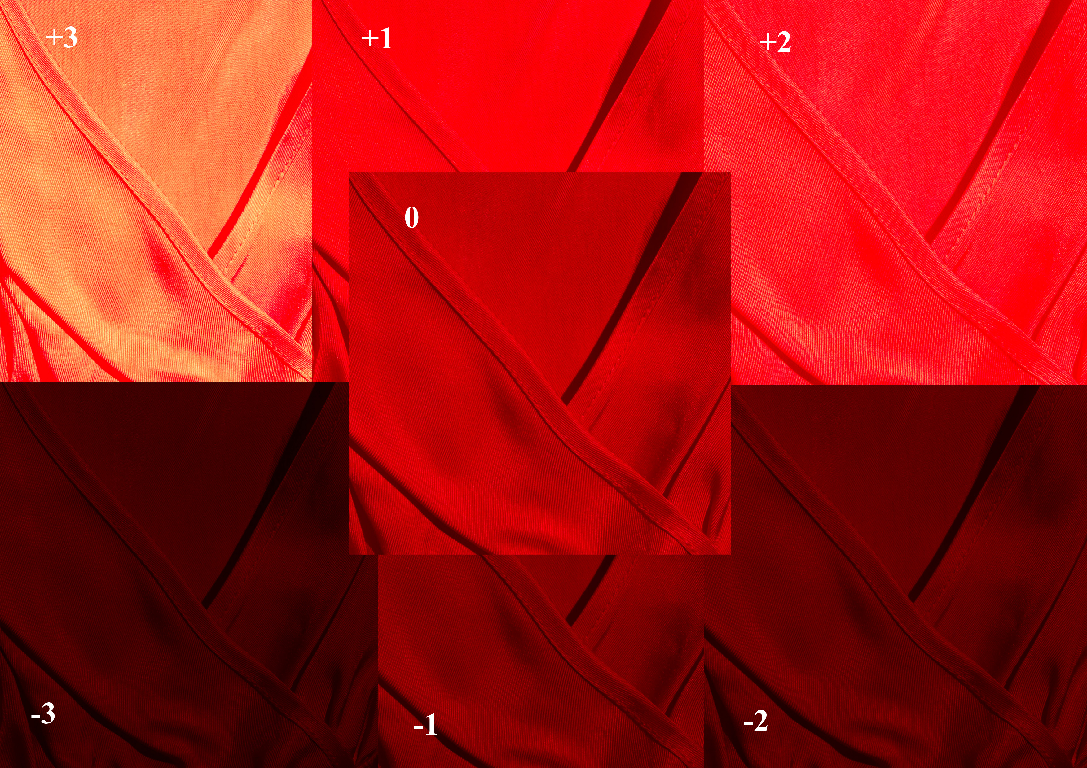
The final image in this series presents a composite of the above items. This makes it easier to compare how different exposures influence the rendering of a colour.
The "straight" image is seen in the centre. The images subject to relative over-exposure are seen in the upper half, and vary from a brighter red, through pink, to the final (+3) exposure, where the sheen of the fabric almost overpowers the true colour of the fabric.
Under exposure perhaps has a less dramatic effect, with a deeper saturation resulting in an ultimate rendering that, while dark, is still undoubtedly red.

No comments:
Post a Comment