The first images in the section demonstrate combinations of primary and secondary colours, seeking to present them in the proportions proposed by Von Goethe in his Theory of Colours (1810), thus making allowance for the relative brightness of each hue.
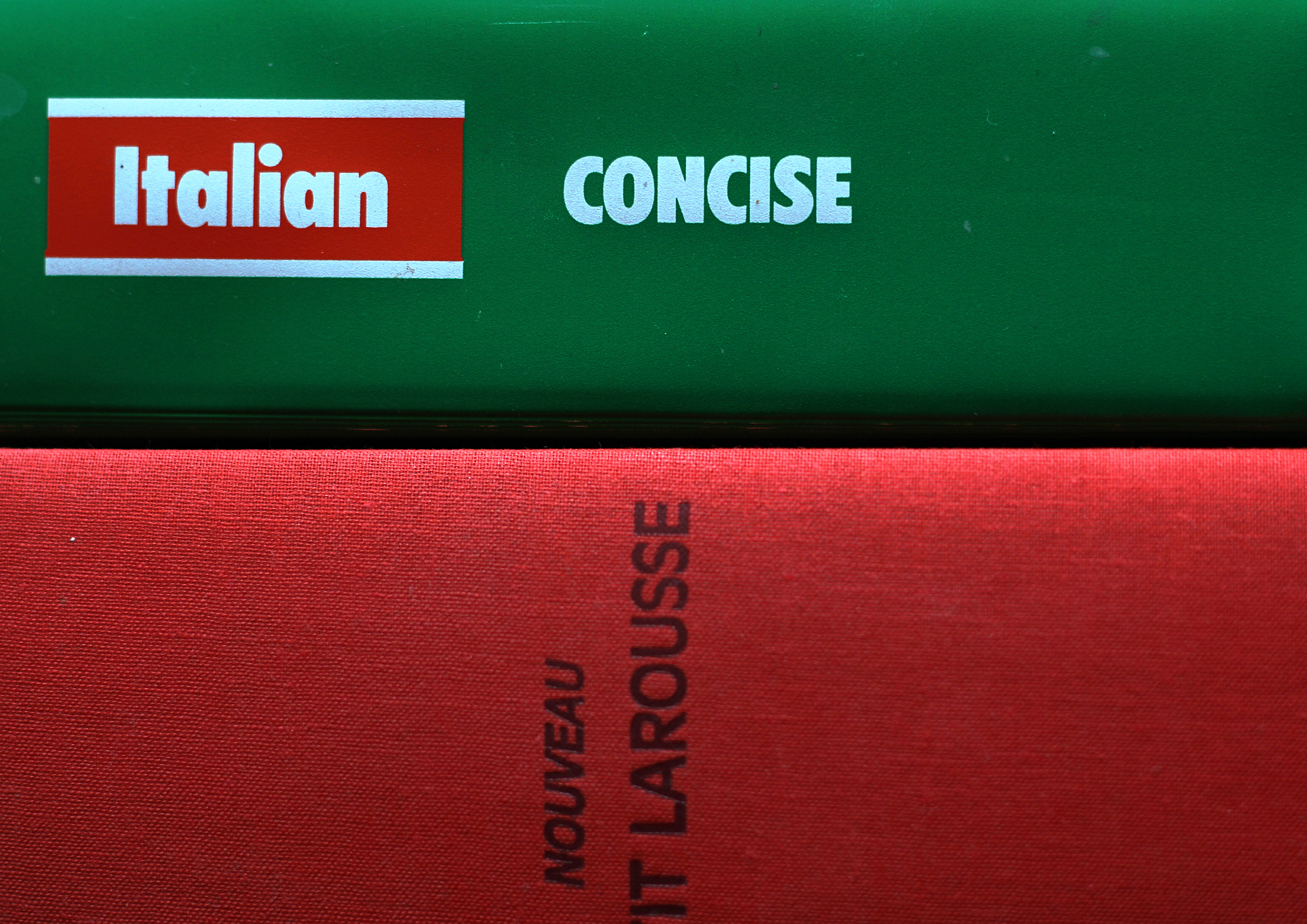 |
| Red - Green |
The one to one ratio is readily achieved here, a touch more of the red book being balanced by the title panel of the green one.
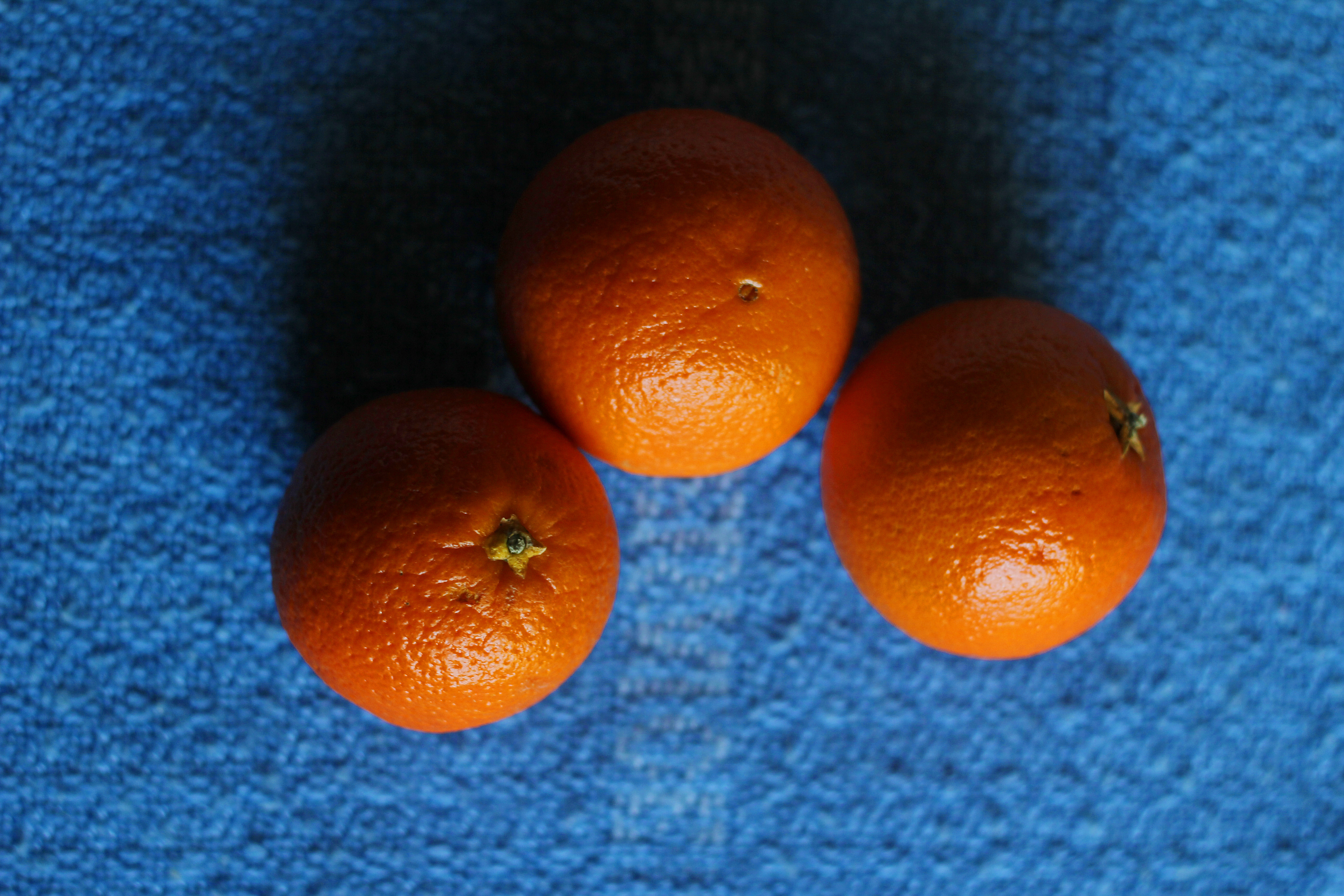 |
| Orange - Blue |
Orange is supposed to have a relative value of 8, compared with the 4 of blue. This example therefore has a larger area of blue background to balance the brighter oranges.
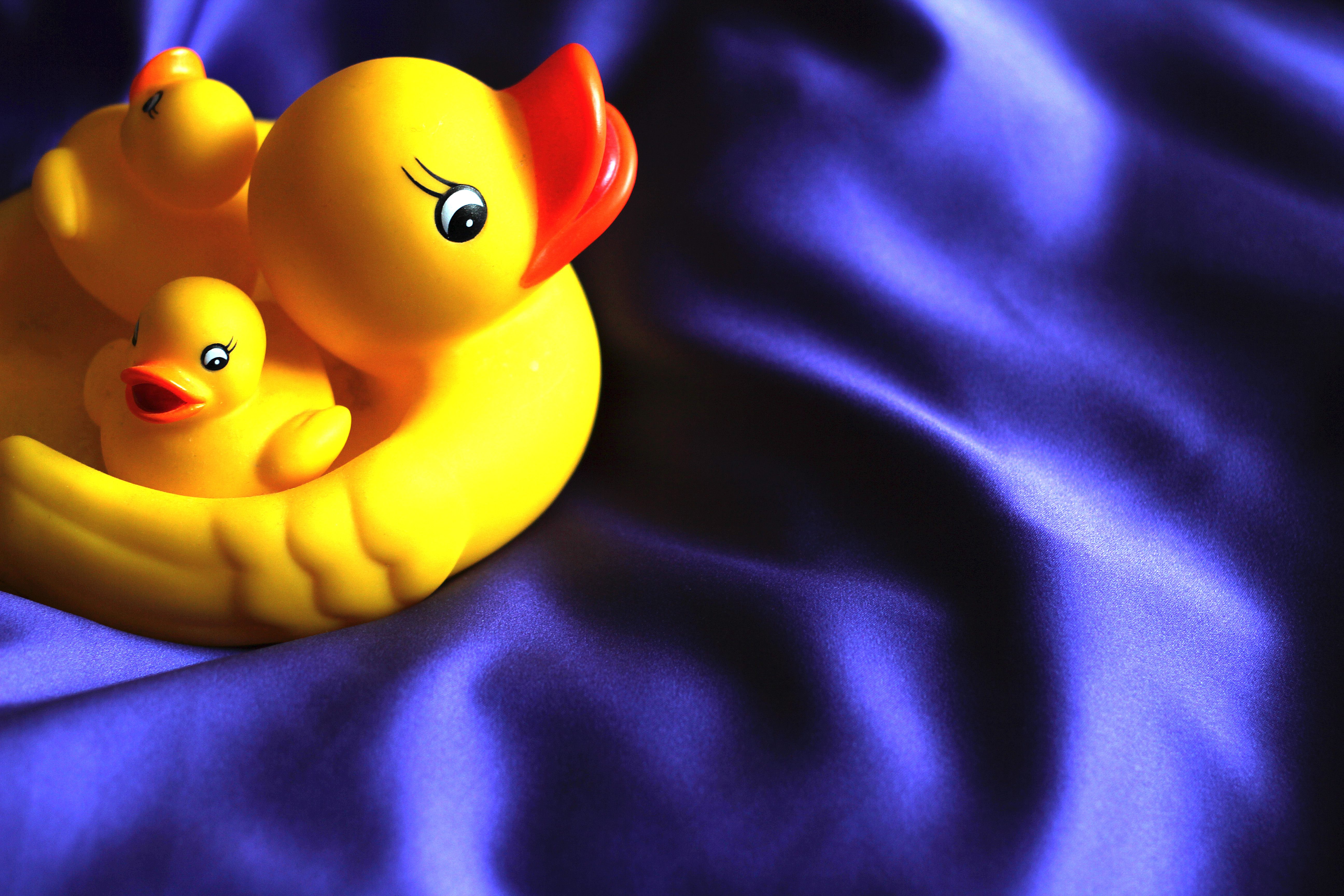 |
| Yellow - Violet |
Yellow is clearly the brighter here. Von Goethe ascribes it a value of 9, while violet is 3. The duck occupies about a quarter of the image, which gives proportions of around 1 to 3. This does seem to give a pleasing balance to the different elements of this composition.
And now the really hard bit - choosing colour combinations that "appeal" to me!
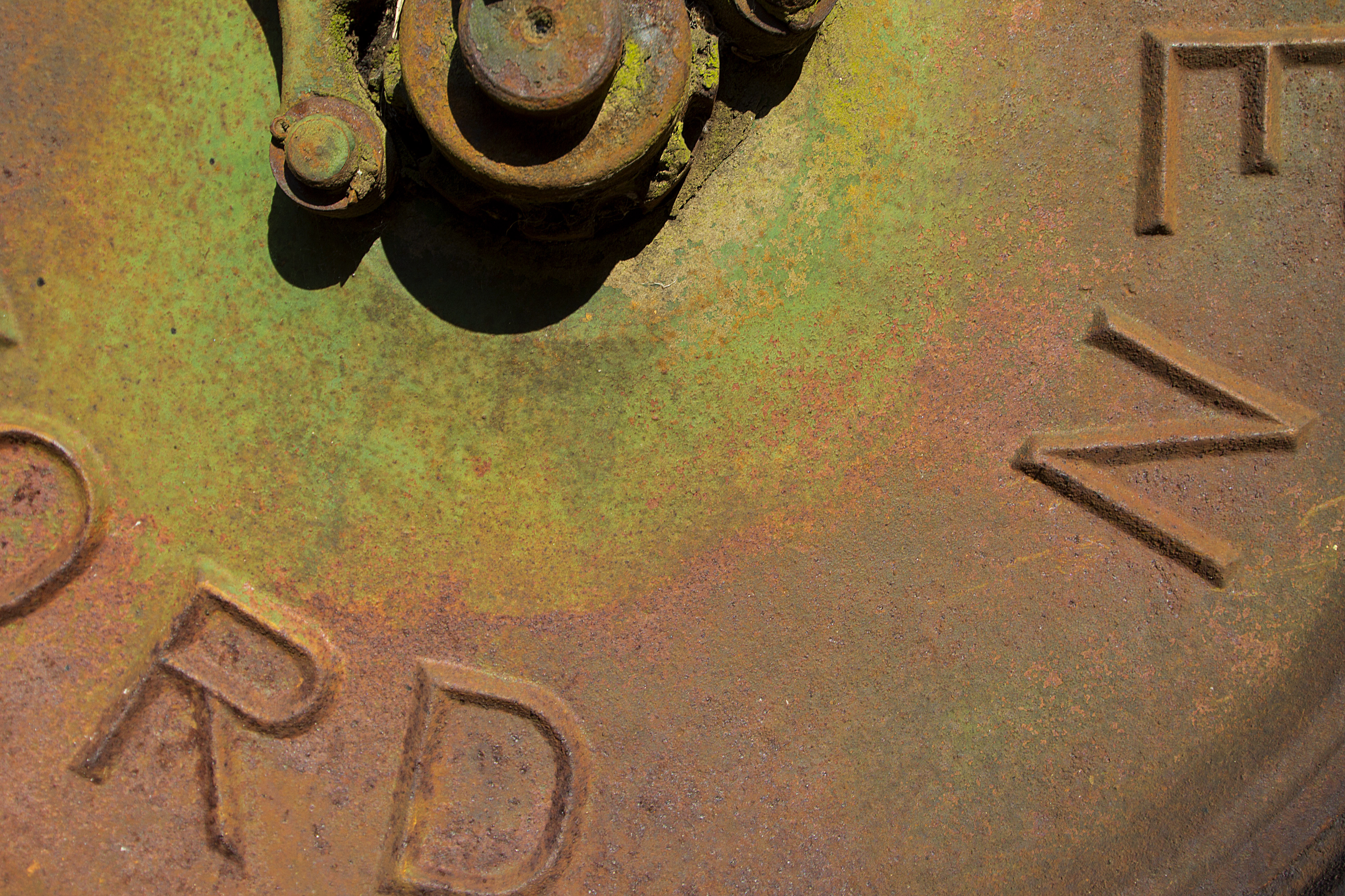 |
| Wheel of Allen Scythe |
I find the colour in this image pleasing because of the relatively understated and muted tones. It is essentially composed with greens contrasted with rust tones derived from the orange end of the spectrum. I terms of balance there is perhaps a preponderance of the warmer rusts, but I think this is compensated by the clearer and more vivid nature of the greens.
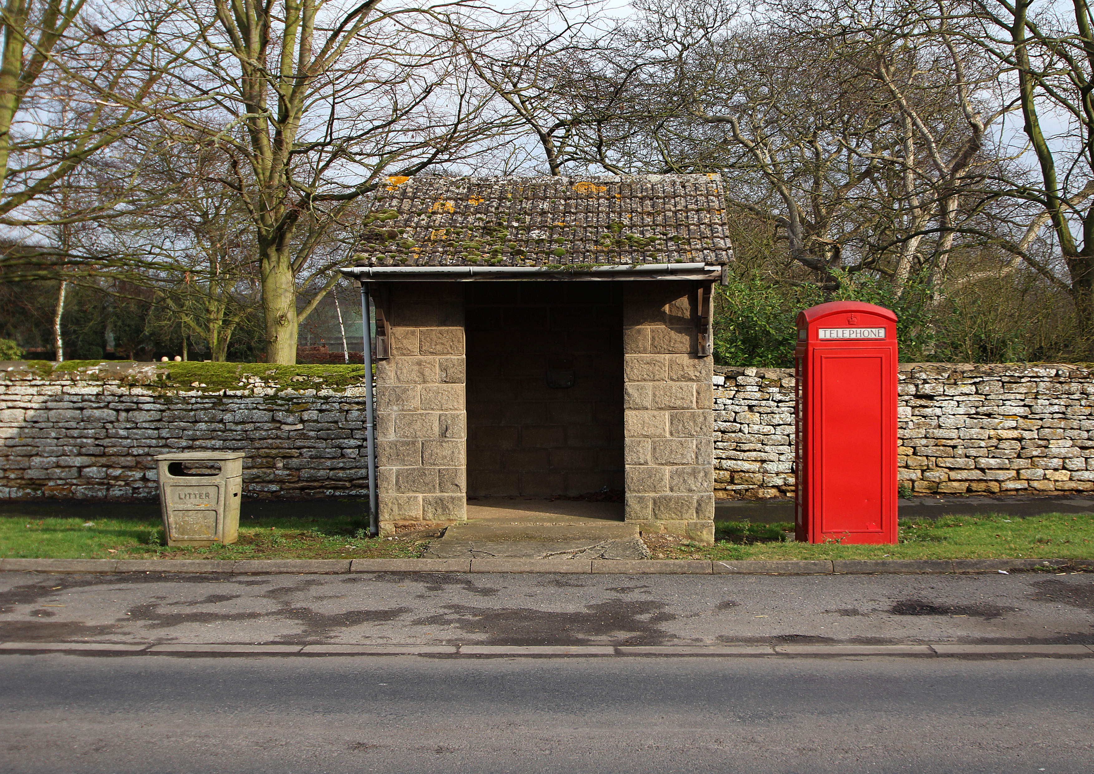 |
| Facilities in Cammeringham |
Ignore the box. The rest of this scene contains quite a lot of green, with some warmer tones to the stone and tile, with a delicate blue sky behind; the road surface is largely blueish. And then we have the box - an extremely positive statement in a red bright enough to dominate everything else. I think this could demonstrate that Goethe's theories of relative colour values apply best when the colours are of similar purity and saturation?
 |
| Pine buds |
A similar, but less dramatic example. The colours here are again largely greens and browns, with snow providing areas of neutrality. An accent is provided by the surprisingly bright orange buds. The large bud in the centre immediately catches the eye, but then we see others dotted around the rest of the image.
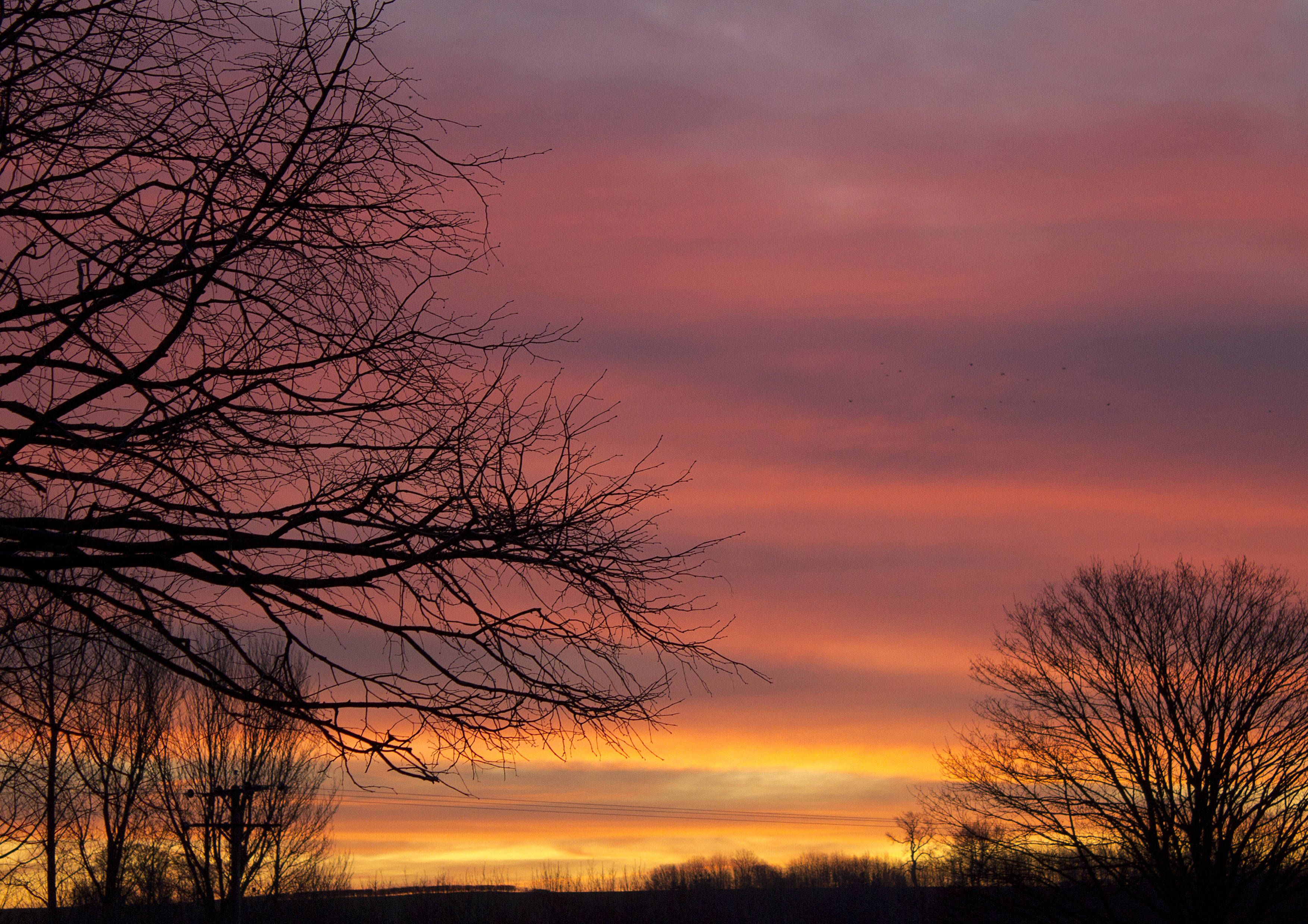 |
| Sunrise, 7:53 AM, 17th January |
The colour in this example has not been enhanced in Photoshop. It was one of those truly vivid, if fleeting moments when the sky was afire... However, the camera (photographer) is selective in what is revealed - the image below was taken with an 18mm focal length, the one above at 55mm. The broader picture is a little less Turneresque...
 |
| Sunrise, 7:54 AM, 17th January
|

No comments:
Post a Comment